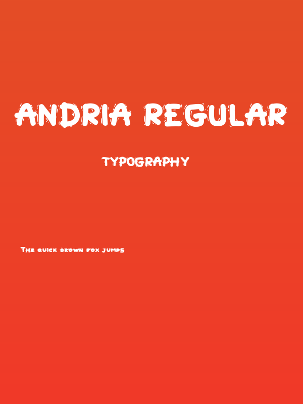
Andria Regular Font
✎ Kids
📄 TrueType
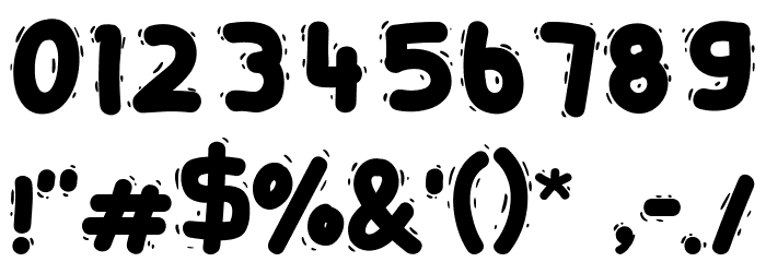
🔢 152 文字
⬇ 714
✅ 無料
✅ Web Font

Fonts by ManekaDesign
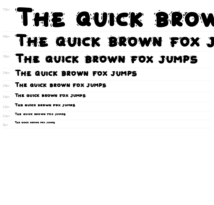
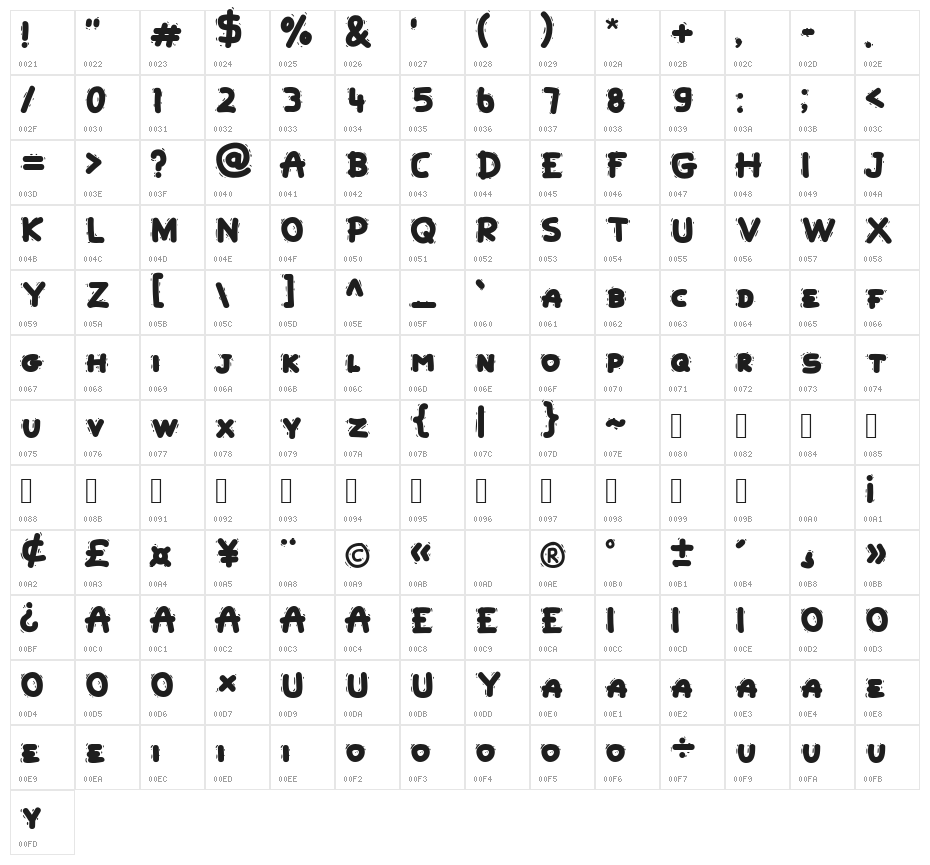
このフォントには 152 文字が含まれています。文字をクリックして詳細を表示。
数字と記号
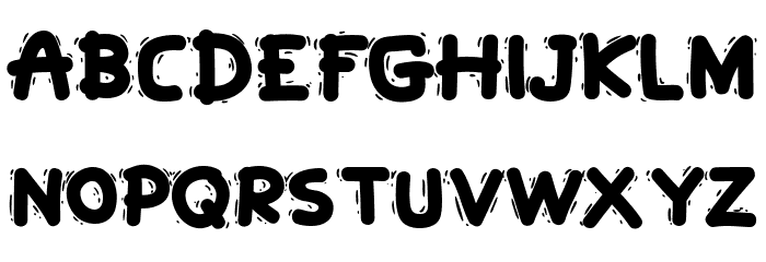
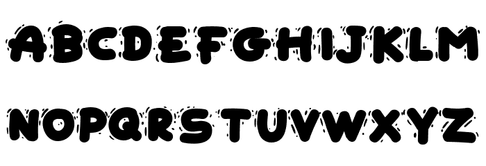
ANDRIA-REGULAR 大文字
ANDRIA-REGULAR 小文字
ANDRIA-REGULAR その他の文字
ギャラリー例


類似フォントのデータはまだありません。
名刺

SNSヘッダー

ロゴ
ポスター
情報
| 名前 | Andria Regular |
| フォントファミリー | Andria |
| Style | AndriaRegular |
| フォーマット | TrueType (.ttf) |
| ファイル | Andria-Regular.zip |
| ウェイト | Regular |
| バージョン | Version Version 1.044;Fontself Maker 3.5.6 |
| 文字数: | 152 |
| ダウンロード数 | 714 |
| 追加日 | 2023-03-22 |
| 更新日 | 2024-11-22 |
| カテゴリ | Kids |
| 太字 | Yes |
| イタリック | No |
| 幅 | Normal |
| 文字間隔 | Monospaced |
| コントラスト | Low |
| 全体的なスタイル | Decorative |
| 用途 | Headlines, Logos |
| おすすめプロジェクト | Ideal for posters, album covers, branding, and any project requiring a bold, artistic touch. |
| 等幅 | No |
| Web Font | 利用可能 |
| ライセンス | 個人利用無料 |
Fonts by ManekaDesign
💻 Windows
- ZIPを解凍
- .ttfを右クリック -> インストール
🍎 macOS
- ZIPを解凍
- .ttfをダブルクリック -> フォントをインストール
Andria Regular
無料 · TrueType
| 名前 | Andria Regular |
| タイプ | TrueType |
| 文字 | 152 |
| ダウンロード数 | 714 |
| 追加日 | 2023-03-22 |
| Web Font | 利用可能 |
| 作者 | Fonts by ManekaDesign |
| カテゴリ | Kids |