フォント
Bolt Cutter Nasty フォント
説明
- bolt cutter nasty.TTF
- フォント: Bolt Cutter Nasty
- ウェイト: Regular
- バージョン: Version Version 1.02; June 22,2003
- 文字数:: 226
- エンコード方式:
- 等幅: 0
フォントトレンド のページへようこそ。今のデザインを形作る書体をすばやく把握できます。 ブランド刷新、SNS クリエイティブ、Web UI などを最新の空気感に保ちましょう。
今季最も トレンド な書体を世界中のクリエイターの選択から収集。 上品なセリフ、ミニマルなサンセリフ、存在感のあるディスプレイ、温かみのあるスクリプトが 2025 年の美意識を彩ります。
見出しにトレンド書体、本文に普遍的なカテゴリ── Modern、Serif、Handwritten を組み合わせて、バランスのよいタイポグラフィに。
-
( THESE ARE SHAREWARE FONTS ! NOT FREEWARE ! PLEASE VISIT www.fuelfonts.com )
A bold, playful font with rounded edges and a modern, quirky style.
 ダウンロード 344 ダウンロード数@WebFont
 -
( Fonts by Daniel Zadorozny - www.iconian.com - Free for personal use )
A futuristic, geometric font with sharp angles and clean lines.
![Tele-Marines フリーフォントのダウンロード]() ダウンロード 2784 ダウンロード数@WebFont
ダウンロード 2784 ダウンロード数@WebFont -
( Fonts by Nick Curtis - www.nicksfonts.com )
A playful, rounded font with bold, approachable characters.
![VlaanderenRound フリーフォントのダウンロード]() ダウンロード 339 ダウンロード数@WebFont
ダウンロード 339 ダウンロード数@WebFont -
![Turok Normal フリーフォントのダウンロード]() ダウンロード 456 ダウンロード数@WebFont
ダウンロード 456 ダウンロード数@WebFont -
( Fonts by John David www.easywriter.com/fonts/ )
An angular, edgy font with a hand-drawn, dynamic style.
![BudAngular フリーフォントのダウンロード]() ダウンロード 223 ダウンロード数@WebFont
ダウンロード 223 ダウンロード数@WebFont -
![Numberpile フリーフォントのダウンロード]() ダウンロード 762 ダウンロード数@WebFont
ダウンロード 762 ダウンロード数@WebFont -
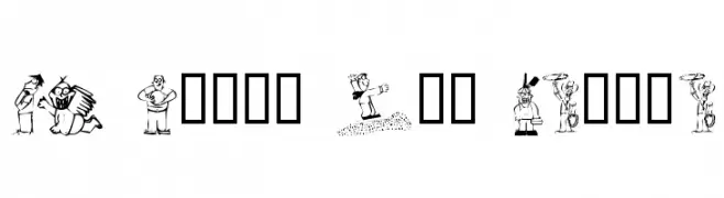
![KR Silly Art People フリーフォントのダウンロード]() ダウンロード 310 ダウンロード数@WebFont
ダウンロード 310 ダウンロード数@WebFont -
![NiseSonic フリーフォントのダウンロード]() ダウンロード 2542 ダウンロード数@WebFont
ダウンロード 2542 ダウンロード数@WebFont


FAQ — フォントトレンド
いま注目のフォント傾向は?
シンプルさ、可読性、人間味がキーワード。丸みのあるサンセリフ、コントラスト強めのセリフ、 上品なレトロ回帰が広く使われています。
いま流行している具体的なフォントは?
など、モダンさと普遍性のバランスが取れた書体が選ばれています。 Web、パッケージ、SNS のビジュアルで清潔感と表現力を両立できます。
トレンドフォントの賢い使い方は?
見出しに映えるディスプレイ、本文にシンプルなサンセリフの組み合わせが定番です。 端末やサイズが変わっても読みやすいかを必ずテストしましょう。
💡 ヒント: 数か月ごとに トレンド書体 を差し替えると、ビジュアルの鮮度と発見性(SEO)を保てます。