フォント
Do not eat this フォント
説明
- Donoteatthis.ttf
- フォント: Do not eat this
- ウェイト: Regular
- バージョン: Version www.pizzadude.dk - 310701
- 文字数:: 402
- エンコード方式:
- 等幅: 0
フォントトレンド のページへようこそ。今のデザインを形作る書体をすばやく把握できます。 ブランド刷新、SNS クリエイティブ、Web UI などを最新の空気感に保ちましょう。
今季最も トレンド な書体を世界中のクリエイターの選択から収集。 上品なセリフ、ミニマルなサンセリフ、存在感のあるディスプレイ、温かみのあるスクリプトが 2025 年の美意識を彩ります。
見出しにトレンド書体、本文に普遍的なカテゴリ── Modern、Serif、Handwritten を組み合わせて、バランスのよいタイポグラフィに。
-
( Copyright (c) 2011, Eduardo Tunni (http://www.tipo.net.ar) )
A playful, bold font with rounded, flowing strokes and a lively appearance.
 ダウンロード 18467 ダウンロード数@WebFont
 -
![Canne フリーフォントのダウンロード]() ダウンロード 248 ダウンロード数@WebFont
ダウンロード 248 ダウンロード数@WebFont -
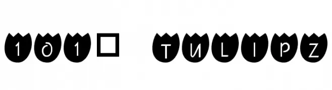
![101! TulipZ フリーフォントのダウンロード]() ダウンロード 797 ダウンロード数@WebFont
ダウンロード 797 ダウンロード数@WebFont -
( Fonts by Mr Fisk - Mike Larsson - fontorama.net )
A vintage, typewriter-style font with a distressed, rugged texture.
![Typewriter-Font [Royal 200] フリーフォントのダウンロード]() ダウンロード 4113 ダウンロード数@WebFont
ダウンロード 4113 ダウンロード数@WebFont -
![VTC Bad DataTrip Regular Italic フリーフォントのダウンロード]() ダウンロード 141 ダウンロード数@WebFont
ダウンロード 141 ダウンロード数@WebFont -
( Fonts by Spork Thug Typography - Josh Wilhelm - www.lifewithouttaffy.com/taffy/blog )
A playful and bold font with rounded edges and a whimsical style.
![Muffy フリーフォントのダウンロード]() ダウンロード 176 ダウンロード数@WebFont
ダウンロード 176 ダウンロード数@WebFont -
( Fonts by Graham Meade - GemFonts )
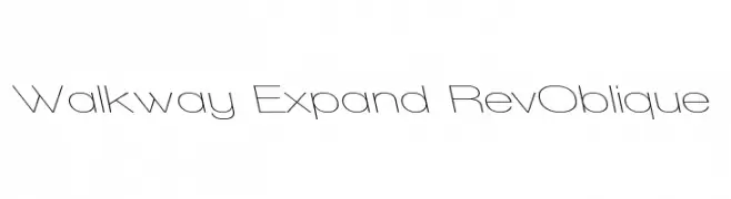
A modern, expanded font with a reverse oblique style and thin, elegant letterforms.
![Walkway Expand RevOblique フリーフォントのダウンロード]() ダウンロード 236 ダウンロード数@WebFont
ダウンロード 236 ダウンロード数@WebFont -
![Saunder BRK フリーフォントのダウンロード]() ダウンロード 428 ダウンロード数@WebFont
ダウンロード 428 ダウンロード数@WebFont

![Typewriter-Font [Royal 200] フリーフォントのダウンロード](https://d144mzi0q5mijx.cloudfront.net/img/T/Y/Typewriter-Font-Royal-200.webp)


FAQ — フォントトレンド
いま注目のフォント傾向は?
シンプルさ、可読性、人間味がキーワード。丸みのあるサンセリフ、コントラスト強めのセリフ、 上品なレトロ回帰が広く使われています。
いま流行している具体的なフォントは?
など、モダンさと普遍性のバランスが取れた書体が選ばれています。 Web、パッケージ、SNS のビジュアルで清潔感と表現力を両立できます。
トレンドフォントの賢い使い方は?
見出しに映えるディスプレイ、本文にシンプルなサンセリフの組み合わせが定番です。 端末やサイズが変わっても読みやすいかを必ずテストしましょう。
💡 ヒント: 数か月ごとに トレンド書体 を差し替えると、ビジュアルの鮮度と発見性(SEO)を保てます。