フォント
Electrofied Bold フォント
説明
- electrb.ttf
- フォント: Electrofied Bold
- ウェイト: Bold
- バージョン: Version Version 1.0
- 文字数:: 253
- エンコード方式:
- 等幅: 0
フォントトレンド のページへようこそ。今のデザインを形作る書体をすばやく把握できます。 ブランド刷新、SNS クリエイティブ、Web UI などを最新の空気感に保ちましょう。
今季最も トレンド な書体を世界中のクリエイターの選択から収集。 上品なセリフ、ミニマルなサンセリフ、存在感のあるディスプレイ、温かみのあるスクリプトが 2025 年の美意識を彩ります。
見出しにトレンド書体、本文に普遍的なカテゴリ── Modern、Serif、Handwritten を組み合わせて、バランスのよいタイポグラフィに。
-
( Fonts by Daniel Zadorozny - www.iconian.com - Free for personal use )
A 3D block font with a pixelated, futuristic design.
 ダウンロード 168 ダウンロード数@WebFont
 -
( Fonts by Daniel Zadorozny - www.iconian.com - Free for personal use )
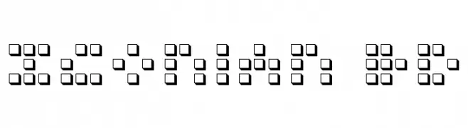
A pixelated, futuristic font with a digital and condensed style.
![Iconian Condensed フリーフォントのダウンロード]() ダウンロード 138 ダウンロード数@WebFont
ダウンロード 138 ダウンロード数@WebFont -
( Fonts by Daniel Zadorozny - www.iconian.com - Free for personal use )
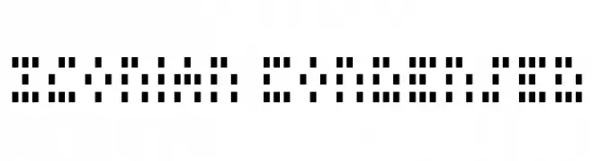
A futuristic, pixelated font composed of small square dots forming each character.
![Iconian Expanded フリーフォントのダウンロード]() ダウンロード 174 ダウンロード数@WebFont
ダウンロード 174 ダウンロード数@WebFont -
![Styllo フリーフォントのダウンロード]() ダウンロード 406 ダウンロード数@WebFont
ダウンロード 406 ダウンロード数@WebFont -
( Fonts by Manfred Klein - manfred-klein.ina-mar.com )
A bold, pixelated font with a retro digital aesthetic.
![UnscreenMK フリーフォントのダウンロード]() ダウンロード 222 ダウンロード数@WebFont
ダウンロード 222 ダウンロード数@WebFont -
( Fonts by Daniel Zadorozny - www.iconian.com )
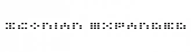
A pixelated, grid-based italic font with a retro digital style.
![X-Grid Italic フリーフォントのダウンロード]() ダウンロード 359 ダウンロード数@WebFont
ダウンロード 359 ダウンロード数@WebFont -
( Fonts by Daniel Zadorozny - www.iconian.com )
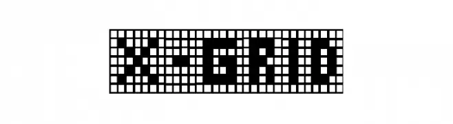
A pixelated, grid-based font with a digital, retro aesthetic.
![X-Grid フリーフォントのダウンロード]() ダウンロード 668 ダウンロード数@WebFont
ダウンロード 668 ダウンロード数@WebFont -
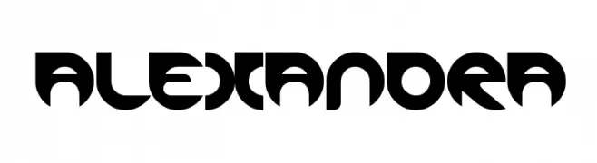
( Fonts by weknow - Wino S Kadir )
A bold, geometric font with a futuristic and modern design.
![ALEXANDRA フリーフォントのダウンロード]() ダウンロード 1481 ダウンロード数@WebFont
ダウンロード 1481 ダウンロード数@WebFont


FAQ — フォントトレンド
いま注目のフォント傾向は?
シンプルさ、可読性、人間味がキーワード。丸みのあるサンセリフ、コントラスト強めのセリフ、 上品なレトロ回帰が広く使われています。
いま流行している具体的なフォントは?
など、モダンさと普遍性のバランスが取れた書体が選ばれています。 Web、パッケージ、SNS のビジュアルで清潔感と表現力を両立できます。
トレンドフォントの賢い使い方は?
見出しに映えるディスプレイ、本文にシンプルなサンセリフの組み合わせが定番です。 端末やサイズが変わっても読みやすいかを必ずテストしましょう。
💡 ヒント: 数か月ごとに トレンド書体 を差し替えると、ビジュアルの鮮度と発見性(SEO)を保てます。