フォント
Fighting Spirit turbo Bold Italic フォント
説明
- Fighting Spirit 2 bold.ttf
- フォント: Fighting Spirit turbo Bold Italic
- ウェイト: Bold Italic
- バージョン: Version Version 1.00 February 17, 2014, initial release
- 文字数:: 236
- エンコード方式:
- 等幅: 0
フォントトレンド のページへようこそ。今のデザインを形作る書体をすばやく把握できます。 ブランド刷新、SNS クリエイティブ、Web UI などを最新の空気感に保ちましょう。
今季最も トレンド な書体を世界中のクリエイターの選択から収集。 上品なセリフ、ミニマルなサンセリフ、存在感のあるディスプレイ、温かみのあるスクリプトが 2025 年の美意識を彩ります。
見出しにトレンド書体、本文に普遍的なカテゴリ── Modern、Serif、Handwritten を組み合わせて、バランスのよいタイポグラフィに。
-
( Fonts by Daniel Zadorozny - www.iconian.com - Free for personal use )
A bold, italicized font with a futuristic and dynamic style.
 ダウンロード 426 ダウンロード数@WebFont
 -
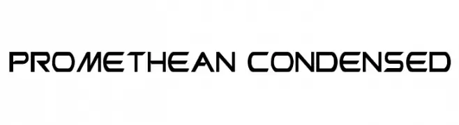
( Fonts by Daniel Zadorozny - www.iconian.com - Free for personal use )
A futuristic, geometric font with sharp angles and a condensed form.
![Promethean Condensed フリーフォントのダウンロード]() ダウンロード 444 ダウンロード数@WebFont
ダウンロード 444 ダウンロード数@WebFont -
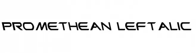
( Fonts by Daniel Zadorozny - www.iconian.com - Free for personal use )
A futuristic, angular font with a forward-leaning slant and geometric style.
![Promethean Leftalic フリーフォントのダウンロード]() ダウンロード 180 ダウンロード数@WebFont
ダウンロード 180 ダウンロード数@WebFont -
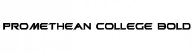
( Fonts by Daniel Zadorozny - www.iconian.com - Free for personal use )
A bold, futuristic font with sharp angles and a double line effect.
![Promethean College Bold フリーフォントのダウンロード]() ダウンロード 342 ダウンロード数@WebFont
ダウンロード 342 ダウンロード数@WebFont -
( Fonts by Daniel Zadorozny - www.iconian.com - Free for personal use )
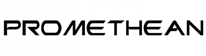
A futuristic, angular font with bold, geometric characters.
![Promethean フリーフォントのダウンロード]() ダウンロード 803 ダウンロード数@WebFont
ダウンロード 803 ダウンロード数@WebFont -
( Fonts by Daniel Zadorozny - www.iconian.com - Free for personal use )
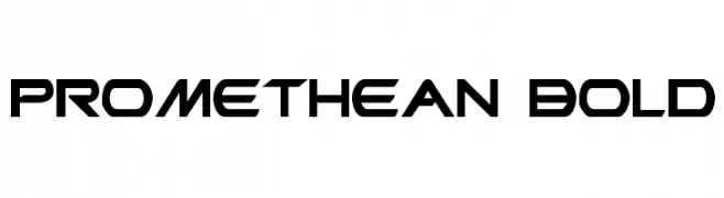
A bold, futuristic font with angular, geometric shapes.
![Promethean Bold フリーフォントのダウンロード]() ダウンロード 639 ダウンロード数@WebFont
ダウンロード 639 ダウンロード数@WebFont -
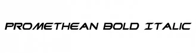
( Fonts by Daniel Zadorozny - www.iconian.com - Free for personal use )
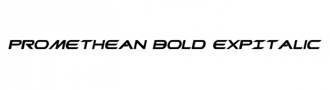
A bold, expansive italic font with a dynamic and futuristic style.
![Promethean Bold ExpItalic フリーフォントのダウンロード]() ダウンロード 371 ダウンロード数@WebFont
ダウンロード 371 ダウンロード数@WebFont -
( Fonts by Daniel Zadorozny - www.iconian.com - Free for personal use )
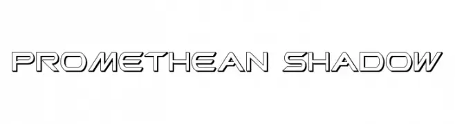
A futuristic, geometric font with a bold, shadowed outline.
![Promethean Shadow フリーフォントのダウンロード]() ダウンロード 188 ダウンロード数@WebFont
ダウンロード 188 ダウンロード数@WebFont
FAQ — フォントトレンド
いま注目のフォント傾向は?
シンプルさ、可読性、人間味がキーワード。丸みのあるサンセリフ、コントラスト強めのセリフ、 上品なレトロ回帰が広く使われています。
いま流行している具体的なフォントは?
など、モダンさと普遍性のバランスが取れた書体が選ばれています。 Web、パッケージ、SNS のビジュアルで清潔感と表現力を両立できます。
トレンドフォントの賢い使い方は?
見出しに映えるディスプレイ、本文にシンプルなサンセリフの組み合わせが定番です。 端末やサイズが変わっても読みやすいかを必ずテストしましょう。
💡 ヒント: 数か月ごとに トレンド書体 を差し替えると、ビジュアルの鮮度と発見性(SEO)を保てます。