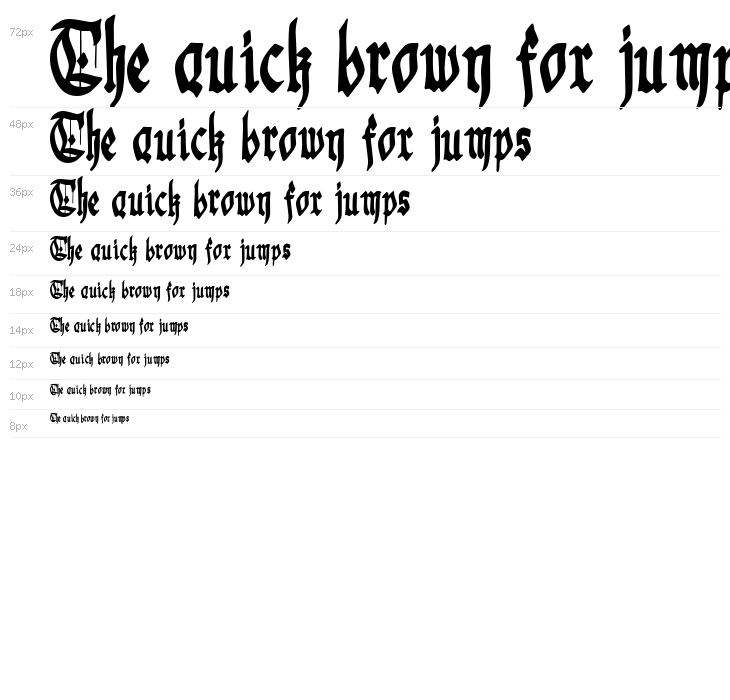
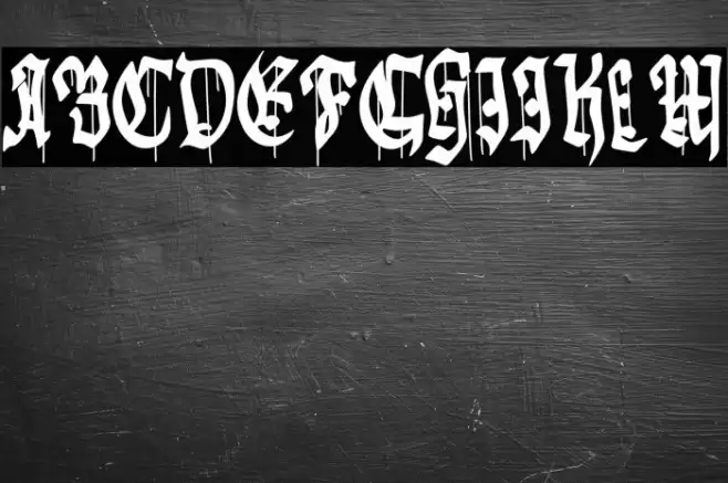
Gothic Godness Font
✎ Gothic
📄 TrueType
🔢 128 文字
⬇ 129
✅ 無料
✅ Web Font

Fonts by Woodcutter

このフォントには 128 文字が含まれています。文字をクリックして詳細を表示。
数字と記号
GOTHIC-GODNESS 大文字
GOTHIC-GODNESS 小文字
GOTHIC-GODNESS その他の文字
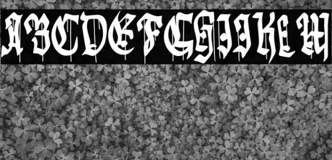
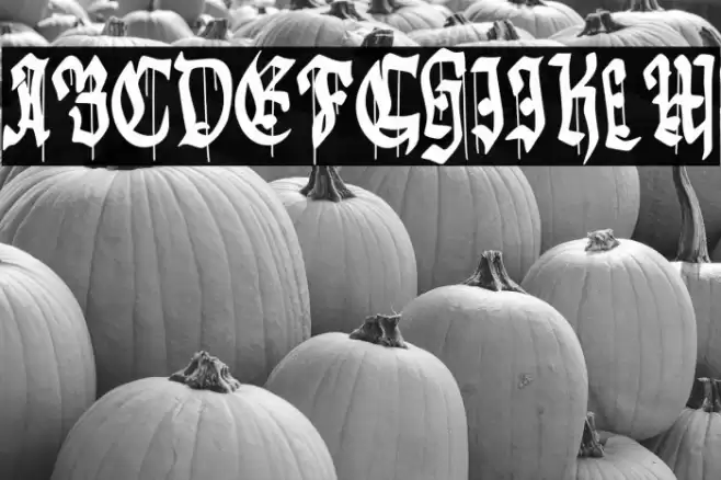
ギャラリー例
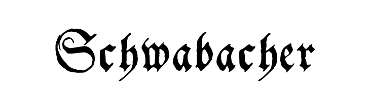
似た無料フォント

名刺

SNSヘッダー

ロゴ
ポスター

情報
| 名前 | Gothic Godness |
| フォントファミリー | Gothic Godness |
| Style | Regular |
| フォーマット | TrueType (.ttf) |
| ファイル | Gothic-Godness.zip |
| バージョン | Version 1.00;November 30, 2023;FontCreator 11.0.0. |
| 文字数: | 128 |
| ダウンロード数 | 129 |
| 追加日 | 2025-03-20 |
| カテゴリ | Gothic |
| 太字 | Yes |
| イタリック | No |
| 幅 | Normal |
| 文字間隔 | Monospaced |
| コントラスト | High |
| 全体的なスタイル | Vintage |
| 用途 | Headlines, Logos, Decorative text |
| おすすめプロジェクト | Ideal for use in book covers, posters, branding for historical or fantasy-themed projects, and decorative headings. |
| 等幅 | No |
| Web Font | 利用可能 |
| ライセンス | 個人利用無料 |
Fonts by Woodcutter
💻 Windows
- ZIPを解凍
- .ttfを右クリック -> インストール
🍎 macOS
- ZIPを解凍
- .ttfをダブルクリック -> フォントをインストール
Gothic Godness
無料 · TrueType
| 名前 | Gothic Godness |
| タイプ | TrueType |
| 文字 | 128 |
| ダウンロード数 | 129 |
| 追加日 | 2025-03-20 |
| Web Font | 利用可能 |
| 作者 | Fonts by Woodcutter |
| カテゴリ | Gothic |