フォント
JFRockSolid フォント
説明
- JFRocSol.TTF
- フォント: JFRockSolid
- ウェイト: Regular
- バージョン: Version August 2000; dedicated to Philip
- 文字数:: 73
- エンコード方式:
- 等幅: 0
フォントトレンド のページへようこそ。今のデザインを形作る書体をすばやく把握できます。 ブランド刷新、SNS クリエイティブ、Web UI などを最新の空気感に保ちましょう。
今季最も トレンド な書体を世界中のクリエイターの選択から収集。 上品なセリフ、ミニマルなサンセリフ、存在感のあるディスプレイ、温かみのあるスクリプトが 2025 年の美意識を彩ります。
見出しにトレンド書体、本文に普遍的なカテゴリ── Modern、Serif、Handwritten を組み合わせて、バランスのよいタイポグラフィに。
-
( Fonts by Manfred Klein - manfred-klein.ina-mar.com )
A bold, retro font with a distressed, industrial look.
 ダウンロード 994 ダウンロード数@WebFont
 -
![Shredded for you フリーフォントのダウンロード]() ダウンロード 395 ダウンロード数@WebFont
ダウンロード 395 ダウンロード数@WebFont -
( Fonts by Rich Gast - www.greywolfwebworks.com 商用 フォント )
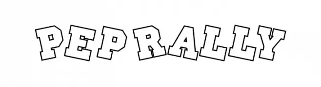
Bold, outlined font with a collegiate, energetic style.
![Pep Rally フリーフォントのダウンロード]() ダウンロード 568 ダウンロード数
ダウンロード 568 ダウンロード数 -
( Fonts by ShyFonts )
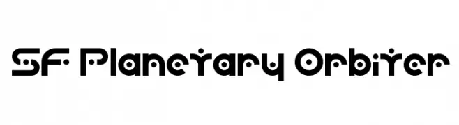
A futuristic, geometric font with bold, rounded letterforms and unique cutouts.
![SF Planetary Orbiter フリーフォントのダウンロード]() ダウンロード 615 ダウンロード数@WebFont
ダウンロード 615 ダウンロード数@WebFont -
( Fonts by ShyFonts )
A futuristic, bold italic font with geometric shapes and smooth curves.
![SF Planetary Orbiter Bold Italic フリーフォントのダウンロード]() ダウンロード 234 ダウンロード数@WebFont
ダウンロード 234 ダウンロード数@WebFont -
( Fonts by ShyFonts )
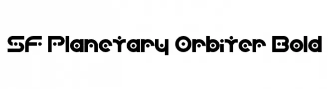
A bold, futuristic font with geometric shapes and unique cutouts.
![SF Planetary Orbiter Bold フリーフォントのダウンロード]() ダウンロード 425 ダウンロード数@WebFont
ダウンロード 425 ダウンロード数@WebFont -
( Fonts by ShyFonts )
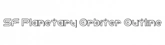
A futuristic, geometric outline font with circular elements and consistent width.
![SF Planetary Orbiter Outline フリーフォントのダウンロード]() ダウンロード 216 ダウンロード数@WebFont
ダウンロード 216 ダウンロード数@WebFont -
( Fonts by ShyFonts )
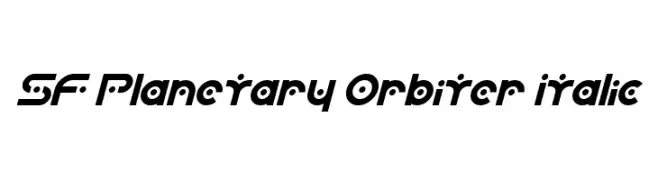
A futuristic, bold, and italic font with geometric and space-age elements.
![SF Planetary Orbiter Italic フリーフォントのダウンロード]() ダウンロード 276 ダウンロード数@WebFont
ダウンロード 276 ダウンロード数@WebFont


FAQ — フォントトレンド
いま注目のフォント傾向は?
シンプルさ、可読性、人間味がキーワード。丸みのあるサンセリフ、コントラスト強めのセリフ、 上品なレトロ回帰が広く使われています。
いま流行している具体的なフォントは?
など、モダンさと普遍性のバランスが取れた書体が選ばれています。 Web、パッケージ、SNS のビジュアルで清潔感と表現力を両立できます。
トレンドフォントの賢い使い方は?
見出しに映えるディスプレイ、本文にシンプルなサンセリフの組み合わせが定番です。 端末やサイズが変わっても読みやすいかを必ずテストしましょう。
💡 ヒント: 数か月ごとに トレンド書体 を差し替えると、ビジュアルの鮮度と発見性(SEO)を保てます。