フォント
Kremlin Advisor Display Kaps Bold フォント
説明
- Kremlin Advisor Display Kaps Bold.ttf
- フォント: Kremlin Advisor Display Kaps Bold
- ウェイト: Bold
- バージョン: Version Version 1.00 June 23, 2008, initial release
- 文字数:: 99
- エンコード方式:
- 等幅: 0
フォントトレンド のページへようこそ。今のデザインを形作る書体をすばやく把握できます。 ブランド刷新、SNS クリエイティブ、Web UI などを最新の空気感に保ちましょう。
今季最も トレンド な書体を世界中のクリエイターの選択から収集。 上品なセリフ、ミニマルなサンセリフ、存在感のあるディスプレイ、温かみのあるスクリプトが 2025 年の美意識を彩ります。
見出しにトレンド書体、本文に普遍的なカテゴリ── Modern、Serif、Handwritten を組み合わせて、バランスのよいタイポグラフィに。
-
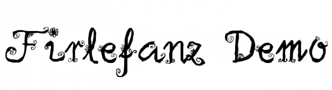
( Fonts by Anke Arnold - www.anke-art.de )
A whimsical, decorative font with ornate, swirling embellishments.
 ダウンロード 595 ダウンロード数@WebFont
 -
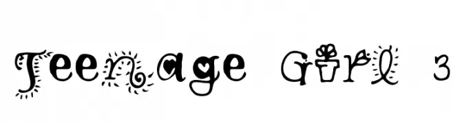
![Teenage Girl 3 フリーフォントのダウンロード]() ダウンロード 488 ダウンロード数@WebFont
ダウンロード 488 ダウンロード数@WebFont -
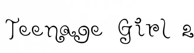
![Teenage Girl 2 フリーフォントのダウンロード]() ダウンロード 272 ダウンロード数@WebFont
ダウンロード 272 ダウンロード数@WebFont -
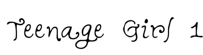
![Teenage Girl 1 フリーフォントのダウンロード]() ダウンロード 365 ダウンロード数@WebFont
ダウンロード 365 ダウンロード数@WebFont -
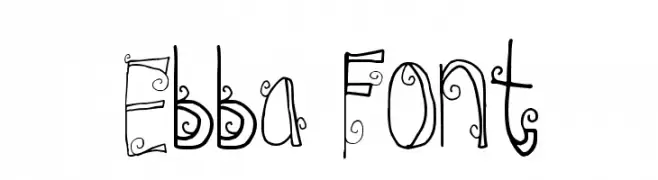
![Ebba Font フリーフォントのダウンロード]() ダウンロード 514 ダウンロード数@WebFont
ダウンロード 514 ダウンロード数@WebFont -
( Fonts by Kimberly Geswein - kimberlygeswein.com )
A whimsical and decorative font with playful curls and swirls.
![Jheri Curls フリーフォントのダウンロード]() ダウンロード 513 ダウンロード数@WebFont
ダウンロード 513 ダウンロード数@WebFont -
( Fonts by Omega Font Labs )
A whimsical and decorative font with playful swirls and dots.
![Spahrty Girl フリーフォントのダウンロード]() ダウンロード 741 ダウンロード数@WebFont
ダウンロード 741 ダウンロード数@WebFont -
![Skirt Girl フリーフォントのダウンロード]() ダウンロード 595 ダウンロード数@WebFont
ダウンロード 595 ダウンロード数@WebFont


FAQ — フォントトレンド
いま注目のフォント傾向は?
シンプルさ、可読性、人間味がキーワード。丸みのあるサンセリフ、コントラスト強めのセリフ、 上品なレトロ回帰が広く使われています。
いま流行している具体的なフォントは?
など、モダンさと普遍性のバランスが取れた書体が選ばれています。 Web、パッケージ、SNS のビジュアルで清潔感と表現力を両立できます。
トレンドフォントの賢い使い方は?
見出しに映えるディスプレイ、本文にシンプルなサンセリフの組み合わせが定番です。 端末やサイズが変わっても読みやすいかを必ずテストしましょう。
💡 ヒント: 数か月ごとに トレンド書体 を差し替えると、ビジュアルの鮮度と発見性(SEO)を保てます。