フォント
Mishmash Fuse BRK フォント
説明
- mimafuse.ttf
- フォント: Mishmash Fuse BRK
- ウェイト: Regular
- バージョン: Version Version 1.12
- 文字数:: 101
- エンコード方式:
- 等幅: 0
フォントトレンド のページへようこそ。今のデザインを形作る書体をすばやく把握できます。 ブランド刷新、SNS クリエイティブ、Web UI などを最新の空気感に保ちましょう。
今季最も トレンド な書体を世界中のクリエイターの選択から収集。 上品なセリフ、ミニマルなサンセリフ、存在感のあるディスプレイ、温かみのあるスクリプトが 2025 年の美意識を彩ります。
見出しにトレンド書体、本文に普遍的なカテゴリ── Modern、Serif、Handwritten を組み合わせて、バランスのよいタイポグラフィに。
-
( Fonts by Jacob Fisher - www.pizzadude.dk )
A modern, rounded font with smooth, elongated characters and consistent stroke width.
 ダウンロード 501 ダウンロード数@WebFont
 -
![SF Movie Poster Italic フリーフォントのダウンロード]() ダウンロード 702 ダウンロード数@WebFont
ダウンロード 702 ダウンロード数@WebFont -
![Iron Maiden フリーフォントのダウンロード]() ダウンロード 6777 ダウンロード数@WebFont
ダウンロード 6777 ダウンロード数@WebFont -
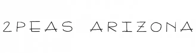
( Fonts by www.twopeasinabucket.com )
A playful, handwritten font with thin, irregular strokes and a casual vibe.
![2Peas Arizona フリーフォントのダウンロード]() ダウンロード 5472 ダウンロード数@WebFont
ダウンロード 5472 ダウンロード数@WebFont -
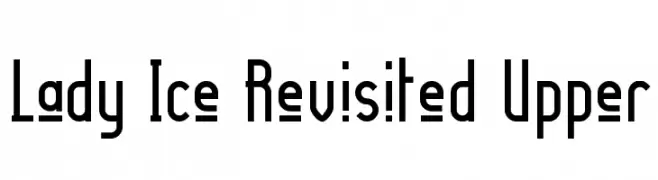
( Fonts by Apostrophic Lab )
A modern, geometric font with clean lines and a sleek appearance.
![Lady Ice Revisited Upper フリーフォントのダウンロード]() ダウンロード 240 ダウンロード数@WebFont
ダウンロード 240 ダウンロード数@WebFont -
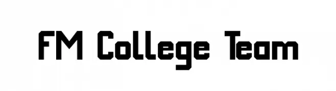
( Fonts by Dieter Schumacher )
Bold, geometric font with a collegiate style and strong, angular lines.
![FM College Team フリーフォントのダウンロード]() ダウンロード 2018 ダウンロード数@WebFont
ダウンロード 2018 ダウンロード数@WebFont -
( Fonts by Graham Meade - GemFonts )
A bold and playful font with exaggerated curves and a strong visual impact.
![Stretch Plain フリーフォントのダウンロード]() ダウンロード 370 ダウンロード数@WebFont
ダウンロード 370 ダウンロード数@WebFont -
( Fonts by Levi Halmos )
A bold, angular font with a Gothic-inspired, modern design.
![Resurrection フリーフォントのダウンロード]() ダウンロード 375 ダウンロード数@WebFont
ダウンロード 375 ダウンロード数@WebFont


FAQ — フォントトレンド
いま注目のフォント傾向は?
シンプルさ、可読性、人間味がキーワード。丸みのあるサンセリフ、コントラスト強めのセリフ、 上品なレトロ回帰が広く使われています。
いま流行している具体的なフォントは?
など、モダンさと普遍性のバランスが取れた書体が選ばれています。 Web、パッケージ、SNS のビジュアルで清潔感と表現力を両立できます。
トレンドフォントの賢い使い方は?
見出しに映えるディスプレイ、本文にシンプルなサンセリフの組み合わせが定番です。 端末やサイズが変わっても読みやすいかを必ずテストしましょう。
💡 ヒント: 数か月ごとに トレンド書体 を差し替えると、ビジュアルの鮮度と発見性(SEO)を保てます。