フォント
NCL Broton Onqtuops フォント
説明
- フォント: NCL Broton Onqtuops
- ウェイト: Regular
- バージョン: Version Version 1.000;October 19, 2023;FontCreator 14.0.0.2901 64-bit
- 文字数:: 364
- エンコード方式:
- 等幅: 0
フォントトレンド のページへようこそ。今のデザインを形作る書体をすばやく把握できます。 ブランド刷新、SNS クリエイティブ、Web UI などを最新の空気感に保ちましょう。
今季最も トレンド な書体を世界中のクリエイターの選択から収集。 上品なセリフ、ミニマルなサンセリフ、存在感のあるディスプレイ、温かみのあるスクリプトが 2025 年の美意識を彩ります。
見出しにトレンド書体、本文に普遍的なカテゴリ── Modern、Serif、Handwritten を組み合わせて、バランスのよいタイポグラフィに。
-
( Fonts by www.peter-wiegel.de. Personal-use only. For commercial use please contact owner. )
A bold, modern font with wide, geometric characters and strong legibility.
 ダウンロード 712 ダウンロード数@WebFont
 -
( Fonts by www.peter-wiegel.de. Personal-use only. For commercial use please contact owner. )
A bold, geometric sans-serif font with tall, narrow letterforms.
![Berlin Email Bold フリーフォントのダウンロード]() ダウンロード 977 ダウンロード数@WebFont
ダウンロード 977 ダウンロード数@WebFont -
( Fonts by www.peter-wiegel.de. Personal-use only. For commercial use please contact owner. )
A tall, narrow, and modern font with a sleek and structured appearance.
![Berlin Email 2 フリーフォントのダウンロード]() ダウンロード 1011 ダウンロード数@WebFont
ダウンロード 1011 ダウンロード数@WebFont -
( Fonts by www.peter-wiegel.de. Personal-use only. For commercial use please contact owner. )
A bold, shadowed font with a modern, three-dimensional look.
![Berlin Email Schaddow フリーフォントのダウンロード]() ダウンロード 402 ダウンロード数@WebFont
ダウンロード 402 ダウンロード数@WebFont -
( Fonts by www.peter-wiegel.de. Personal-use only. For commercial use please contact owner. )
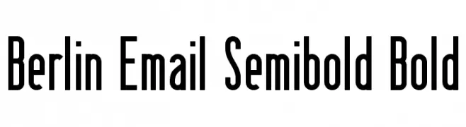
A bold, modern font with tall, narrow characters and a strong vertical emphasis.
![Berlin Email Semibold Bold フリーフォントのダウンロード]() ダウンロード 810 ダウンロード数@WebFont
ダウンロード 810 ダウンロード数@WebFont -
( Copyright (c) 2010, 2011 Johan Aakerlund (aajohan@gmail.com) )
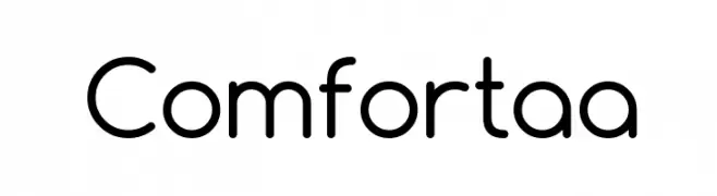
A modern, rounded typeface with clean lines and balanced spacing.
![Comfortaa フリーフォントのダウンロード]() ダウンロード 15433 ダウンロード数@WebFont
ダウンロード 15433 ダウンロード数@WebFont -
( Copyright 2011 The Comfortaa Project Authors (https://github.com/alexeiva/comfortaa), with Reserved Font Name "Comfortaa". )
A modern, rounded font with clean lines and balanced proportions.
![Comfortaa Bold フリーフォントのダウンロード]() ダウンロード 18842 ダウンロード数@WebFont
ダウンロード 18842 ダウンロード数@WebFont -
![Comfortaa Thin フリーフォントのダウンロード]() ダウンロード 7086 ダウンロード数@WebFont
ダウンロード 7086 ダウンロード数@WebFont


FAQ — フォントトレンド
いま注目のフォント傾向は?
シンプルさ、可読性、人間味がキーワード。丸みのあるサンセリフ、コントラスト強めのセリフ、 上品なレトロ回帰が広く使われています。
いま流行している具体的なフォントは?
など、モダンさと普遍性のバランスが取れた書体が選ばれています。 Web、パッケージ、SNS のビジュアルで清潔感と表現力を両立できます。
トレンドフォントの賢い使い方は?
見出しに映えるディスプレイ、本文にシンプルなサンセリフの組み合わせが定番です。 端末やサイズが変わっても読みやすいかを必ずテストしましょう。
💡 ヒント: 数か月ごとに トレンド書体 を差し替えると、ビジュアルの鮮度と発見性(SEO)を保てます。