家
コメントを読む
コメント
-
#1 With the bases loaded you struck us out with that anwser! Jul 02 2011
-
#2 That's way the besstet answer so far! Jul 17 2011
-
#3 It's spooky how clveer some ppl are. Thanks! Sep 07 2011
-
#4 This is way more helpful than anything else I've loeokd at. Mar 29 2012
-
#5 The one I find obscure sotmeimes is l for litre. It can be mistaken in many fonts for a 1, especially if written without a space. If there is a space it can look like an I. Maybe that's why you often see ltr or litre used to avoid confusion. May 02 2012
-
#6 Normally I'm against killnig but this article slaughtered my ignorance. May 13 2012
-
#7 YMMD with that anwser! TX Jun 24 2012
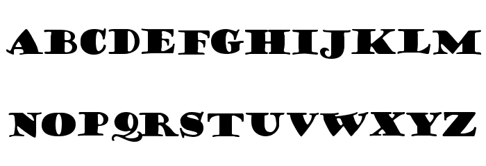
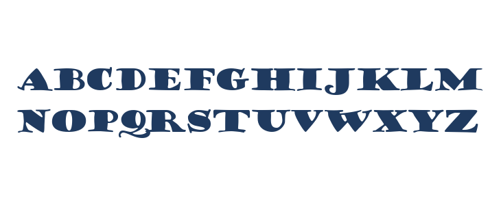
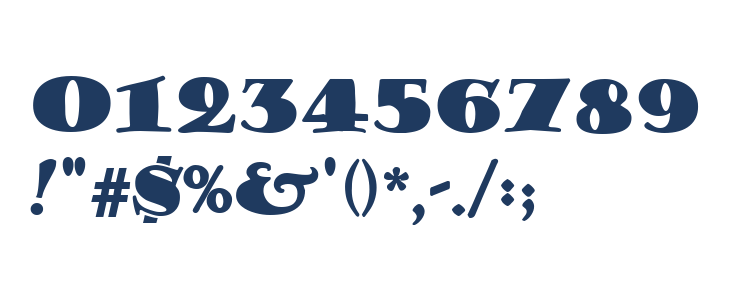
Porter Lil' Kaps フォント

- ダウンロード: 1,243
- portt2.ttf
- フォント: Porter Lil' Kaps
- 重量: Normal
- バージョン: Version 1.0 Mon Nov 29 21:01:12 1993
- 文字の番号:: 151
- エンコーディングスキーム:
- 固定ピッチか: いいえ
Glyphs ! # $ % ( ) * + , - . / 0 1 2 3 4 5 6 7 8 9 : ; = ? @ A B C D E F G H I J K L M N O P Q R S T U V W X Y Z [ ] ^ _
大文字
小文字
その他の文字
Gallery Examples


フリーフォントのダウンロード
-
 Porter Regular ダウンロードする Porter Regular
 -
Rider Condensed ExtraBlack Italic ダウンロードする Rider Condensed ExtraBlack Italic


商業 フォント


フォント 商業
-
Buy font Ohno Fatface 14 Pt Squished 商業
-
Buy font Ohno Fatface 14 Pt Narrow 商業
-
Buy font Ohno Fatface 14 Pt Condensed 商業
-
Buy font Ohno Fatface 14 Pt Compressed 商業
-
Buy font Ohno Fatface 12 Pt 商業
-
Buy font Ohno Fatface 12 Pt Squished 商業
-
Buy font Ohno Fatface 12 Pt Narrow 商業
-
Buy font Ohno Fatface 12 Pt Condensed 商業
-
Buy font Ohno Fatface 12 Pt Compressed 商業
-
Buy font Despina Pro 商業
-
Buy font Despina Alternate Pro 商業
-
Buy font Duende Pro Regular 商業
-
Buy font Duende Light Pro Light 商業
-
Buy font RooneySans Regular 商業
-
Buy font RooneySans Regular Italic 商業
-
Buy font Ballinger Mono Regular 商業
-
Buy font Ballinger Mono Medium 商業
-
Buy font Ballinger Mono Bold 商業