フォント
Ruglhe フォント
説明
- フォント: Ruglhe
- ウェイト:
- バージョン:
- 文字数::
- エンコード方式:
- 等幅: 0
フォントトレンド のページへようこそ。今のデザインを形作る書体をすばやく把握できます。 ブランド刷新、SNS クリエイティブ、Web UI などを最新の空気感に保ちましょう。
今季最も トレンド な書体を世界中のクリエイターの選択から収集。 上品なセリフ、ミニマルなサンセリフ、存在感のあるディスプレイ、温かみのあるスクリプトが 2025 年の美意識を彩ります。
見出しにトレンド書体、本文に普遍的なカテゴリ── Modern、Serif、Handwritten を組み合わせて、バランスのよいタイポグラフィに。
-
( Fonts by a kmzero font foundry - www.zetafonts.com. Personal-use only. For commercial use please contact owner. )
A bold, modern font with tall, slightly condensed characters and a sleek appearance.
 ダウンロード 1527 ダウンロード数@WebFont
 -
( Fonts by a kmzero font foundry - www.zetafonts.com. Personal-use only. For commercial use please contact owner. )
A bold, modern, and condensed font with a geometric structure.
![Prozak フリーフォントのダウンロード]() ダウンロード 1509 ダウンロード数@WebFont
ダウンロード 1509 ダウンロード数@WebFont -
( Fonts by a kmzero font foundry - www.zetafonts.com. Personal-use only. For commercial use please contact owner. )
A modern, narrow sans-serif font with consistent stroke width and clean lines.
![Prozak Light フリーフォントのダウンロード]() ダウンロード 1153 ダウンロード数@WebFont
ダウンロード 1153 ダウンロード数@WebFont -
( Fonts by Manfred Klein - manfred-klein.ina-mar.com )
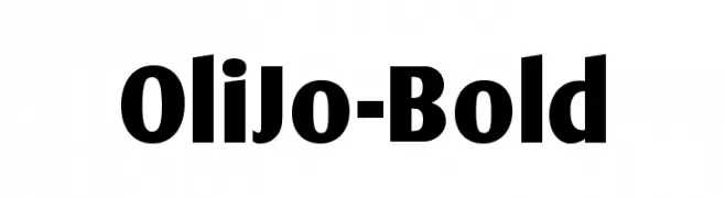
A bold, modern typeface with strong lines and a commanding presence.
![OliJo-Bold フリーフォントのダウンロード]() ダウンロード 3005 ダウンロード数@WebFont
ダウンロード 3005 ダウンロード数@WebFont -
( Fonts by Audrius Skersys - www.extate.lt )
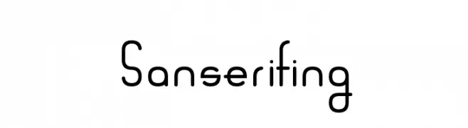
A modern, geometric font with consistent stroke widths and a minimalist design.
![Sanserifing フリーフォントのダウンロード]() ダウンロード 605 ダウンロード数@WebFont
ダウンロード 605 ダウンロード数@WebFont -
( Fonts by a kmzero font foundry - www.zetafonts.com. Personal-use only. For commercial use please contact owner. )
A bold, modern font with a geometric and friendly design.
![Sugo フリーフォントのダウンロード]() ダウンロード 7156 ダウンロード数@WebFont
ダウンロード 7156 ダウンロード数@WebFont -
( Fonts by www.thebend.be - Dimitri Castrique )
A bold, clean sans-serif font with smooth curves and uniform strokes.
![Qlassik Bold フリーフォントのダウンロード]() ダウンロード 7179 ダウンロード数@WebFont
ダウンロード 7179 ダウンロード数@WebFont -
( Fonts by www.thebend.be - Dimitri Castrique )
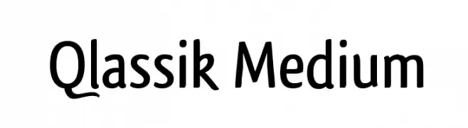
A modern, medium-weight sans-serif font with clean lines and versatile style.
![Qlassik Medium フリーフォントのダウンロード]() ダウンロード 4485 ダウンロード数@WebFont
ダウンロード 4485 ダウンロード数@WebFont


FAQ — フォントトレンド
いま注目のフォント傾向は?
シンプルさ、可読性、人間味がキーワード。丸みのあるサンセリフ、コントラスト強めのセリフ、 上品なレトロ回帰が広く使われています。
いま流行している具体的なフォントは?
など、モダンさと普遍性のバランスが取れた書体が選ばれています。 Web、パッケージ、SNS のビジュアルで清潔感と表現力を両立できます。
トレンドフォントの賢い使い方は?
見出しに映えるディスプレイ、本文にシンプルなサンセリフの組み合わせが定番です。 端末やサイズが変わっても読みやすいかを必ずテストしましょう。
💡 ヒント: 数か月ごとに トレンド書体 を差し替えると、ビジュアルの鮮度と発見性(SEO)を保てます。