フォント
SF Willamette Extended Bold フォント
説明
- SF Willamette Extended Bold.ttf
- フォント: SF Willamette Extended Bold
- ウェイト: Bold
- バージョン: Version ver 1.0; 1999. Freeware for non-commercial use.
- 文字数:: 184
- エンコード方式:
- 等幅: 0
フォントトレンド のページへようこそ。今のデザインを形作る書体をすばやく把握できます。 ブランド刷新、SNS クリエイティブ、Web UI などを最新の空気感に保ちましょう。
今季最も トレンド な書体を世界中のクリエイターの選択から収集。 上品なセリフ、ミニマルなサンセリフ、存在感のあるディスプレイ、温かみのあるスクリプトが 2025 年の美意識を彩ります。
見出しにトレンド書体、本文に普遍的なカテゴリ── Modern、Serif、Handwritten を組み合わせて、バランスのよいタイポグラフィに。
-
( Fonts by www.planet.dk )
A futuristic, geometric font with bold, uniform strokes and a modern aesthetic.
 ダウンロード 1001 ダウンロード数@WebFont
 -
![LVDC Papicon フリーフォントのダウンロード]() ダウンロード 403 ダウンロード数@WebFont
ダウンロード 403 ダウンロード数@WebFont -
![Vandiana Platin Lite フリーフォントのダウンロード]() ダウンロード 1291 ダウンロード数@WebFont
ダウンロード 1291 ダウンロード数@WebFont -
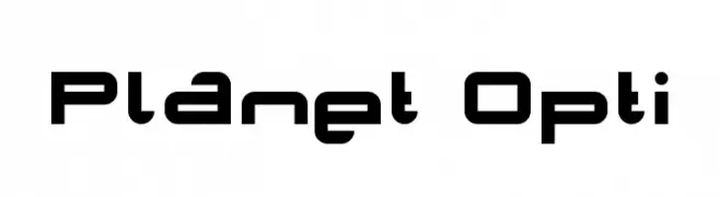
( Fonts by www.planet.dk )
A futuristic, geometric font with rounded edges and consistent line thickness.
![Planet Space フリーフォントのダウンロード]() ダウンロード 777 ダウンロード数@WebFont
ダウンロード 777 ダウンロード数@WebFont -
![V5 Ampon Slanted フリーフォントのダウンロード]() ダウンロード 620 ダウンロード数@WebFont
ダウンロード 620 ダウンロード数@WebFont -
![V5 Ampon Warped フリーフォントのダウンロード]() ダウンロード 383 ダウンロード数@WebFont
ダウンロード 383 ダウンロード数@WebFont -
![V5 Ampon Upright フリーフォントのダウンロード]() ダウンロード 470 ダウンロード数@WebFont
ダウンロード 470 ダウンロード数@WebFont -
( Fonts by Daniel Zadorozny - www.iconian.com - Free for personal use )
Bold, italicized font with a college varsity style and outlined characters.
![Exedore College Italic フリーフォントのダウンロード]() ダウンロード 246 ダウンロード数@WebFont
ダウンロード 246 ダウンロード数@WebFont


FAQ — フォントトレンド
いま注目のフォント傾向は?
シンプルさ、可読性、人間味がキーワード。丸みのあるサンセリフ、コントラスト強めのセリフ、 上品なレトロ回帰が広く使われています。
いま流行している具体的なフォントは?
など、モダンさと普遍性のバランスが取れた書体が選ばれています。 Web、パッケージ、SNS のビジュアルで清潔感と表現力を両立できます。
トレンドフォントの賢い使い方は?
見出しに映えるディスプレイ、本文にシンプルなサンセリフの組み合わせが定番です。 端末やサイズが変わっても読みやすいかを必ずテストしましょう。
💡 ヒント: 数か月ごとに トレンド書体 を差し替えると、ビジュアルの鮮度と発見性(SEO)を保てます。