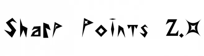
Sharp Points 2.0 Font
✎ Broken
📄 PostScript
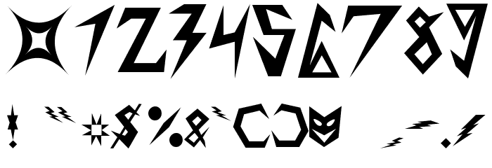
🔢 99 文字
⬇ 484
✅ 無料
✅ Web Font

このフォントには 99 文字が含まれています。文字をクリックして詳細を表示。
数字と記号
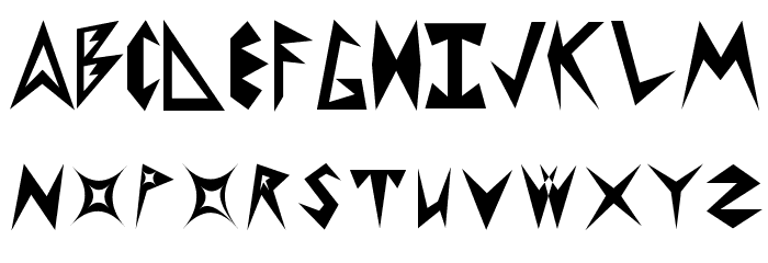
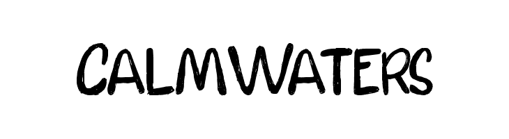
SHARP-POINTS-20 大文字
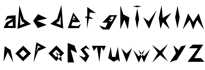
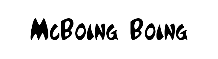
SHARP-POINTS-20 小文字
SHARP-POINTS-20 その他の文字
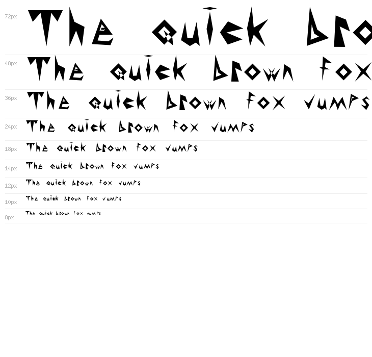
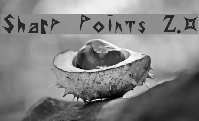
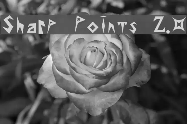
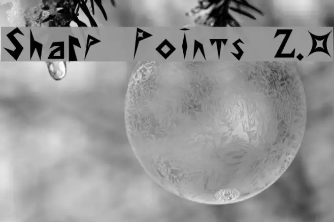
ギャラリー例
似た無料フォント
似た商用フォント


名刺

SNSヘッダー

ロゴ
ポスター

情報
| 名前 | Sharp Points 2.0 |
| TTF Name | NewSharp.ttf |
| フォントファミリー | 1 |
| Style | 1 |
| フォーマット | PostScript (.ttf) |
| ファイル | Sharp-Points-20.zip |
| ウェイト | American BaddAss |
| バージョン | Version 2.0 Th April 18 7:44 P.M. 2002 |
| 文字数: | 99 |
| ダウンロード数 | 484 |
| 追加日 | 2009-05-22 |
| 更新日 | 2024-12-07 |
| カテゴリ | Broken |
| 太字 | Yes |
| イタリック | No |
| 幅 | Normal |
| 文字間隔 | Monospaced |
| コントラスト | High |
| 全体的なスタイル | Modern, Edgy |
| 用途 | Headlines, Logos, Posters |
| おすすめプロジェクト | Ideal for music album covers, video game titles, posters, and branding for edgy or modern products. |
| 等幅 | No |
| Web Font | 利用可能 |
| ライセンス | 個人利用無料 |
タグ
💻 Windows
- ZIPを解凍
- .ttfを右クリック -> インストール
🍎 macOS
- ZIPを解凍
- .ttfをダブルクリック -> フォントをインストール
Sharp Points 2.0
無料 · PostScript
| 名前 | Sharp Points 2.0 |
| タイプ | PostScript |
| 文字 | 99 |
| ダウンロード数 | 484 |
| 追加日 | 2009-05-22 |
| Web Font | 利用可能 |
| カテゴリ | Broken |