フォント
Sinkin Sans 500 Medium Italic フォント
説明
- SinkinSans-500MediumItalic.ttf
- フォント: Sinkin Sans 500 Medium Italic
- ウェイト: 500 Medium Italic
- バージョン: Version Sinkin Sans [version 1.0] by Keith Bates " © 2014 www.k-type.com
- 文字数:: 415
- エンコード方式:
- 等幅: 0
フォントトレンド のページへようこそ。今のデザインを形作る書体をすばやく把握できます。 ブランド刷新、SNS クリエイティブ、Web UI などを最新の空気感に保ちましょう。
今季最も トレンド な書体を世界中のクリエイターの選択から収集。 上品なセリフ、ミニマルなサンセリフ、存在感のあるディスプレイ、温かみのあるスクリプトが 2025 年の美意識を彩ります。
見出しにトレンド書体、本文に普遍的なカテゴリ── Modern、Serif、Handwritten を組み合わせて、バランスのよいタイポグラフィに。
-
 ダウンロード 1809 ダウンロード数@WebFont
 -
( Fonts by Nick Curtis - www.nicksfonts.com )
A bold, angular font with a futuristic, space-age design.
![SpacePatrol フリーフォントのダウンロード]() ダウンロード 2585 ダウンロード数@WebFont
ダウンロード 2585 ダウンロード数@WebFont -
![POSTOFFICE フリーフォントのダウンロード]() ダウンロード 4831 ダウンロード数@WebFont
ダウンロード 4831 ダウンロード数@WebFont -
( Fonts by Rick Mueller )
A bold, dynamic script font with flowing, energetic letterforms.
![Speedline フリーフォントのダウンロード]() ダウンロード 7878 ダウンロード数@WebFont
ダウンロード 7878 ダウンロード数@WebFont -
( Fonts by Philippe BLONDEL www.philing.net )
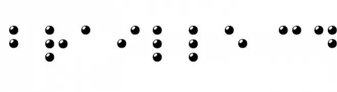
A 3D visual representation of Braille characters using raised spherical dots.
![Braille 3D フリーフォントのダウンロード]() ダウンロード 2597 ダウンロード数@WebFont
ダウンロード 2597 ダウンロード数@WebFont -
![HMBlackOvalThree フリーフォントのダウンロード]() ダウンロード 346 ダウンロード数@WebFont
ダウンロード 346 ダウンロード数@WebFont -
![Paddy1 フリーフォントのダウンロード]() ダウンロード 230 ダウンロード数@WebFont
ダウンロード 230 ダウンロード数@WebFont -
![SPDoric フリーフォントのダウンロード]() ダウンロード 732 ダウンロード数@WebFont
ダウンロード 732 ダウンロード数@WebFont


FAQ — フォントトレンド
いま注目のフォント傾向は?
シンプルさ、可読性、人間味がキーワード。丸みのあるサンセリフ、コントラスト強めのセリフ、 上品なレトロ回帰が広く使われています。
いま流行している具体的なフォントは?
など、モダンさと普遍性のバランスが取れた書体が選ばれています。 Web、パッケージ、SNS のビジュアルで清潔感と表現力を両立できます。
トレンドフォントの賢い使い方は?
見出しに映えるディスプレイ、本文にシンプルなサンセリフの組み合わせが定番です。 端末やサイズが変わっても読みやすいかを必ずテストしましょう。
💡 ヒント: 数か月ごとに トレンド書体 を差し替えると、ビジュアルの鮮度と発見性(SEO)を保てます。