フォント
The Quakeer フォント
説明
- The Quakeer.ttf
- フォント: The Quakeer
- ウェイト:
- バージョン:
- 文字数::
- エンコード方式:
- 等幅: 0
フォントトレンド のページへようこそ。今のデザインを形作る書体をすばやく把握できます。 ブランド刷新、SNS クリエイティブ、Web UI などを最新の空気感に保ちましょう。
今季最も トレンド な書体を世界中のクリエイターの選択から収集。 上品なセリフ、ミニマルなサンセリフ、存在感のあるディスプレイ、温かみのあるスクリプトが 2025 年の美意識を彩ります。
見出しにトレンド書体、本文に普遍的なカテゴリ── Modern、Serif、Handwritten を組み合わせて、バランスのよいタイポグラフィに。
-
( Fonts by Colorful Typhoon - http://orange.s56.xrea.com/blog/ )
A bold, brushstroke font with a textured, hand-painted look.
 ダウンロード 428 ダウンロード数@WebFont
 -
![Puff Angel フリーフォントのダウンロード]() ダウンロード 269 ダウンロード数
ダウンロード 269 ダウンロード数 -
![Lethargic BRK フリーフォントのダウンロード]() ダウンロード 356 ダウンロード数@WebFont
ダウンロード 356 ダウンロード数@WebFont -
( Fonts by Graham Meade - GemFonts )
A bold, artistic freehand font with dynamic strokes and a lively appearance.
![Ulse Freehand フリーフォントのダウンロード]() ダウンロード 400 ダウンロード数@WebFont
ダウンロード 400 ダウンロード数@WebFont -
![invader フリーフォントのダウンロード]() ダウンロード 273 ダウンロード数@WebFont
ダウンロード 273 ダウンロード数@WebFont -
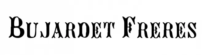
![Bujardet Freres フリーフォントのダウンロード]() ダウンロード 556 ダウンロード数@WebFont
ダウンロード 556 ダウンロード数@WebFont -
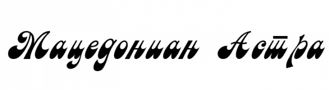
![Macedonian Astra フリーフォントのダウンロード]() ダウンロード 719 ダウンロード数@WebFont
ダウンロード 719 ダウンロード数@WebFont -
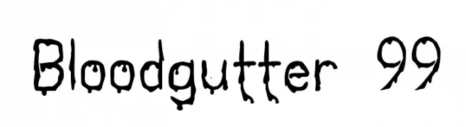
![Bloodgutter 99 フリーフォントのダウンロード]() ダウンロード 691 ダウンロード数@WebFont
ダウンロード 691 ダウンロード数@WebFont


FAQ — フォントトレンド
いま注目のフォント傾向は?
シンプルさ、可読性、人間味がキーワード。丸みのあるサンセリフ、コントラスト強めのセリフ、 上品なレトロ回帰が広く使われています。
いま流行している具体的なフォントは?
など、モダンさと普遍性のバランスが取れた書体が選ばれています。 Web、パッケージ、SNS のビジュアルで清潔感と表現力を両立できます。
トレンドフォントの賢い使い方は?
見出しに映えるディスプレイ、本文にシンプルなサンセリフの組み合わせが定番です。 端末やサイズが変わっても読みやすいかを必ずテストしましょう。
💡 ヒント: 数か月ごとに トレンド書体 を差し替えると、ビジュアルの鮮度と発見性(SEO)を保てます。