人気フォント セクションへようこそ。ここでは「よくダウンロードされ、よく使われている」実績ある書体をまとめています。 ロゴ、Web、SNS のどれにも使いやすい、外さない選択肢が見つかります。
どの トップフォント も、バランス・可読性・汎用性で高評価です。 モダン・サンセリフ、エレガントなスクリプト、ヴィンテージなセリフ、ミニマルなディスプレイなどを厳選しています。
-
( Fonts by CannotIntoSpaceFonts - KineticPlasma Fonts - Personal-use only. For commercial use please contact owner. )
A playful, handwritten font with a casual and friendly appearance.
 ダウンロード 100 ダウンロード数@WebFont
 -
( Fonts by Woodcutter Manero - http://www.woodcutter.es - Personal-use only. For commercial use please contact owner. )
A bold, graffiti-inspired font with a rough, hand-drawn texture.
![María Mercedes Graffiti Shop フリーフォントのダウンロード]() ダウンロード 100 ダウンロード数@WebFont
ダウンロード 100 ダウンロード数@WebFont -
( Fonts by Luedecke Design Font Co. - ldfonts.weebly.com )
A hand-drawn, vintage-style font with sketch-like, decorative elements.
![HistorianPencil フリーフォントのダウンロード]() ダウンロード 100 ダウンロード数@WebFont
ダウンロード 100 ダウンロード数@WebFont -
( Fonts by www.junkohanhero.com - Personal-use only. For commercial use please contact owner. )
A distressed, grunge-style font with a bold, ink-splattered appearance.
![Typistys DIRT フリーフォントのダウンロード]() ダウンロード 100 ダウンロード数@WebFont
ダウンロード 100 ダウンロード数@WebFont -
( Fonts by Markonah Creative - Personal-use only. For commercial use please contact owner. )
A bold, expressive script font with playful, interconnected characters.
![Betharia フリーフォントのダウンロード]() ダウンロード 100 ダウンロード数@WebFont
ダウンロード 100 ダウンロード数@WebFont -
-
( Fonts by Nirmala Creative )
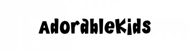
A playful, bold, and hand-drawn font with a childlike charm.
![Adorable Kids フリーフォントのダウンロード]() ダウンロード 100 ダウンロード数@WebFont
ダウンロード 100 ダウンロード数@WebFont -
( Fonts by Daniel Zadorozny - www.iconian.com - Free for personal use )
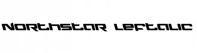
A futuristic, angular font with a dynamic slant and bold geometric shapes.
![Northstar Leftalic フリーフォントのダウンロード]() ダウンロード 100 ダウンロード数@WebFont
ダウンロード 100 ダウンロード数@WebFont -
( Copyright 2019 The Livvic Project Authors (https://github.com/Fonthausen/Livvic) )
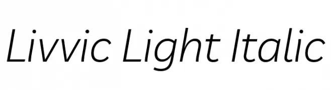
A sleek, modern, light italic sans-serif font with excellent readability.
![Livvic Light Italic フリーフォントのダウンロード]() ダウンロード 100 ダウンロード数@WebFont
ダウンロード 100 ダウンロード数@WebFont -
( Fonts by Style-7 - www.styleseven.com - Personal-use only. For commercial use please contact owner. )
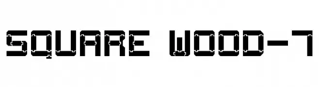
A bold, geometric font with an industrial, mechanical design.
![Square Wood-7 フリーフォントのダウンロード]() ダウンロード 100 ダウンロード数@WebFont
ダウンロード 100 ダウンロード数@WebFont -
( Fonts by Iconian Fonts )
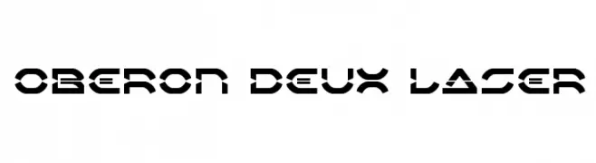
A futuristic, geometric font with bold, angular letterforms and a stencil-like appearance.
![Oberon Deux Laser フリーフォントのダウンロード]() ダウンロード 100 ダウンロード数@WebFont
ダウンロード 100 ダウンロード数@WebFont

今のトップフォントは?
は、クリーンな造形と広い適用範囲で支持を集めています。 ブランディングからランディングページ、ポスターまで活躍します。
ロゴで人気のフォントは?
幾何学系の サンセリフ(例: Poppins、Gotham 系のファミリー)は、スケーラブルでクリーンな印象に最適。 親しみやすさを出すなら スクリプト や手書き系も定番です。 見出しは力強く、本文はニュートラルに──この組み合わせが認知とバランスを高めます。
人気リストはどのくらいの頻度で更新される?
ダウンロード数やエンゲージメントに基づき定期的に更新します。 こまめにチェックして、次に流行るフォントを先取りしましょう。
💡 ヒント: このページをブックマークしておくと便利です。トレンドは速く、今のトップが明日のリブランディングを導くこともあります。