人気フォント セクションへようこそ。ここでは「よくダウンロードされ、よく使われている」実績ある書体をまとめています。 ロゴ、Web、SNS のどれにも使いやすい、外さない選択肢が見つかります。
どの トップフォント も、バランス・可読性・汎用性で高評価です。 モダン・サンセリフ、エレガントなスクリプト、ヴィンテージなセリフ、ミニマルなディスプレイなどを厳選しています。
-
( Fonts by twinletter - Rozikan - Personal-use only. For commercial use please contact owner. )
A bold, playful script font with a handwritten style.
 ダウンロード 99 ダウンロード数@WebFont
 -
( SSI.Scraps - Syukur Setiyadi - www.creativefabrica.com/designer/syukursetiyadi/ )
An elegant, flowing script font with ornate uppercase and connected lowercase letters.
![Aisy Khadijah フリーフォントのダウンロード]() ダウンロード 99 ダウンロード数@WebFont
ダウンロード 99 ダウンロード数@WebFont -
( Fonts by Daniel Zadorozny - www.iconian.com )
A bold, outlined font with sharp, angular edges and a geometric style.
![Wolf's Bane II Outline フリーフォントのダウンロード]() ダウンロード 99 ダウンロード数@WebFont
ダウンロード 99 ダウンロード数@WebFont -
( Fonts by www.typodermicfonts.com - Ray Larabie )
A dynamic, calligraphic font with bold, sweeping strokes and high contrast.
![MapofYou-Regular フリーフォントのダウンロード]() ダウンロード 99 ダウンロード数@WebFont
ダウンロード 99 ダウンロード数@WebFont -
( Fonts by Ann )
A playful, handwritten font with a casual and friendly style.
![Boldbolder Hand Regular フリーフォントのダウンロード]() ダウンロード 99 ダウンロード数@WebFont
ダウンロード 99 ダウンロード数@WebFont -
-
( Fonts by Peter Wiegel - www.peter-wiegel.de - Personal-use only. For commercial use please contact owner. )
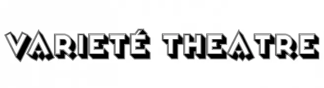
A bold, three-dimensional font with a dynamic, theatrical style.
![Varieté Theatre フリーフォントのダウンロード]() ダウンロード 99 ダウンロード数@WebFont
ダウンロード 99 ダウンロード数@WebFont -
( Fonts by Andrew McCluskey - nalgames.com )
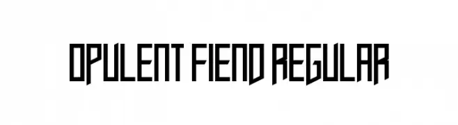
A bold, geometric font with sharp angles and a modern, edgy aesthetic.
![Opulent Fiend Regular フリーフォントのダウンロード]() ダウンロード 99 ダウンロード数@WebFont
ダウンロード 99 ダウンロード数@WebFont -
( Fonts by Manfred Klein. Free for private and charity use. Free for commercial with donation to organizations )
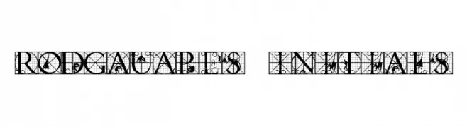
An intricate and decorative uppercase font with geometric and ornamental details.
![RodGauApes Initials フリーフォントのダウンロード]() ダウンロード 99 ダウンロード数@WebFont
ダウンロード 99 ダウンロード数@WebFont -
( Fonts by Manfred Klein. Free for private and charity use. Free for commercial with donation to organizations )
A decorative set of starburst and cog-shaped vector frames.
![VectoryStarFrames フリーフォントのダウンロード]() ダウンロード 99 ダウンロード数@WebFont
ダウンロード 99 ダウンロード数@WebFont -
( Fonts by Khurasan )
A playful, bold font with rounded, bubbly characters perfect for fun and whimsical designs.
![Pop Sweet フリーフォントのダウンロード]() ダウンロード 99 ダウンロード数@WebFont
ダウンロード 99 ダウンロード数@WebFont


今のトップフォントは?
は、クリーンな造形と広い適用範囲で支持を集めています。 ブランディングからランディングページ、ポスターまで活躍します。
ロゴで人気のフォントは?
幾何学系の サンセリフ(例: Poppins、Gotham 系のファミリー)は、スケーラブルでクリーンな印象に最適。 親しみやすさを出すなら スクリプト や手書き系も定番です。 見出しは力強く、本文はニュートラルに──この組み合わせが認知とバランスを高めます。
人気リストはどのくらいの頻度で更新される?
ダウンロード数やエンゲージメントに基づき定期的に更新します。 こまめにチェックして、次に流行るフォントを先取りしましょう。
💡 ヒント: このページをブックマークしておくと便利です。トレンドは速く、今のトップが明日のリブランディングを導くこともあります。