人気フォント セクションへようこそ。ここでは「よくダウンロードされ、よく使われている」実績ある書体をまとめています。 ロゴ、Web、SNS のどれにも使いやすい、外さない選択肢が見つかります。
どの トップフォント も、バランス・可読性・汎用性で高評価です。 モダン・サンセリフ、エレガントなスクリプト、ヴィンテージなセリフ、ミニマルなディスプレイなどを厳選しています。
-
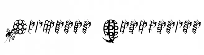
( Fonts by Manfred Klein. Free for private and charity use. Free for commercial with donation to organizations )
A decorative font featuring climbers and intricate patterns within circular shapes.
 ダウンロード 98 ダウンロード数@WebFont
 -
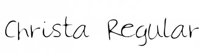
( Fonts by Altsys Metamorphosis )
A playful handwritten font with irregular strokes and a lively appearance.
![Christa Regular フリーフォントのダウンロード]() ダウンロード 98 ダウンロード数@WebFont
ダウンロード 98 ダウンロード数@WebFont -
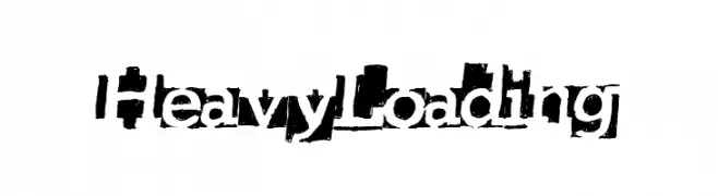
( Fonts by a Max Infeld - XEROGRAPHER FONTS - xerographer.blogspot.com . Personal-use only. For commercial use please contact owner. )
A bold, distressed font with a grunge aesthetic and uneven edges.
![HeavyLoading フリーフォントのダウンロード]() ダウンロード 98 ダウンロード数@WebFont
ダウンロード 98 ダウンロード数@WebFont -
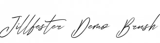
( Fonts by Edric Studio - Personal-use only. For commercial use please contact owner. )
A fluid and elegant brush script font with dynamic, cursive strokes.
![Jillfester Demo Brush フリーフォントのダウンロード]() ダウンロード 98 ダウンロード数@WebFont
ダウンロード 98 ダウンロード数@WebFont -
![Reckless Catfish Heavy フリーフォントのダウンロード]() ダウンロード 98 ダウンロード数@WebFont
ダウンロード 98 ダウンロード数@WebFont -
-
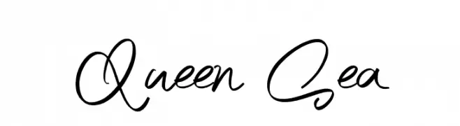
( Fonts by Burhan Afif - hanscostudio.com - Personal-use only. For commercial use please contact owner. )
A lively cursive font with fluid, interconnected characters and varying stroke thickness.
![Queen Sea フリーフォントのダウンロード]() ダウンロード 98 ダウンロード数@WebFont
ダウンロード 98 ダウンロード数@WebFont -
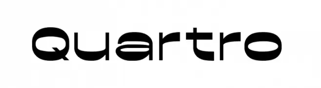
( Fonts by Brainware Graphic - Muhammad Jauhar Azmi - Personal-use only. For commercial use please contact owner. )
A bold, geometric font with a modern and futuristic aesthetic.
![Quartro フリーフォントのダウンロード]() ダウンロード 98 ダウンロード数@WebFont
ダウンロード 98 ダウンロード数@WebFont -
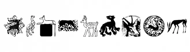
( Fonts by Manfred Klein. Free for private and charity use. Free for commercial with donation to organizations )
Decorative font with ancient-style animal illustrations.
![MAnimalsK フリーフォントのダウンロード]() ダウンロード 98 ダウンロード数@WebFont
ダウンロード 98 ダウンロード数@WebFont -
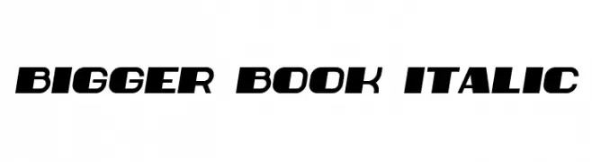
( Vladimir Nikolic - www.coroflot.com/vladimirnikolic )
A bold, italic font with a dynamic and modern style.
![Bigger Book Italic フリーフォントのダウンロード]() ダウンロード 98 ダウンロード数@WebFont
ダウンロード 98 ダウンロード数@WebFont -
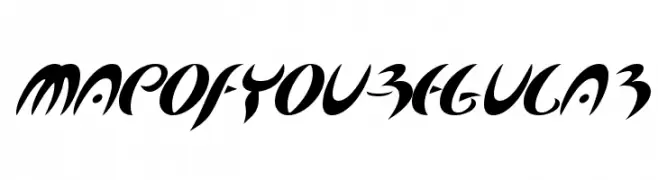
( Fonts by www.typodermicfonts.com - Ray Larabie )
A dynamic, calligraphic font with bold, sweeping strokes and high contrast.
![MapofYou-Regular フリーフォントのダウンロード]() ダウンロード 98 ダウンロード数@WebFont
ダウンロード 98 ダウンロード数@WebFont
今のトップフォントは?
は、クリーンな造形と広い適用範囲で支持を集めています。 ブランディングからランディングページ、ポスターまで活躍します。
ロゴで人気のフォントは?
幾何学系の サンセリフ(例: Poppins、Gotham 系のファミリー)は、スケーラブルでクリーンな印象に最適。 親しみやすさを出すなら スクリプト や手書き系も定番です。 見出しは力強く、本文はニュートラルに──この組み合わせが認知とバランスを高めます。
人気リストはどのくらいの頻度で更新される?
ダウンロード数やエンゲージメントに基づき定期的に更新します。 こまめにチェックして、次に流行るフォントを先取りしましょう。
💡 ヒント: このページをブックマークしておくと便利です。トレンドは速く、今のトップが明日のリブランディングを導くこともあります。