人気フォント セクションへようこそ。ここでは「よくダウンロードされ、よく使われている」実績ある書体をまとめています。 ロゴ、Web、SNS のどれにも使いやすい、外さない選択肢が見つかります。
どの トップフォント も、バランス・可読性・汎用性で高評価です。 モダン・サンセリフ、エレガントなスクリプト、ヴィンテージなセリフ、ミニマルなディスプレイなどを厳選しています。
-
( Fonts by Manfred Klein. Free for private and charity use. Free for commercial with donation to organizations )
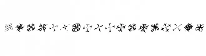
A decorative, abstract font with geometric, starburst-like characters.
 ダウンロード 98 ダウンロード数@WebFont
 -
( Fonts by Daniel Zadorozny - www.iconian.com - Free for personal use )
A dynamic, italic font with sharp, angular edges and a futuristic style.
![Tigershark Laser Italic フリーフォントのダウンロード]() ダウンロード 98 ダウンロード数@WebFont
ダウンロード 98 ダウンロード数@WebFont -
( Fonts by Daniel Zadorozny - www.iconian.com )
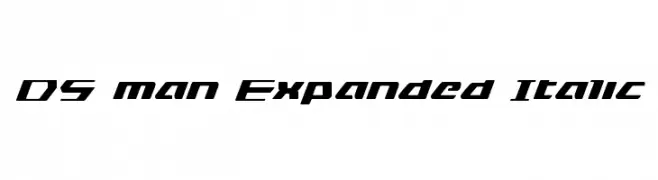
A bold, expanded italic font with a modern, angular design.
![DS man Expanded Italic フリーフォントのダウンロード]() ダウンロード 98 ダウンロード数@WebFont
ダウンロード 98 ダウンロード数@WebFont -
( Fonts by Carrot Rope - typewhatyouloveandletitkillyou.tumblr.com. Personal-use only. For commercial use please contact owner. )
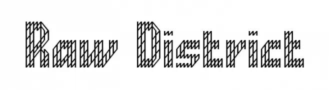
A decorative font with diagonal striped patterns, offering a bold and modern look.
![Raw District フリーフォントのダウンロード]() ダウンロード 98 ダウンロード数@WebFont
ダウンロード 98 ダウンロード数@WebFont -
( Fonts by Manfred Klein. Free for private and charity use. Free for commercial with donation to organizations )
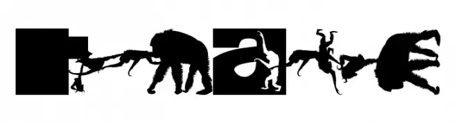
A playful font featuring monkey silhouettes integrated into bold, blocky characters.
![TypoApish フリーフォントのダウンロード]() ダウンロード 98 ダウンロード数@WebFont
ダウンロード 98 ダウンロード数@WebFont -
-
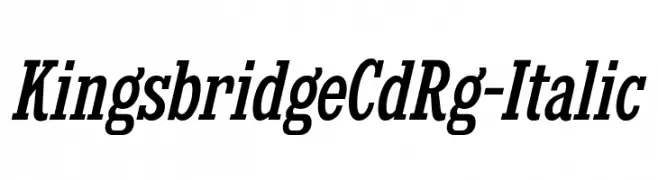
( Fonts by Typodermic Fonts )
A classic serif font with a pronounced italic slant, offering elegance and readability.
![KingsbridgeCdRg-Italic フリーフォントのダウンロード]() ダウンロード 98 ダウンロード数@WebFont
ダウンロード 98 ダウンロード数@WebFont -
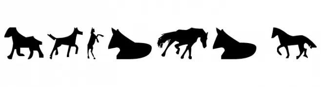
( Fonts by Ding Bang )
Silhouette pictogram font featuring horses and equestrian scenes.
![Horses 1 フリーフォントのダウンロード]() ダウンロード 98 ダウンロード数@WebFont
ダウンロード 98 ダウンロード数@WebFont -
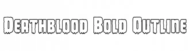
( Fonts by Daniel Zadorozny - www.iconian.com )
A bold, outlined font with a dripping, horror-themed style.
![Deathblood Bold Outline フリーフォントのダウンロード]() ダウンロード 98 ダウンロード数@WebFont
ダウンロード 98 ダウンロード数@WebFont -
( Fonts by Manfred Klein. Free for private and charity use. Free for commercial with donation to organizations )
An artistic, pictorial display font with each character as a unique illustration.
![ArtGoesPixeled フリーフォントのダウンロード]() ダウンロード 98 ダウンロード数@WebFont
ダウンロード 98 ダウンロード数@WebFont -
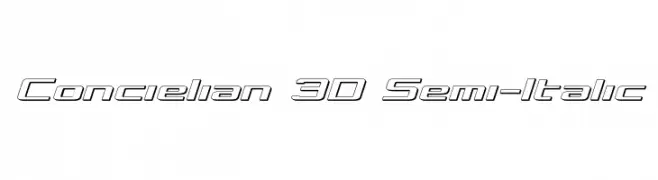
( Fonts by Daniel Zadorozny - www.iconian.com - Free for personal use )
A 3D semi-italic font with outlined characters and a futuristic style.
![Concielian 3D Semi-Italic フリーフォントのダウンロード]() ダウンロード 98 ダウンロード数@WebFont
ダウンロード 98 ダウンロード数@WebFont

今のトップフォントは?
は、クリーンな造形と広い適用範囲で支持を集めています。 ブランディングからランディングページ、ポスターまで活躍します。
ロゴで人気のフォントは?
幾何学系の サンセリフ(例: Poppins、Gotham 系のファミリー)は、スケーラブルでクリーンな印象に最適。 親しみやすさを出すなら スクリプト や手書き系も定番です。 見出しは力強く、本文はニュートラルに──この組み合わせが認知とバランスを高めます。
人気リストはどのくらいの頻度で更新される?
ダウンロード数やエンゲージメントに基づき定期的に更新します。 こまめにチェックして、次に流行るフォントを先取りしましょう。
💡 ヒント: このページをブックマークしておくと便利です。トレンドは速く、今のトップが明日のリブランディングを導くこともあります。