人気フォント セクションへようこそ。ここでは「よくダウンロードされ、よく使われている」実績ある書体をまとめています。 ロゴ、Web、SNS のどれにも使いやすい、外さない選択肢が見つかります。
どの トップフォント も、バランス・可読性・汎用性で高評価です。 モダン・サンセリフ、エレガントなスクリプト、ヴィンテージなセリフ、ミニマルなディスプレイなどを厳選しています。
-
( Fonts by Vladimir Nikolic )
A bold, decorative font with a 3D effect and dotted pattern, ideal for retro or playful designs.
 ダウンロード 97 ダウンロード数@WebFont
 -
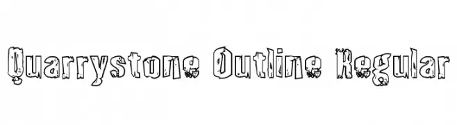
( Fonts by Daniel Zadorozny - www.iconian.com - Free for personal use )
A rugged, distressed outline font with a bold, weathered appearance.
![Quarrystone Outline Regular フリーフォントのダウンロード]() ダウンロード 97 ダウンロード数@WebFont
ダウンロード 97 ダウンロード数@WebFont -
( Fonts by Michael Muranaka - muraknockout.com - Personal-use only. For commercial use please contact owner. )
A graffiti-inspired font with sharp, angular lines and dynamic curves.
![BlackbookTwo フリーフォントのダウンロード]() ダウンロード 97 ダウンロード数@WebFont
ダウンロード 97 ダウンロード数@WebFont -
( Måns Grebäck - www.mansgreback.com )
A bold, italicized font with a modern and dynamic style.
![Roona Sans Black PERSONAL Italic フリーフォントのダウンロード]() ダウンロード 97 ダウンロード数@WebFont
ダウンロード 97 ダウンロード数@WebFont -
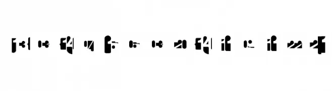
( Fonts by Manfred Klein. Free for private and charity use. Free for commercial with donation to organizations )
A bold, modern stencil-style font with geometric shapes and clean lines.
![CalendarDigits フリーフォントのダウンロード]() ダウンロード 97 ダウンロード数@WebFont
ダウンロード 97 ダウンロード数@WebFont -
-
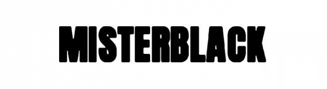
( Fonts by Woodcutter )
A bold, heavy font with uniform strokes and tight spacing, perfect for impactful designs.
![Mister Black フリーフォントのダウンロード]() ダウンロード 97 ダウンロード数@WebFont
ダウンロード 97 ダウンロード数@WebFont -
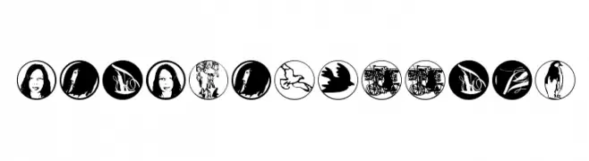
( Fonts by Manfred Klein. Free for private and charity use. Free for commercial with donation to organizations )
Circular pictogram font with people and symbolic silhouettes.
![PeopleButtons フリーフォントのダウンロード]() ダウンロード 97 ダウンロード数@WebFont
ダウンロード 97 ダウンロード数@WebFont -
( Fonts by Wino S Kadir - weknow - www.revolge.com/shop/weknow/ - Personal-use only. For commercial use please contact owner. )
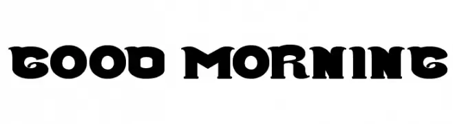
A bold, playful font with decorative, exaggerated serifs.
![Good Morning フリーフォントのダウンロード]() ダウンロード 97 ダウンロード数@WebFont
ダウンロード 97 ダウンロード数@WebFont -
( Fonts by Bolt Cutter - www.boltcutterdesign.com - Personal-use only. For commercial use please contact owner. )
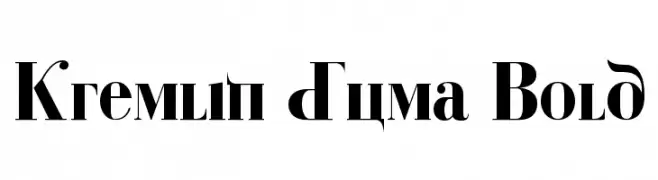
A bold, high-contrast font with ornate serifs and dramatic flourishes.
![Kremlin Duma Bold フリーフォントのダウンロード]() ダウンロード 97 ダウンロード数@WebFont
ダウンロード 97 ダウンロード数@WebFont -
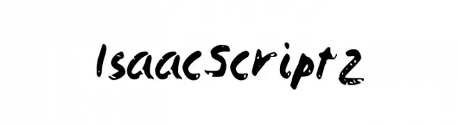
( Isaac González )
A bold, textured script font with a hand-painted, artistic style.
![IsaacScript2 フリーフォントのダウンロード]() ダウンロード 97 ダウンロード数@WebFont
ダウンロード 97 ダウンロード数@WebFont


今のトップフォントは?
は、クリーンな造形と広い適用範囲で支持を集めています。 ブランディングからランディングページ、ポスターまで活躍します。
ロゴで人気のフォントは?
幾何学系の サンセリフ(例: Poppins、Gotham 系のファミリー)は、スケーラブルでクリーンな印象に最適。 親しみやすさを出すなら スクリプト や手書き系も定番です。 見出しは力強く、本文はニュートラルに──この組み合わせが認知とバランスを高めます。
人気リストはどのくらいの頻度で更新される?
ダウンロード数やエンゲージメントに基づき定期的に更新します。 こまめにチェックして、次に流行るフォントを先取りしましょう。
💡 ヒント: このページをブックマークしておくと便利です。トレンドは速く、今のトップが明日のリブランディングを導くこともあります。