人気フォント セクションへようこそ。ここでは「よくダウンロードされ、よく使われている」実績ある書体をまとめています。 ロゴ、Web、SNS のどれにも使いやすい、外さない選択肢が見つかります。
どの トップフォント も、バランス・可読性・汎用性で高評価です。 モダン・サンセリフ、エレガントなスクリプト、ヴィンテージなセリフ、ミニマルなディスプレイなどを厳選しています。
-
( Fonts by a Neale Davidson - www.pixelsagas.com. Personal-use only. For commercial use please contact owner. )
A modern, angular font with sharp edges and geometric forms.
 ダウンロード 94 ダウンロード数@WebFont
 -
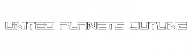
( Fonts by Daniel Zadorozny - www.iconian.com - Free for personal use )
A futuristic, geometric outline font with sharp angles and clean lines.
![United Planets Outline フリーフォントのダウンロード]() ダウンロード 94 ダウンロード数@WebFont
ダウンロード 94 ダウンロード数@WebFont -
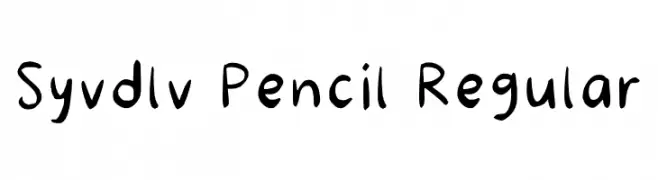
( Fonts by Syadila Melawardani )
A playful, handwritten font with a casual, pencil-drawn appearance.
![Syvdlv Pencil Regular フリーフォントのダウンロード]() ダウンロード 93 ダウンロード数@WebFont
ダウンロード 93 ダウンロード数@WebFont -
( Fonts by FatmaStudio - Fatmawati - Personal-use only. For commercial use please contact owner. )
A whimsical and elegant script font with flowing, connected letterforms.
![Hello Butterfly フリーフォントのダウンロード]() ダウンロード 93 ダウンロード数@WebFont
ダウンロード 93 ダウンロード数@WebFont -
( Fonts by Francis Studio - Francis John - Personal-use only. For commercial use please contact owner. )
A bold, expressive handwritten font with a playful and artistic flair.
![Beauty and the Beast フリーフォントのダウンロード]() ダウンロード 93 ダウンロード数@WebFont
ダウンロード 93 ダウンロード数@WebFont -
-
( Fonts by Serge Shi - Personal-use only. For commercial use please contact owner. )
A modern, geometric sans-serif font with a clean and balanced design.
![SS_Adec2.0_text フリーフォントのダウンロード]() ダウンロード 93 ダウンロード数@WebFont
ダウンロード 93 ダウンロード数@WebFont -
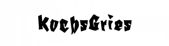
( Fonts by Manfred Klein - manfred-klein.ina-mar.com )
A bold, angular font with a Gothic-inspired, decorative style.
![KochsGries フリーフォントのダウンロード]() ダウンロード 93 ダウンロード数@WebFont
ダウンロード 93 ダウンロード数@WebFont -
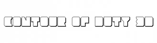
( Fonts by Iconian Fonts )
A bold, geometric 3D font with a futuristic, digital aesthetic.
![Contour of Duty 3D フリーフォントのダウンロード]() ダウンロード 93 ダウンロード数@WebFont
ダウンロード 93 ダウンロード数@WebFont -
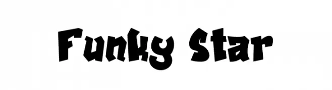
( Fonts by Asep Rendi )
A bold, playful font with exaggerated, irregular shapes and dynamic energy.
![Funky Star フリーフォントのダウンロード]() ダウンロード 93 ダウンロード数@WebFont
ダウンロード 93 ダウンロード数@WebFont -
( Noto is a trademark of Google Inc. Noto fonts are open source. All Noto fonts are published under the SIL Open Font License, Version 1.1 )
A modern, clean sans-serif font designed for clarity and readability.
![Noto Sans Arabic UI Medium フリーフォントのダウンロード]() ダウンロード 93 ダウンロード数@WebFont
ダウンロード 93 ダウンロード数@WebFont


今のトップフォントは?
は、クリーンな造形と広い適用範囲で支持を集めています。 ブランディングからランディングページ、ポスターまで活躍します。
ロゴで人気のフォントは?
幾何学系の サンセリフ(例: Poppins、Gotham 系のファミリー)は、スケーラブルでクリーンな印象に最適。 親しみやすさを出すなら スクリプト や手書き系も定番です。 見出しは力強く、本文はニュートラルに──この組み合わせが認知とバランスを高めます。
人気リストはどのくらいの頻度で更新される?
ダウンロード数やエンゲージメントに基づき定期的に更新します。 こまめにチェックして、次に流行るフォントを先取りしましょう。
💡 ヒント: このページをブックマークしておくと便利です。トレンドは速く、今のトップが明日のリブランディングを導くこともあります。