人気フォント セクションへようこそ。ここでは「よくダウンロードされ、よく使われている」実績ある書体をまとめています。 ロゴ、Web、SNS のどれにも使いやすい、外さない選択肢が見つかります。
どの トップフォント も、バランス・可読性・汎用性で高評価です。 モダン・サンセリフ、エレガントなスクリプト、ヴィンテージなセリフ、ミニマルなディスプレイなどを厳選しています。
-
( Fonts by Good Java Studio - www.creativefabrica.com/designer/goodjavastudio/ref/236564 - Personal-use only. For commercial use please contact owner. )
A bold, hand-drawn font with a playful, brush-lettering style.
 ダウンロード 93 ダウンロード数@WebFont
 -
( Fonts by Apol Sta Maria )
A playful, hand-drawn font with bold outlines and a whimsical style.
![kalansayetika フリーフォントのダウンロード]() ダウンロード 93 ダウンロード数@WebFont
ダウンロード 93 ダウンロード数@WebFont -
( Fonts by pointlab studio - Personal-use only. For commercial use please contact owner. )
An elegant script font with graceful, flowing lines and delicate curves.
![MiolletaScript フリーフォントのダウンロード]() ダウンロード 93 ダウンロード数@WebFont
ダウンロード 93 ダウンロード数@WebFont -
( Fonts by Biham Santoso - Personal-use only. For commercial use please contact owner. )
A classic serif font with elegant, elongated strokes and high contrast.
![Gellaghan フリーフォントのダウンロード]() ダウンロード 93 ダウンロード数@WebFont
ダウンロード 93 ダウンロード数@WebFont -
( Fonts by Biham Santoso - Personal-use only. For commercial use please contact owner. )
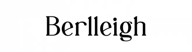
A classic serif font with elegant strokes and sharp serifs.
![Berlleigh フリーフォントのダウンロード]() ダウンロード 93 ダウンロード数@WebFont
ダウンロード 93 ダウンロード数@WebFont -
-
( Fonts by wep - Wahyu Eka Prasetya - Personal-use only. For commercial use please contact owner. )
A bold, high-contrast script font with a dynamic, handwritten style.
![Beatline_ フリーフォントのダウンロード]() ダウンロード 93 ダウンロード数@WebFont
ダウンロード 93 ダウンロード数@WebFont -
( Fonts by Ramiro Baldivieso - behance.net/baldivieso. Personal-use only. For commercial use please contact owner. )
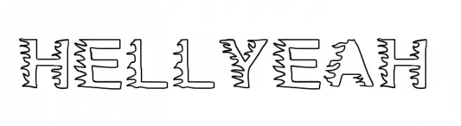
A bold, wavy outlined font with a playful and dynamic style.
![HellYeah フリーフォントのダウンロード]() ダウンロード 93 ダウンロード数@WebFont
ダウンロード 93 ダウンロード数@WebFont -
![JakAs フリーフォントのダウンロード]() ダウンロード 93 ダウンロード数@WebFont
ダウンロード 93 ダウンロード数@WebFont -
( Gabriel Mark Perida - www.theborkyperidaproject.weebly.com )
A bold, condensed serif font with italic styling for impactful and elegant designs.
![Gabriel Serif Condensed Bold Italic フリーフォントのダウンロード]() ダウンロード 93 ダウンロード数@WebFont
ダウンロード 93 ダウンロード数@WebFont -
( Fonts by Manfred Klein. Free for private and charity use. Free for commercial with donation to organizations )
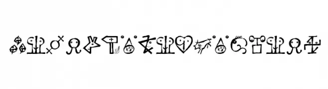
A collection of abstract, hand-drawn symbols with a tribal and artistic aesthetic.
![VectorizedSignets フリーフォントのダウンロード]() ダウンロード 93 ダウンロード数@WebFont
ダウンロード 93 ダウンロード数@WebFont


今のトップフォントは?
は、クリーンな造形と広い適用範囲で支持を集めています。 ブランディングからランディングページ、ポスターまで活躍します。
ロゴで人気のフォントは?
幾何学系の サンセリフ(例: Poppins、Gotham 系のファミリー)は、スケーラブルでクリーンな印象に最適。 親しみやすさを出すなら スクリプト や手書き系も定番です。 見出しは力強く、本文はニュートラルに──この組み合わせが認知とバランスを高めます。
人気リストはどのくらいの頻度で更新される?
ダウンロード数やエンゲージメントに基づき定期的に更新します。 こまめにチェックして、次に流行るフォントを先取りしましょう。
💡 ヒント: このページをブックマークしておくと便利です。トレンドは速く、今のトップが明日のリブランディングを導くこともあります。