人気フォント セクションへようこそ。ここでは「よくダウンロードされ、よく使われている」実績ある書体をまとめています。 ロゴ、Web、SNS のどれにも使いやすい、外さない選択肢が見つかります。
どの トップフォント も、バランス・可読性・汎用性で高評価です。 モダン・サンセリフ、エレガントなスクリプト、ヴィンテージなセリフ、ミニマルなディスプレイなどを厳選しています。
-
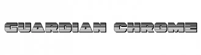
( Fonts by Daniel Zadorozny - www.iconian.com )
A bold, decorative font with a futuristic striped design.
 ダウンロード 91 ダウンロード数@WebFont
 -
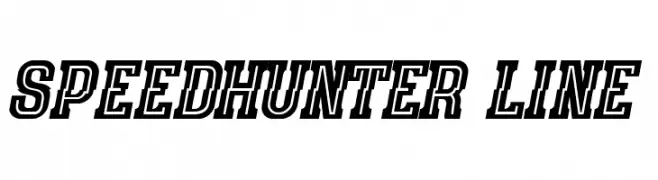
( Fonts by Peter Olexa - www.dealjumbo.com - Personal-use only. For commercial use please contact owner. )
A bold, dynamic font with a three-dimensional effect and a sense of motion.
![speedhunter line フリーフォントのダウンロード]() ダウンロード 91 ダウンロード数@WebFont
ダウンロード 91 ダウンロード数@WebFont -
![Font Social Pro フリーフォントのダウンロード]() ダウンロード 91 ダウンロード数@WebFont
ダウンロード 91 ダウンロード数@WebFont -
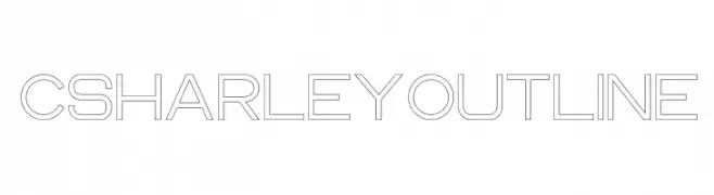
( Craft Supply Co. - creativemarket.com/craftsupplyco )
A modern, geometric outline font with a clean and structured design.
![CS Harley Outline フリーフォントのダウンロード]() ダウンロード 91 ダウンロード数@WebFont
ダウンロード 91 ダウンロード数@WebFont -
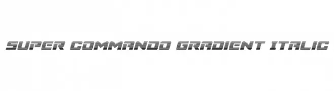
( Fonts by Daniel Zadorozny - www.iconian.com )
A bold, italicized font with a futuristic gradient effect and dynamic striped design.
![Super Commando Gradient Italic フリーフォントのダウンロード]() ダウンロード 91 ダウンロード数@WebFont
ダウンロード 91 ダウンロード数@WebFont -
-
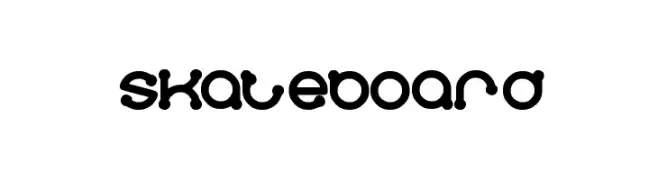
( Fonts by Wino S Kadir - weknow - www.revolge.com/shop/weknow/ - Personal-use only. For commercial use please contact owner. )
A playful, bubble-like font with rounded, bold characters.
![skateboard フリーフォントのダウンロード]() ダウンロード 91 ダウンロード数@WebFont
ダウンロード 91 ダウンロード数@WebFont -
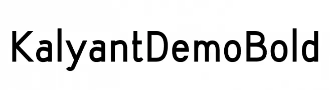
( Fonts by SIGN Studio - Sugiyanto - Personal-use only. For commercial use please contact owner. )
A bold, modern sans-serif font with a clean and geometric style.
![KalyantDemoBold フリーフォントのダウンロード]() ダウンロード 91 ダウンロード数@WebFont
ダウンロード 91 ダウンロード数@WebFont -
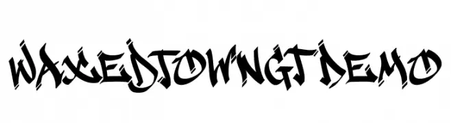
( Fonts by Gartype Studio - Gartype Studio - Personal-use only. For commercial use please contact owner. )
A bold, graffiti-inspired font with sharp, angular lines and dynamic energy.
![Waxedtown GT Demo フリーフォントのダウンロード]() ダウンロード 91 ダウンロード数@WebFont
ダウンロード 91 ダウンロード数@WebFont -
( Fonts by Manfred Klein. Free for private and charity use. Free for commercial with donation to organizations )
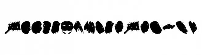
An abstract, brushstroke-inspired font with a bold and chaotic style.
![BlackStrokeBeings フリーフォントのダウンロード]() ダウンロード 91 ダウンロード数@WebFont
ダウンロード 91 ダウンロード数@WebFont -
( Fonts by Almarkhatype - Abdul Malik Wisnu - Personal-use only. For commercial use please contact owner. )
A bold, expressive handwritten font with fluid, cursive strokes.
![Someone フリーフォントのダウンロード]() ダウンロード 91 ダウンロード数@WebFont
ダウンロード 91 ダウンロード数@WebFont

今のトップフォントは?
は、クリーンな造形と広い適用範囲で支持を集めています。 ブランディングからランディングページ、ポスターまで活躍します。
ロゴで人気のフォントは?
幾何学系の サンセリフ(例: Poppins、Gotham 系のファミリー)は、スケーラブルでクリーンな印象に最適。 親しみやすさを出すなら スクリプト や手書き系も定番です。 見出しは力強く、本文はニュートラルに──この組み合わせが認知とバランスを高めます。
人気リストはどのくらいの頻度で更新される?
ダウンロード数やエンゲージメントに基づき定期的に更新します。 こまめにチェックして、次に流行るフォントを先取りしましょう。
💡 ヒント: このページをブックマークしておくと便利です。トレンドは速く、今のトップが明日のリブランディングを導くこともあります。