人気フォント セクションへようこそ。ここでは「よくダウンロードされ、よく使われている」実績ある書体をまとめています。 ロゴ、Web、SNS のどれにも使いやすい、外さない選択肢が見つかります。
どの トップフォント も、バランス・可読性・汎用性で高評価です。 モダン・サンセリフ、エレガントなスクリプト、ヴィンテージなセリフ、ミニマルなディスプレイなどを厳選しています。
-
( Fonts by Kong Font )
A bold, dynamic font with jagged, brush-like strokes and an artistic, hand-drawn feel.
 ダウンロード 91 ダウンロード数@WebFont
 -
( Fonts by Luke Owens - Personal-use only. For commercial use please contact owner. )
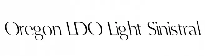
A modern, elegant font with a light, airy appearance and subtle slant.
![Oregon LDO Light Sinistral フリーフォントのダウンロード]() ダウンロード 91 ダウンロード数@WebFont
ダウンロード 91 ダウンロード数@WebFont -
( Fonts by Kong Font - fontkong.com - Personal-use only. For commercial use please contact owner. )
A bold, dynamic script font with a handwritten appearance.
![Snooky フリーフォントのダウンロード]() ダウンロード 91 ダウンロード数@WebFont
ダウンロード 91 ダウンロード数@WebFont -
( Fonts of Afrika - www.themaps.co.za/downloads.asp )
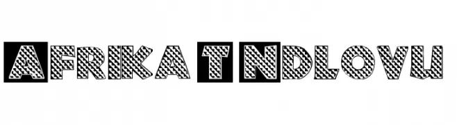
A bold, decorative font with a unique patterned fill, perfect for eye-catching designs.
![Afrika T Ndlovu フリーフォントのダウンロード]() ダウンロード 91 ダウンロード数@WebFont
ダウンロード 91 ダウンロード数@WebFont -
( Fonts by Yun Gonzalez - g3drakoheart-arts.deviantart.com - Personal-use only. For commercial use please contact owner. )
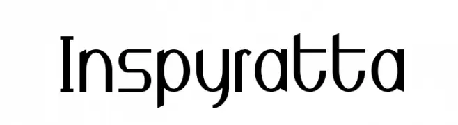
A modern, geometric font with sharp angles and smooth curves, perfect for contemporary designs.
![Inspyratta フリーフォントのダウンロード]() ダウンロード 91 ダウンロード数@WebFont
ダウンロード 91 ダウンロード数@WebFont -
-
( Fonts by Manfred Klein. Free for private and charity use. Free for commercial with donation to organizations )
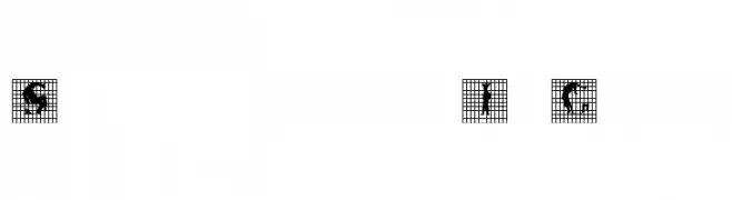
A creative font with human silhouettes integrated into each letter within a grid.
![SilhouettesInGrids フリーフォントのダウンロード]() ダウンロード 91 ダウンロード数@WebFont
ダウンロード 91 ダウンロード数@WebFont -
( Fonts by Manuel Viergutz - Typo Graphic Design - www.typographicdesign.de )
A bold, graffiti-inspired font with blocky, angular characters and a strong urban aesthetic.
![RawStreetWall Italic フリーフォントのダウンロード]() ダウンロード 91 ダウンロード数@WebFont
ダウンロード 91 ダウンロード数@WebFont -
( Fonts by Manfred Klein. Free for private and charity use. Free for commercial with donation to organizations )
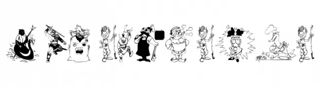
Cartoon illustration font with each glyph as a unique character drawing.
![ModernPeace フリーフォントのダウンロード]() ダウンロード 91 ダウンロード数@WebFont
ダウンロード 91 ダウンロード数@WebFont -
( Fonts by Apostrophic Lab )
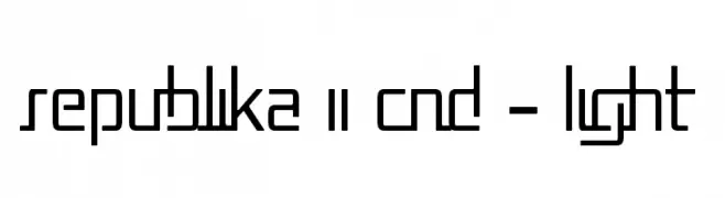
A geometric, modern font with a condensed, technical style.
![Republika II Cnd - Light フリーフォントのダウンロード]() ダウンロード 91 ダウンロード数@WebFont
ダウンロード 91 ダウンロード数@WebFont -
( Fonts by Kreative Korporation - www.kreativekorp.com )
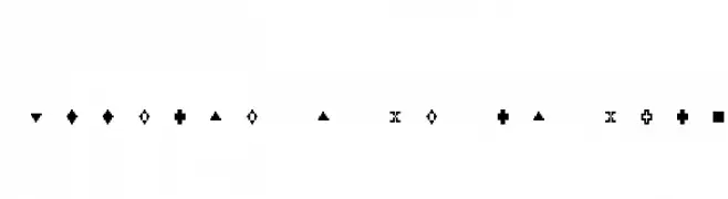
A modular, geometric symbol font with a pixel-art style.
![LisaGraph Paper 2X3Y フリーフォントのダウンロード]() ダウンロード 91 ダウンロード数@WebFont
ダウンロード 91 ダウンロード数@WebFont


今のトップフォントは?
は、クリーンな造形と広い適用範囲で支持を集めています。 ブランディングからランディングページ、ポスターまで活躍します。
ロゴで人気のフォントは?
幾何学系の サンセリフ(例: Poppins、Gotham 系のファミリー)は、スケーラブルでクリーンな印象に最適。 親しみやすさを出すなら スクリプト や手書き系も定番です。 見出しは力強く、本文はニュートラルに──この組み合わせが認知とバランスを高めます。
人気リストはどのくらいの頻度で更新される?
ダウンロード数やエンゲージメントに基づき定期的に更新します。 こまめにチェックして、次に流行るフォントを先取りしましょう。
💡 ヒント: このページをブックマークしておくと便利です。トレンドは速く、今のトップが明日のリブランディングを導くこともあります。