人気フォント セクションへようこそ。ここでは「よくダウンロードされ、よく使われている」実績ある書体をまとめています。 ロゴ、Web、SNS のどれにも使いやすい、外さない選択肢が見つかります。
どの トップフォント も、バランス・可読性・汎用性で高評価です。 モダン・サンセリフ、エレガントなスクリプト、ヴィンテージなセリフ、ミニマルなディスプレイなどを厳選しています。
-
( Fonts by Patria Ari Typestudio - Patria Ari - Personal-use only. For commercial use please contact owner. )
A modern, decorative font with tall, narrow letterforms and subtle curves.
 ダウンロード 91 ダウンロード数@WebFont
 -
( Fontscafe.com - fontscafe.com/ )
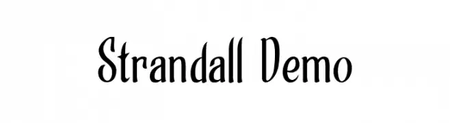
A bold, vintage serif font with decorative elements and shadow effects.
![Hot Legend Team DEMO フリーフォントのダウンロード]() ダウンロード 91 ダウンロード数@WebFont
ダウンロード 91 ダウンロード数@WebFont -
( Fonts by Ditya Ananto )
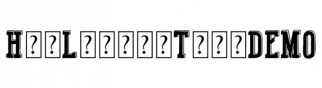
A bold, geometric stencil font with angular, fragmented strokes.
![HUFFER フリーフォントのダウンロード]() ダウンロード 91 ダウンロード数@WebFont
ダウンロード 91 ダウンロード数@WebFont -
( Fonts by Woodcutter Manero - http://www.woodcutter.es - Personal-use only. For commercial use please contact owner. )
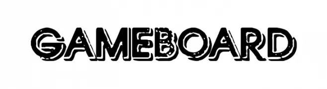
A bold, distressed font with a vintage, weathered appearance.
![Gameboard フリーフォントのダウンロード]() ダウンロード 91 ダウンロード数@WebFont
ダウンロード 91 ダウンロード数@WebFont -
( Fonts by Wino S Kadir - weknow - www.revolge.com/shop/weknow/ - Personal-use only. For commercial use please contact owner. )
A sleek, futuristic font with elongated, geometric letterforms.
![EXTRA LARGE フリーフォントのダウンロード]() ダウンロード 91 ダウンロード数@WebFont
ダウンロード 91 ダウンロード数@WebFont -
-
( Fonts by Anthony Robinson )
A bold, angular font with a modern, edgy style and a playful wave-like background.
![[FoOtY-ScArF] フリーフォントのダウンロード]() ダウンロード 91 ダウンロード数@WebFont
ダウンロード 91 ダウンロード数@WebFont -
( Fonts by Zanatlija - Personal-use only. For commercial use please contact owner. )
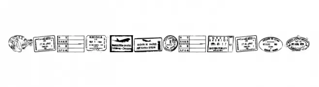
A decorative font mimicking international passport stamps and seals.
![Stamp seal tfb フリーフォントのダウンロード]() ダウンロード 91 ダウンロード数@WebFont
ダウンロード 91 ダウンロード数@WebFont -
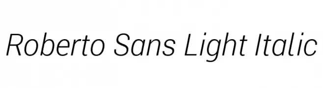
( Fonts by Google - Personal-use only. For commercial use please contact owner. )
A sleek, modern sans-serif font with a light, italic style.
![Roberto Sans Light Italic フリーフォントのダウンロード]() ダウンロード 91 ダウンロード数@WebFont
ダウンロード 91 ダウンロード数@WebFont -
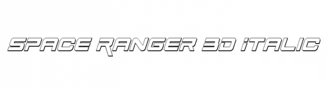
( Fonts by Daniel Zadorozny - www.iconian.com )
A bold, 3D italic font with a futuristic and geometric design.
![Space Ranger 3D Italic フリーフォントのダウンロード]() ダウンロード 91 ダウンロード数@WebFont
ダウンロード 91 ダウンロード数@WebFont -
( Fonts by Wino S Kadir - weknow - www.revolge.com/shop/weknow/ - Personal-use only. For commercial use please contact owner. )
A bold, playful font with rounded edges and a slightly italicized style.
![You Make Me Happy フリーフォントのダウンロード]() ダウンロード 91 ダウンロード数@WebFont
ダウンロード 91 ダウンロード数@WebFont


![[FoOtY-ScArF] フリーフォントのダウンロード](https://d144mzi0q5mijx.cloudfront.net/img/0/F/FoOtY-ScArF.webp)

今のトップフォントは?
は、クリーンな造形と広い適用範囲で支持を集めています。 ブランディングからランディングページ、ポスターまで活躍します。
ロゴで人気のフォントは?
幾何学系の サンセリフ(例: Poppins、Gotham 系のファミリー)は、スケーラブルでクリーンな印象に最適。 親しみやすさを出すなら スクリプト や手書き系も定番です。 見出しは力強く、本文はニュートラルに──この組み合わせが認知とバランスを高めます。
人気リストはどのくらいの頻度で更新される?
ダウンロード数やエンゲージメントに基づき定期的に更新します。 こまめにチェックして、次に流行るフォントを先取りしましょう。
💡 ヒント: このページをブックマークしておくと便利です。トレンドは速く、今のトップが明日のリブランディングを導くこともあります。