人気フォント セクションへようこそ。ここでは「よくダウンロードされ、よく使われている」実績ある書体をまとめています。 ロゴ、Web、SNS のどれにも使いやすい、外さない選択肢が見つかります。
どの トップフォント も、バランス・可読性・汎用性で高評価です。 モダン・サンセリフ、エレガントなスクリプト、ヴィンテージなセリフ、ミニマルなディスプレイなどを厳選しています。
-
( Fonts by a Max Infeld - XEROGRAPHER FONTS - xerographer.blogspot.com . Personal-use only. For commercial use please contact owner. )
A playful, futuristic font with bold strokes and dot connections.
 ダウンロード 86 ダウンロード数@WebFont
 -
( Fonts by www.studiotypo.com - Personal-use only. For commercial use please contact owner. )
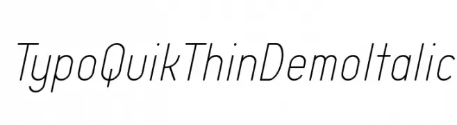
A thin, modern italic font with a sleek and elegant design.
![Typo Quik Thin Demo Italic フリーフォントのダウンロード]() ダウンロード 86 ダウンロード数@WebFont
ダウンロード 86 ダウンロード数@WebFont -
( Fonts by wep - Wahyu Eka Prasetya - Personal-use only. For commercial use please contact owner. )
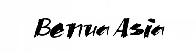
A bold, dynamic brush script font with energetic strokes.
![Benua Asia フリーフォントのダウンロード]() ダウンロード 86 ダウンロード数@WebFont
ダウンロード 86 ダウンロード数@WebFont -
( Fonts by weknow - Wino S Kadir )
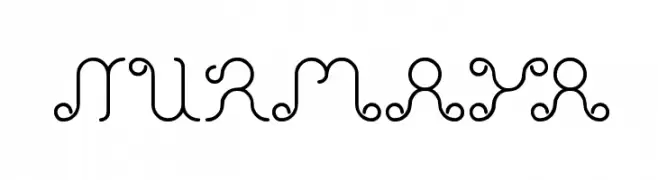
A decorative font with intricate curls and loops, offering a whimsical and artistic style.
![Nurmaya フリーフォントのダウンロード]() ダウンロード 86 ダウンロード数@WebFont
ダウンロード 86 ダウンロード数@WebFont -
( Fonts by Aditya Rezki Apriyadi - Personal-use only. For commercial use please contact owner. )
A bold, dynamic script font with flowing, cursive letterforms and high contrast.
![Mistrain フリーフォントのダウンロード]() ダウンロード 86 ダウンロード数@WebFont
ダウンロード 86 ダウンロード数@WebFont -
-
( Isurus Labs - Derik Schneider )
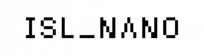
A pixelated, blocky font with a retro digital style.
![ISL_NANO フリーフォントのダウンロード]() ダウンロード 86 ダウンロード数@WebFont
ダウンロード 86 ダウンロード数@WebFont -
( Fonts by Bolt Cutter - www.boltcutterdesign.com - Personal-use only. For commercial use please contact owner. )
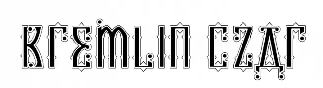
An ornate, decorative font with Eastern European influences and intricate details.
![Kremlin Czar フリーフォントのダウンロード]() ダウンロード 86 ダウンロード数@WebFont
ダウンロード 86 ダウンロード数@WebFont -
( Fonts by Pen Culture - Revo Farisky - Personal-use only. For commercial use please contact owner. )
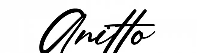
A dynamic and fluid script font with elegant, flowing strokes.
![Anitto フリーフォントのダウンロード]() ダウンロード 86 ダウンロード数@WebFont
ダウンロード 86 ダウンロード数@WebFont -
( Fonts by Faris Graphic Art - Personal-use only. For commercial use please contact owner. )
A modern, geometric font with consistent stroke width and rounded edges.
![Scenery フリーフォントのダウンロード]() ダウンロード 86 ダウンロード数@WebFont
ダウンロード 86 ダウンロード数@WebFont -
( Fonts by Letterena Studios )
A fluid, cursive script font with elegant, sweeping strokes and a handwritten appearance.
![Tightones フリーフォントのダウンロード]() ダウンロード 86 ダウンロード数@WebFont
ダウンロード 86 ダウンロード数@WebFont


今のトップフォントは?
は、クリーンな造形と広い適用範囲で支持を集めています。 ブランディングからランディングページ、ポスターまで活躍します。
ロゴで人気のフォントは?
幾何学系の サンセリフ(例: Poppins、Gotham 系のファミリー)は、スケーラブルでクリーンな印象に最適。 親しみやすさを出すなら スクリプト や手書き系も定番です。 見出しは力強く、本文はニュートラルに──この組み合わせが認知とバランスを高めます。
人気リストはどのくらいの頻度で更新される?
ダウンロード数やエンゲージメントに基づき定期的に更新します。 こまめにチェックして、次に流行るフォントを先取りしましょう。
💡 ヒント: このページをブックマークしておくと便利です。トレンドは速く、今のトップが明日のリブランディングを導くこともあります。