人気フォント セクションへようこそ。ここでは「よくダウンロードされ、よく使われている」実績ある書体をまとめています。 ロゴ、Web、SNS のどれにも使いやすい、外さない選択肢が見つかります。
どの トップフォント も、バランス・可読性・汎用性で高評価です。 モダン・サンセリフ、エレガントなスクリプト、ヴィンテージなセリフ、ミニマルなディスプレイなどを厳選しています。
-
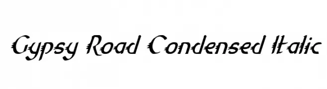
( Fonts by Daniel Zadorozny - www.iconian.com - Free for personal use )
A dynamic, edgy, and condensed italic font with sharp, jagged edges.
 ダウンロード 85 ダウンロード数@WebFont
 -
( Fonts by Letterena Studios )
Elegant handwritten script font.
![Hayrittius フリーフォントのダウンロード]() ダウンロード 85 ダウンロード数@WebFont
ダウンロード 85 ダウンロード数@WebFont -
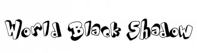
( imagex - www.imagex-fonts.com )
A bold, playful font with a unique shadow effect and rounded, irregular characters.
![World Black Shadow フリーフォントのダウンロード]() ダウンロード 85 ダウンロード数@WebFont
ダウンロード 85 ダウンロード数@WebFont -
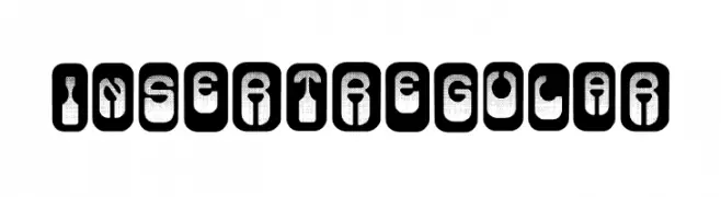
( Fonts by Vladimir Nikolic - www.creativefabrica.com/designer/vladimirnikolic/ - Personal-use only. For commercial use please contact owner. )
A bold, stencil-like font with characters enclosed in rounded rectangles, offering a modern and industrial feel.
![Insert Regular フリーフォントのダウンロード]() ダウンロード 85 ダウンロード数@WebFont
ダウンロード 85 ダウンロード数@WebFont -
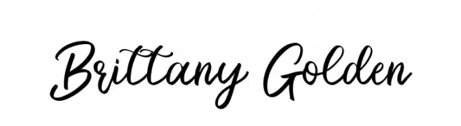
( Fonts by Bluestype Studio - Jefri Dwi Alfatah - Personal-use only. For commercial use please contact owner. )
A flowing, cursive font with elegant, sweeping curves and a sophisticated style.
![Brittany Golden フリーフォントのダウンロード]() ダウンロード 85 ダウンロード数@WebFont
ダウンロード 85 ダウンロード数@WebFont -
-
( Fonts by Maulana Creative - Gilang Maulana - Personal-use only. For commercial use please contact owner. )
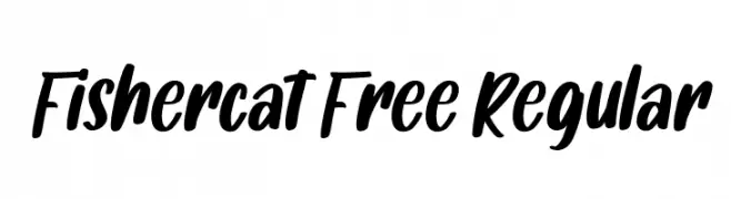
A bold, expressive handwritten font with fluid strokes and a playful style.
![Fishercat Free Regular フリーフォントのダウンロード]() ダウンロード 85 ダウンロード数@WebFont
ダウンロード 85 ダウンロード数@WebFont -
( Fonts by Manfred Klein. Free for private and charity use. Free for commercial with donation to organizations )
A decorative font with whimsical bird illustrations replacing standard characters.
![LateBirds フリーフォントのダウンロード]() ダウンロード 85 ダウンロード数@WebFont
ダウンロード 85 ダウンロード数@WebFont -
( Fonts by Noah Type - noahtype.com - Personal-use only. For commercial use please contact owner. )
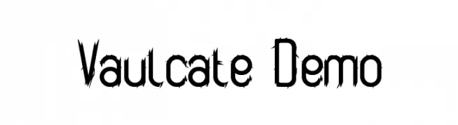
An edgy, thorny font with sharp, jagged edges for a bold look.
![Vaulcate Demo フリーフォントのダウンロード]() ダウンロード 85 ダウンロード数@WebFont
ダウンロード 85 ダウンロード数@WebFont -
( Fonts by Pizzadude - Jakob Fischer - Personal-use only. For commercial use please contact owner. )
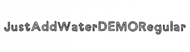
A playful, hand-drawn font with diagonal hatching and a bold, rounded style.
![Just Add Water DEMO Regular フリーフォントのダウンロード]() ダウンロード 85 ダウンロード数@WebFont
ダウンロード 85 ダウンロード数@WebFont -
( Musafir LAB )
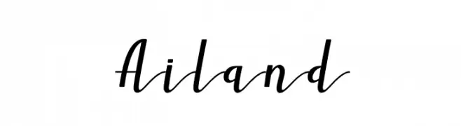
A flowing, cursive script font with elegant, sweeping strokes.
![Ailand フリーフォントのダウンロード]() ダウンロード 85 ダウンロード数@WebFont
ダウンロード 85 ダウンロード数@WebFont


今のトップフォントは?
は、クリーンな造形と広い適用範囲で支持を集めています。 ブランディングからランディングページ、ポスターまで活躍します。
ロゴで人気のフォントは?
幾何学系の サンセリフ(例: Poppins、Gotham 系のファミリー)は、スケーラブルでクリーンな印象に最適。 親しみやすさを出すなら スクリプト や手書き系も定番です。 見出しは力強く、本文はニュートラルに──この組み合わせが認知とバランスを高めます。
人気リストはどのくらいの頻度で更新される?
ダウンロード数やエンゲージメントに基づき定期的に更新します。 こまめにチェックして、次に流行るフォントを先取りしましょう。
💡 ヒント: このページをブックマークしておくと便利です。トレンドは速く、今のトップが明日のリブランディングを導くこともあります。