人気フォント セクションへようこそ。ここでは「よくダウンロードされ、よく使われている」実績ある書体をまとめています。 ロゴ、Web、SNS のどれにも使いやすい、外さない選択肢が見つかります。
どの トップフォント も、バランス・可読性・汎用性で高評価です。 モダン・サンセリフ、エレガントなスクリプト、ヴィンテージなセリフ、ミニマルなディスプレイなどを厳選しています。
-
( Fonts by Fachranheit - Fachrul Rozi - Personal-use only. For commercial use please contact owner. )
A bold, modern sans-serif font with clean lines and excellent readability.
 ダウンロード 79 ダウンロード数@WebFont
 -
( Fonts by vladimirnikolic - Personal-use only. For commercial use please contact owner. )
A sleek, modern italic font with smooth, continuous lines and a cohesive design.
![Mercy Italic フリーフォントのダウンロード]() ダウンロード 79 ダウンロード数@WebFont
ダウンロード 79 ダウンロード数@WebFont -
( Fonts by scratchones )
Bold, decorative font with framed characters and ornamental details.
![Envelope フリーフォントのダウンロード]() ダウンロード 79 ダウンロード数@WebFont
ダウンロード 79 ダウンロード数@WebFont -
( Fonts by Out of Step Font Company - Dan Steinbok - outofstepfontco.com - Personal-use only. For commercial use please contact owner. )
A graffiti-inspired script font with bold, angular letters and a rebellious flair.
![Graf Script Demo フリーフォントのダウンロード]() ダウンロード 79 ダウンロード数@WebFont
ダウンロード 79 ダウンロード数@WebFont -
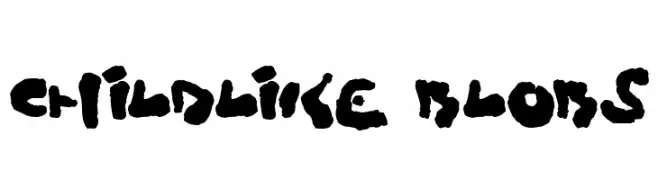
( Fonts by Darrell Flood - Personal-use only. For commercial use please contact owner. )
A playful, blob-like font with a childlike, hand-drawn appearance.
![Childlike Blobs フリーフォントのダウンロード]() ダウンロード 79 ダウンロード数@WebFont
ダウンロード 79 ダウンロード数@WebFont -
-
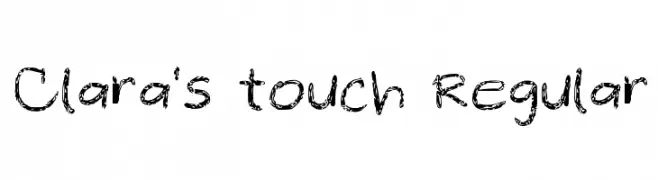
( Clara Lizano - vindicta.ph/ )
A playful, hand-drawn brushstroke font with a textured, sketch-like appearance.
![Clara's touch Regular フリーフォントのダウンロード]() ダウンロード 79 ダウンロード数@WebFont
ダウンロード 79 ダウンロード数@WebFont -
( Fonts by Alit Design - Alit Suarnegara - Personal-use only. For commercial use please contact owner. )
An edgy, hand-drawn font with sharp, irregular edges and a dramatic appearance.
![Rankday Regular フリーフォントのダウンロード]() ダウンロード 79 ダウンロード数@WebFont
ダウンロード 79 ダウンロード数@WebFont -
( Fonts by ingoFonts - Ingo Zimmermann - Personal-use only. For commercial use please contact owner. )
A classic serif font with elegant lines and balanced proportions.
![FaberSerifReduced-45Leicht フリーフォントのダウンロード]() ダウンロード 79 ダウンロード数@WebFont
ダウンロード 79 ダウンロード数@WebFont -
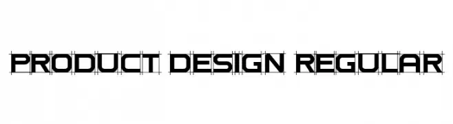
( Fonts by Vladimir Nikolic )
A modern, geometric font with a structured, technical design.
![Product Design Regular フリーフォントのダウンロード]() ダウンロード 79 ダウンロード数@WebFont
ダウンロード 79 ダウンロード数@WebFont -
( Fonts by A Mimar Hidayat - Personal-use only. For commercial use please contact owner. )
A flowing, cursive script font with elegant loops and swirls.
![AgattaScript-Regular フリーフォントのダウンロード]() ダウンロード 79 ダウンロード数@WebFont
ダウンロード 79 ダウンロード数@WebFont


今のトップフォントは?
は、クリーンな造形と広い適用範囲で支持を集めています。 ブランディングからランディングページ、ポスターまで活躍します。
ロゴで人気のフォントは?
幾何学系の サンセリフ(例: Poppins、Gotham 系のファミリー)は、スケーラブルでクリーンな印象に最適。 親しみやすさを出すなら スクリプト や手書き系も定番です。 見出しは力強く、本文はニュートラルに──この組み合わせが認知とバランスを高めます。
人気リストはどのくらいの頻度で更新される?
ダウンロード数やエンゲージメントに基づき定期的に更新します。 こまめにチェックして、次に流行るフォントを先取りしましょう。
💡 ヒント: このページをブックマークしておくと便利です。トレンドは速く、今のトップが明日のリブランディングを導くこともあります。