人気フォント セクションへようこそ。ここでは「よくダウンロードされ、よく使われている」実績ある書体をまとめています。 ロゴ、Web、SNS のどれにも使いやすい、外さない選択肢が見つかります。
どの トップフォント も、バランス・可読性・汎用性で高評価です。 モダン・サンセリフ、エレガントなスクリプト、ヴィンテージなセリフ、ミニマルなディスプレイなどを厳選しています。
-
( Fonts by Vladimir Nikolic - www.creativefabrica.com/designer/vladimirnikolic/ - Personal-use only. For commercial use please contact owner. )
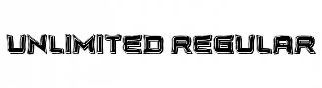
A bold, three-dimensional font with a futuristic and dynamic style.
 ダウンロード 76 ダウンロード数@WebFont
 -
( Fonts by Situjuh Nazara - 7ntypes.com - Personal-use only. For commercial use please contact owner. )
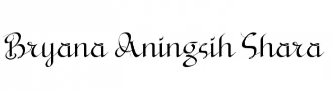
A sophisticated cursive script with decorative swirls and elegant curves.
![Bryana Aningsih Shara フリーフォントのダウンロード]() ダウンロード 76 ダウンロード数@WebFont
ダウンロード 76 ダウンロード数@WebFont -
( Fonts by Greg Medina - www.dcoxy.com - Personal-use only. For commercial use please contact owner. )
A playful, hand-drawn font with bold, rounded forms and whimsical curves.
![Mad Potato Bill フリーフォントのダウンロード]() ダウンロード 76 ダウンロード数@WebFont
ダウンロード 76 ダウンロード数@WebFont -
( Fonts by Jipatype - Anupap Jaichumnan - Personal-use only. For commercial use please contact owner. )
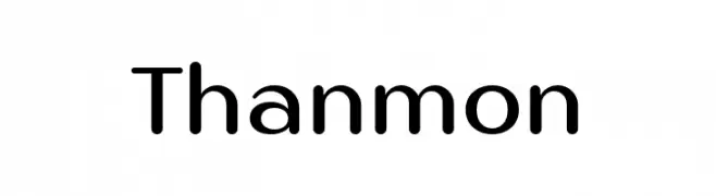
A modern, rounded sans-serif font with smooth curves and uniform stroke width.
![Thanmon フリーフォントのダウンロード]() ダウンロード 76 ダウンロード数@WebFont
ダウンロード 76 ダウンロード数@WebFont -
( Fonts by Artimasa - www.behance.net/artimasa - Personal-use only. For commercial use please contact owner. )
A bold, italicized font with a dynamic and energetic style.
![Oldways-Italic フリーフォントのダウンロード]() ダウンロード 76 ダウンロード数@WebFont
ダウンロード 76 ダウンロード数@WebFont -
-
( Luc Mahler )
A sleek, modern font with elongated, narrow characters and minimal contrast.
![Rogaton フリーフォントのダウンロード]() ダウンロード 76 ダウンロード数@WebFont
ダウンロード 76 ダウンロード数@WebFont -
( Fonts by a Max Infeld - XEROGRAPHER FONTS - xerographer.blogspot.com . Personal-use only. For commercial use please contact owner. )
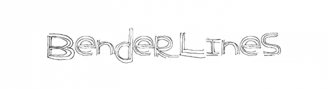
A playful, hand-drawn font with a sketch-like, artistic style.
![BenderLines フリーフォントのダウンロード]() ダウンロード 76 ダウンロード数@WebFont
ダウンロード 76 ダウンロード数@WebFont -
( Character )
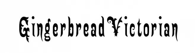
An ornate, Victorian-inspired font with intricate flourishes and decorative elements.
![GingerbreadVictorian フリーフォントのダウンロード]() ダウンロード 76 ダウンロード数@WebFont
ダウンロード 76 ダウンロード数@WebFont -
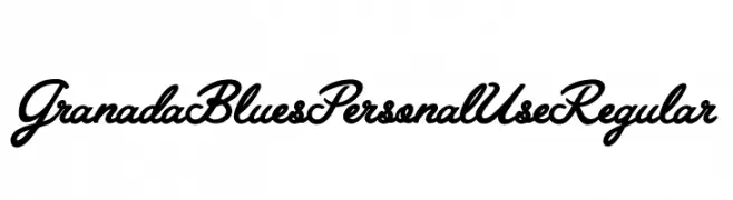
![Granada Blues Personal Use Regular フリーフォントのダウンロード]() ダウンロード 76 ダウンロード数@WebFont
ダウンロード 76 ダウンロード数@WebFont -
( Fonts by StringLabs - stringlabscreative.com - Personal-use only. For commercial use please contact owner. )
A dynamic handwritten font with fluid strokes and a natural flow.
![Rattu Aqilla フリーフォントのダウンロード]() ダウンロード 76 ダウンロード数@WebFont
ダウンロード 76 ダウンロード数@WebFont


今のトップフォントは?
は、クリーンな造形と広い適用範囲で支持を集めています。 ブランディングからランディングページ、ポスターまで活躍します。
ロゴで人気のフォントは?
幾何学系の サンセリフ(例: Poppins、Gotham 系のファミリー)は、スケーラブルでクリーンな印象に最適。 親しみやすさを出すなら スクリプト や手書き系も定番です。 見出しは力強く、本文はニュートラルに──この組み合わせが認知とバランスを高めます。
人気リストはどのくらいの頻度で更新される?
ダウンロード数やエンゲージメントに基づき定期的に更新します。 こまめにチェックして、次に流行るフォントを先取りしましょう。
💡 ヒント: このページをブックマークしておくと便利です。トレンドは速く、今のトップが明日のリブランディングを導くこともあります。