人気フォント セクションへようこそ。ここでは「よくダウンロードされ、よく使われている」実績ある書体をまとめています。 ロゴ、Web、SNS のどれにも使いやすい、外さない選択肢が見つかります。
どの トップフォント も、バランス・可読性・汎用性で高評価です。 モダン・サンセリフ、エレガントなスクリプト、ヴィンテージなセリフ、ミニマルなディスプレイなどを厳選しています。
-
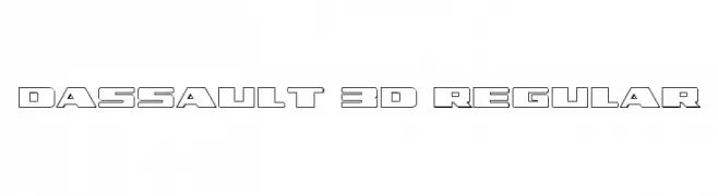
( Fonts by Daniel Zadorozny - www.iconian.com - Free for personal use )
A bold, geometric font with a 3D effect, ideal for futuristic designs.
 ダウンロード 76 ダウンロード数@WebFont
 -
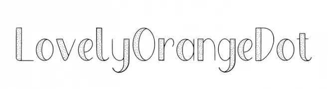
( Fonts by Almarkhatype - Abdul Malik Wisnu - Personal-use only. For commercial use please contact owner. )
A playful, dotted decorative font with a modern and whimsical style.
![Lovely Orange Dot フリーフォントのダウンロード]() ダウンロード 76 ダウンロード数@WebFont
ダウンロード 76 ダウンロード数@WebFont -
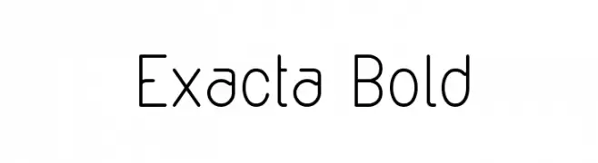
( Fonts by Manuel Ramos - www.infinitismo.com - Personal-use only. For commercial use please contact owner. )
A modern, geometric sans-serif font with a monospaced appearance and rounded edges.
![Exacta Bold フリーフォントのダウンロード]() ダウンロード 76 ダウンロード数@WebFont
ダウンロード 76 ダウンロード数@WebFont -
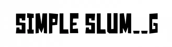
( Fonts by Goma Shin - www.geocities.jp/gomarice_font/ - Personal-use only. For commercial use please contact owner. )
A bold, angular font with an urban, hand-crafted aesthetic.
![Simple Slum__G フリーフォントのダウンロード]() ダウンロード 76 ダウンロード数@WebFont
ダウンロード 76 ダウンロード数@WebFont -
( Moon in Aquarius - web.archive.org/web/20040604012552/www.mooninaquarius.homestead.com/ )
A decorative font inspired by Kachina dolls, featuring intricate and artistic characters.
![Z-Most Kachina 2 フリーフォントのダウンロード]() ダウンロード 76 ダウンロード数@WebFont
ダウンロード 76 ダウンロード数@WebFont -
-
( Fonts by Wino S Kadir - weknow - www.revolge.com/shop/weknow/ - Personal-use only. For commercial use please contact owner. )
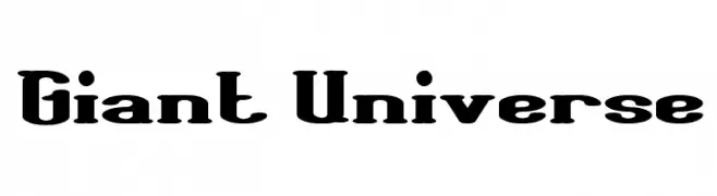
A bold slab serif font with a strong, vintage-modern appeal.
![Giant Universe フリーフォントのダウンロード]() ダウンロード 76 ダウンロード数@WebFont
ダウンロード 76 ダウンロード数@WebFont -
( Fonts by Fanastudio - Personal-use only. For commercial use please contact owner. )
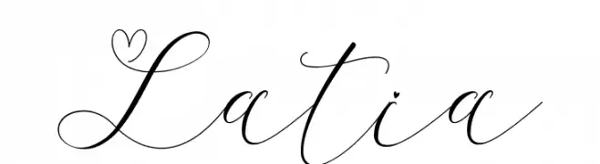
An elegant script font with graceful, flowing lines and intricate flourishes.
![Latia フリーフォントのダウンロード]() ダウンロード 76 ダウンロード数@WebFont
ダウンロード 76 ダウンロード数@WebFont -
( Fonts by Font People - Personal-use only. For commercial use please contact owner. )
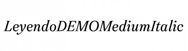
An elegant, italic serif font with medium weight and classic style.
![Leyendo DEMO Medium Italic フリーフォントのダウンロード]() ダウンロード 76 ダウンロード数@WebFont
ダウンロード 76 ダウンロード数@WebFont -
( Fonts by Woodcutter )
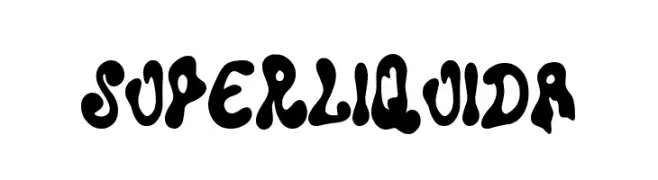
A bold, fluid, and playful font with a melting, organic appearance.
![Super Liquida フリーフォントのダウンロード]() ダウンロード 76 ダウンロード数@WebFont
ダウンロード 76 ダウンロード数@WebFont -
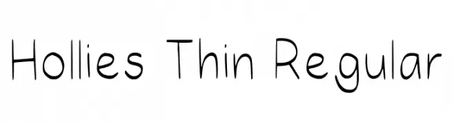
( Fonts by HollieInk )
A playful, hand-drawn style font with thin, consistent strokes.
![Hollies Thin Regular フリーフォントのダウンロード]() ダウンロード 76 ダウンロード数@WebFont
ダウンロード 76 ダウンロード数@WebFont

今のトップフォントは?
は、クリーンな造形と広い適用範囲で支持を集めています。 ブランディングからランディングページ、ポスターまで活躍します。
ロゴで人気のフォントは?
幾何学系の サンセリフ(例: Poppins、Gotham 系のファミリー)は、スケーラブルでクリーンな印象に最適。 親しみやすさを出すなら スクリプト や手書き系も定番です。 見出しは力強く、本文はニュートラルに──この組み合わせが認知とバランスを高めます。
人気リストはどのくらいの頻度で更新される?
ダウンロード数やエンゲージメントに基づき定期的に更新します。 こまめにチェックして、次に流行るフォントを先取りしましょう。
💡 ヒント: このページをブックマークしておくと便利です。トレンドは速く、今のトップが明日のリブランディングを導くこともあります。