人気フォント セクションへようこそ。ここでは「よくダウンロードされ、よく使われている」実績ある書体をまとめています。 ロゴ、Web、SNS のどれにも使いやすい、外さない選択肢が見つかります。
どの トップフォント も、バランス・可読性・汎用性で高評価です。 モダン・サンセリフ、エレガントなスクリプト、ヴィンテージなセリフ、ミニマルなディスプレイなどを厳選しています。
-
( imagex - www.imagex-fonts.com )
A bold, decorative font with intricate floral patterns inside each character.
 ダウンロード 76 ダウンロード数@WebFont
 -
( Fonts by Almaz Studio )
A bold, hand-drawn font with a grunge aesthetic and uneven strokes.
![GoGrunge フリーフォントのダウンロード]() ダウンロード 76 ダウンロード数@WebFont
ダウンロード 76 ダウンロード数@WebFont -
( Fonts by Manfred Klein. Free for private and charity use. Free for commercial with donation to organizations )
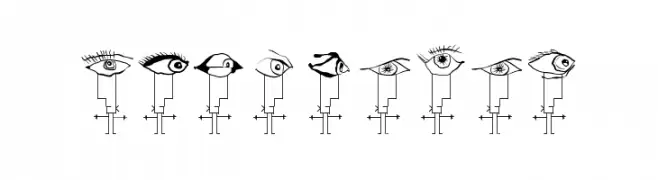
A whimsical set of stick figures with diverse eye designs as heads.
![Strokemen フリーフォントのダウンロード]() ダウンロード 76 ダウンロード数@WebFont
ダウンロード 76 ダウンロード数@WebFont -
( Isurus Labs - Derik Schneider )
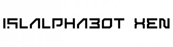
A futuristic, geometric font with sharp angles and a bold, cohesive design.
![ISL_ALPHABOT XEN フリーフォントのダウンロード]() ダウンロード 76 ダウンロード数@WebFont
ダウンロード 76 ダウンロード数@WebFont -
( Fonts by Pilcrowd )
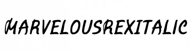
A bold, italicized handwritten font with a playful and dynamic style.
![Marvelous Rex Italic フリーフォントのダウンロード]() ダウンロード 76 ダウンロード数@WebFont
ダウンロード 76 ダウンロード数@WebFont -
-
( Fonts by D&K Project - Degi Kurniawan - Personal-use only. For commercial use please contact owner. )
A casual, script-style font with fluid, flowing strokes and a relaxed vibe.
![Sexy Beachy フリーフォントのダウンロード]() ダウンロード 76 ダウンロード数@WebFont
ダウンロード 76 ダウンロード数@WebFont -
( Fonts by Bolt Cutter - www.boltcutterdesign.com - Personal-use only. For commercial use please contact owner. )
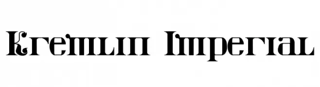
A bold, decorative font with sharp serifs and intricate detailing, inspired by traditional Slavic scripts.
![Kremlin Imperial フリーフォントのダウンロード]() ダウンロード 76 ダウンロード数@WebFont
ダウンロード 76 ダウンロード数@WebFont -
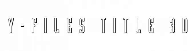
( Fonts by Iconian Fonts )
A bold, 3D outlined font with a modern and decorative style.
![Y-Files Title 3D フリーフォントのダウンロード]() ダウンロード 76 ダウンロード数@WebFont
ダウンロード 76 ダウンロード数@WebFont -
( Noto is a trademark of Google Inc. Noto fonts are open source. All Noto fonts are published under the SIL Open Font License, Version 1.1 )
A modern, extra-condensed font supporting the Thai script with clarity and elegance.
![Noto Serif Thai ExtraCondensed フリーフォントのダウンロード]() ダウンロード 76 ダウンロード数@WebFont
ダウンロード 76 ダウンロード数@WebFont -
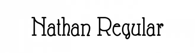
( Fonts by Peter Wiegel - www.peter-wiegel.de - Personal-use only. For commercial use please contact owner. )
A serif font combining classic elegance with modern flair.
![Nathan Regular フリーフォントのダウンロード]() ダウンロード 76 ダウンロード数@WebFont
ダウンロード 76 ダウンロード数@WebFont


今のトップフォントは?
は、クリーンな造形と広い適用範囲で支持を集めています。 ブランディングからランディングページ、ポスターまで活躍します。
ロゴで人気のフォントは?
幾何学系の サンセリフ(例: Poppins、Gotham 系のファミリー)は、スケーラブルでクリーンな印象に最適。 親しみやすさを出すなら スクリプト や手書き系も定番です。 見出しは力強く、本文はニュートラルに──この組み合わせが認知とバランスを高めます。
人気リストはどのくらいの頻度で更新される?
ダウンロード数やエンゲージメントに基づき定期的に更新します。 こまめにチェックして、次に流行るフォントを先取りしましょう。
💡 ヒント: このページをブックマークしておくと便利です。トレンドは速く、今のトップが明日のリブランディングを導くこともあります。