人気フォント セクションへようこそ。ここでは「よくダウンロードされ、よく使われている」実績ある書体をまとめています。 ロゴ、Web、SNS のどれにも使いやすい、外さない選択肢が見つかります。
どの トップフォント も、バランス・可読性・汎用性で高評価です。 モダン・サンセリフ、エレガントなスクリプト、ヴィンテージなセリフ、ミニマルなディスプレイなどを厳選しています。
-
( Fonts by Daniel Zadorozny - www.iconian.com - Free for personal use )
A playful, bold, and hand-drawn style with a whimsical and dynamic appearance.
 ダウンロード 66 ダウンロード数@WebFont
 -
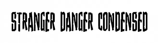
( Fonts by Daniel Zadorozny - www.iconian.com )
A bold, condensed font with a sharp, edgy style.
![Stranger Danger Condensed フリーフォントのダウンロード]() ダウンロード 66 ダウンロード数@WebFont
ダウンロード 66 ダウンロード数@WebFont -
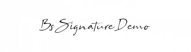
( Fonts by Bangun Studio - Personal-use only. For commercial use please contact owner. )
A sophisticated, cursive font with elegant, flowing strokes.
![Bs Signature Demo フリーフォントのダウンロード]() ダウンロード 66 ダウンロード数@WebFont
ダウンロード 66 ダウンロード数@WebFont -
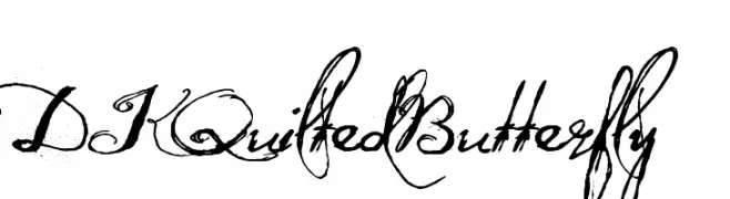
( Hanoded - David Kerkhoff - www.hanodedfonts.com )
A decorative font with whimsical swirls and butterfly embellishments.
![DK Quilted Butterfly フリーフォントのダウンロード]() ダウンロード 66 ダウンロード数@WebFont
ダウンロード 66 ダウンロード数@WebFont -
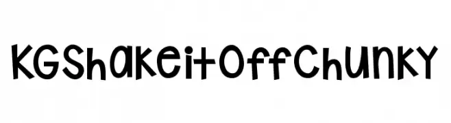
( Fonts by Kimberly Geswein - Personal-use only. For commercial use please contact owner. )
A playful, chunky, hand-drawn font with a whimsical and bold style.
![KG Shake it Off Chunky フリーフォントのダウンロード]() ダウンロード 66 ダウンロード数@WebFont
ダウンロード 66 ダウンロード数@WebFont -
-
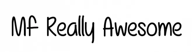
( Fonts by Misti`s Fonts - mistifonts.com - Personal-use only. For commercial use please contact owner. )
A playful, hand-drawn font with rounded, friendly characters.
![Mf Really Awesome フリーフォントのダウンロード]() ダウンロード 66 ダウンロード数@WebFont
ダウンロード 66 ダウンロード数@WebFont -
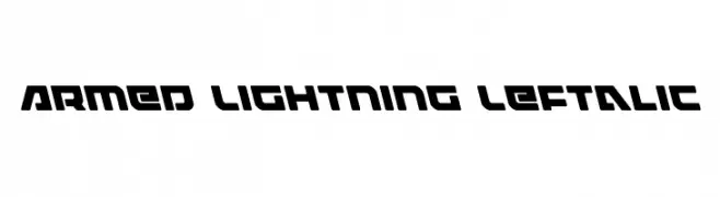
( Fonts by Iconian Fonts )
A bold, angular font with a futuristic and dynamic design.
![Armed Lightning Leftalic フリーフォントのダウンロード]() ダウンロード 66 ダウンロード数@WebFont
ダウンロード 66 ダウンロード数@WebFont -
( Fonts by Thirtypath - Personal-use only. For commercial use please contact owner. )
An elegant script font with flowing, interconnected letters and sophisticated flourishes.
![elaineighteen フリーフォントのダウンロード]() ダウンロード 66 ダウンロード数@WebFont
ダウンロード 66 ダウンロード数@WebFont -
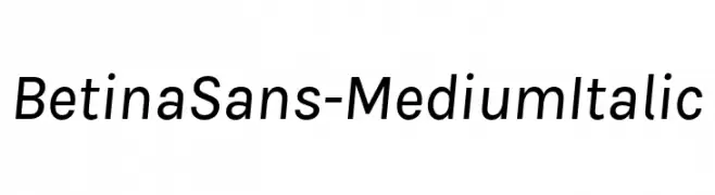
( Fonts by Jonathan Pinhorn (font) & Cristiano Sobral (main changes) - Personal-use only. For commercial use please contact owner. )
A modern, italic sans-serif font with balanced proportions and clear readability.
![BetinaSans-MediumItalic フリーフォントのダウンロード]() ダウンロード 66 ダウンロード数@WebFont
ダウンロード 66 ダウンロード数@WebFont -
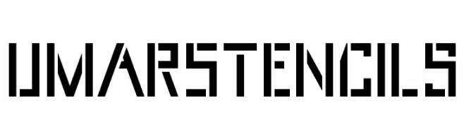
( Fonts by Mikrojihad Inc - www.behance.net/mikrojihad - Personal-use only. For commercial use please contact owner. )
A bold, geometric stencil font with sharp, angular edges.
![UmarStencils フリーフォントのダウンロード]() ダウンロード 66 ダウンロード数@WebFont
ダウンロード 66 ダウンロード数@WebFont

今のトップフォントは?
は、クリーンな造形と広い適用範囲で支持を集めています。 ブランディングからランディングページ、ポスターまで活躍します。
ロゴで人気のフォントは?
幾何学系の サンセリフ(例: Poppins、Gotham 系のファミリー)は、スケーラブルでクリーンな印象に最適。 親しみやすさを出すなら スクリプト や手書き系も定番です。 見出しは力強く、本文はニュートラルに──この組み合わせが認知とバランスを高めます。
人気リストはどのくらいの頻度で更新される?
ダウンロード数やエンゲージメントに基づき定期的に更新します。 こまめにチェックして、次に流行るフォントを先取りしましょう。
💡 ヒント: このページをブックマークしておくと便利です。トレンドは速く、今のトップが明日のリブランディングを導くこともあります。