人気フォント セクションへようこそ。ここでは「よくダウンロードされ、よく使われている」実績ある書体をまとめています。 ロゴ、Web、SNS のどれにも使いやすい、外さない選択肢が見つかります。
どの トップフォント も、バランス・可読性・汎用性で高評価です。 モダン・サンセリフ、エレガントなスクリプト、ヴィンテージなセリフ、ミニマルなディスプレイなどを厳選しています。
-
( Fonts by Gilar Studio - Personal-use only. For commercial use please contact owner. )
An elegant script font with ornate flourishes and high contrast strokes.
 ダウンロード 65 ダウンロード数@WebFont
 -
( Noem9 Studio - www.noem9studio.com )
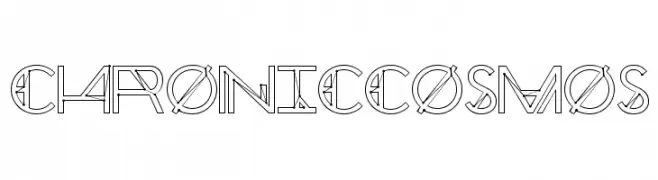
A futuristic, geometric outline font with sharp angles and dynamic design.
![Chronic Cosmos フリーフォントのダウンロード]() ダウンロード 65 ダウンロード数@WebFont
ダウンロード 65 ダウンロード数@WebFont -
( weknow - Wino S Kadir - www.creativefabrica.com/designer/weknow/ )
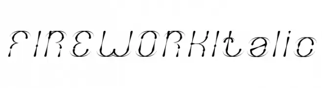
A dynamic, italic font with swirling, firework-like embellishments.
![FIREWORK Italic フリーフォントのダウンロード]() ダウンロード 65 ダウンロード数@WebFont
ダウンロード 65 ダウンロード数@WebFont -
( Fonts by www.junkohanhero.com - Personal-use only. For commercial use please contact owner. )
A bold, distressed font with a grunge, textured style.
![I tell you all my secrets フリーフォントのダウンロード]() ダウンロード 65 ダウンロード数@WebFont
ダウンロード 65 ダウンロード数@WebFont -
( Fonts by CannotIntoSpaceFonts - KineticPlasma Fonts - Personal-use only. For commercial use please contact owner. )
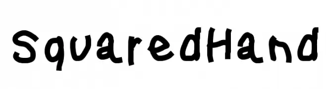
A playful, hand-drawn font with bold, irregular strokes.
![Squared Hand フリーフォントのダウンロード]() ダウンロード 65 ダウンロード数@WebFont
ダウンロード 65 ダウンロード数@WebFont -
-
( Javier Rivas - graphicriver.net/user/jrdesign08 )
An artistic, calligraphic font with sharp serifs and dynamic curves.
![Jaleas フリーフォントのダウンロード]() ダウンロード 65 ダウンロード数@WebFont
ダウンロード 65 ダウンロード数@WebFont -
( Fonts by BeauType Studio - beautique.vn - Personal-use only. For commercial use please contact owner. )
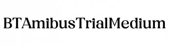
A classic serif font with medium weight and moderate contrast, offering elegance and readability.
![BT Amibus Trial Medium フリーフォントのダウンロード]() ダウンロード 65 ダウンロード数@WebFont
ダウンロード 65 ダウンロード数@WebFont -
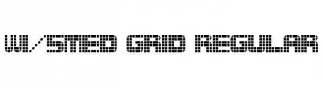
( Fonts by Winter Design Studio - winty5.wixsite.com/noahtheawesome/ - Personal-use only. For commercial use please contact owner. )
A grid-based, pixel-inspired font with a bold, modern aesthetic.
![wi/5Med Grid Regular フリーフォントのダウンロード]() ダウンロード 65 ダウンロード数@WebFont
ダウンロード 65 ダウンロード数@WebFont -
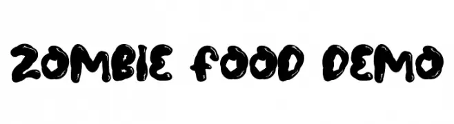
( Fonts by NihStudio )
A bold, playful font with rounded, irregular shapes and a whimsical style.
![Zombie Food Demo フリーフォントのダウンロード]() ダウンロード 65 ダウンロード数@WebFont
ダウンロード 65 ダウンロード数@WebFont -
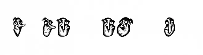
( Fonts by Vladimir Nikolic )
A whimsical, cartoon-like font with playful, hand-drawn characters.
![Hoder Regular フリーフォントのダウンロード]() ダウンロード 65 ダウンロード数@WebFont
ダウンロード 65 ダウンロード数@WebFont


今のトップフォントは?
は、クリーンな造形と広い適用範囲で支持を集めています。 ブランディングからランディングページ、ポスターまで活躍します。
ロゴで人気のフォントは?
幾何学系の サンセリフ(例: Poppins、Gotham 系のファミリー)は、スケーラブルでクリーンな印象に最適。 親しみやすさを出すなら スクリプト や手書き系も定番です。 見出しは力強く、本文はニュートラルに──この組み合わせが認知とバランスを高めます。
人気リストはどのくらいの頻度で更新される?
ダウンロード数やエンゲージメントに基づき定期的に更新します。 こまめにチェックして、次に流行るフォントを先取りしましょう。
💡 ヒント: このページをブックマークしておくと便利です。トレンドは速く、今のトップが明日のリブランディングを導くこともあります。