人気フォント セクションへようこそ。ここでは「よくダウンロードされ、よく使われている」実績ある書体をまとめています。 ロゴ、Web、SNS のどれにも使いやすい、外さない選択肢が見つかります。
どの トップフォント も、バランス・可読性・汎用性で高評価です。 モダン・サンセリフ、エレガントなスクリプト、ヴィンテージなセリフ、ミニマルなディスプレイなどを厳選しています。
-
( Fonts by Daniel Zadorozny - www.iconian.com - Free for personal use )
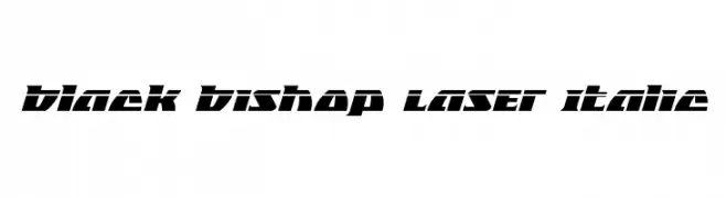
A bold, angular, and futuristic font with a dynamic slant.
 ダウンロード 65 ダウンロード数@WebFont
 -
( Fonts by Vigilante Typeface Corporation Larry Yerkes. Personal-use only. For commercial use please contact owner. )
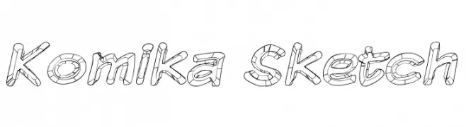
A playful, sketch-like font with a 3D effect and cartoonish style.
![Komika Sketch フリーフォントのダウンロード]() ダウンロード 65 ダウンロード数@WebFont
ダウンロード 65 ダウンロード数@WebFont -
( Fonts by Wino S Kadir - weknow - www.revolge.com/shop/weknow/ - Personal-use only. For commercial use please contact owner. )
A decorative, futuristic font with smooth, continuous curves and abstract shapes.
![graphicdream フリーフォントのダウンロード]() ダウンロード 65 ダウンロード数@WebFont
ダウンロード 65 ダウンロード数@WebFont -
( Fonts by Kong Font - Personal-use only. For commercial use please contact owner. )
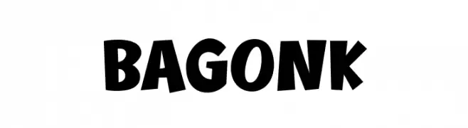
A bold, playful font with exaggerated, uneven strokes and a lively appearance.
![Bagonk フリーフォントのダウンロード]() ダウンロード 65 ダウンロード数@WebFont
ダウンロード 65 ダウンロード数@WebFont -
( Fonts by Kong Font - https://fontkong.com/ - Personal-use only. For commercial use please contact owner. )
An elegant, calligraphic font with flowing swashes and decorative flair.
![Dakiens Swash フリーフォントのダウンロード]() ダウンロード 65 ダウンロード数@WebFont
ダウンロード 65 ダウンロード数@WebFont -
-
( Fonts by Vigilante Typeface Corporation Larry Yerkes. Personal-use only. For commercial use please contact owner. )
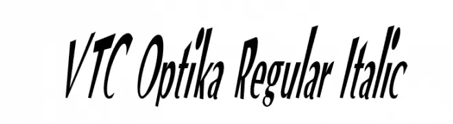
A bold, italic font with a dynamic and modern style.
![VTC Optika Regular Italic フリーフォントのダウンロード]() ダウンロード 65 ダウンロード数@WebFont
ダウンロード 65 ダウンロード数@WebFont -
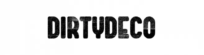
( Fonts by Woodcutter )
A bold, textured font with a distressed, vintage look.
![Dirty Deco フリーフォントのダウンロード]() ダウンロード 65 ダウンロード数@WebFont
ダウンロード 65 ダウンロード数@WebFont -
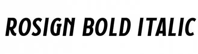
( Fonts by surotype - Adil Budianto - Personal-use only. For commercial use please contact owner. )
A bold, italicized font with strong, slanted letterforms for dynamic emphasis.
![Rosign Bold Italic フリーフォントのダウンロード]() ダウンロード 65 ダウンロード数@WebFont
ダウンロード 65 ダウンロード数@WebFont -
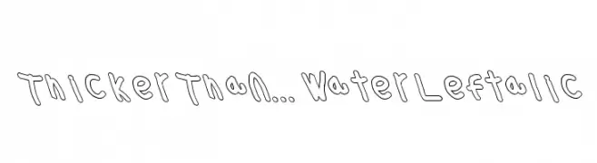
( Fonts by Cannot Into Space Fonts )
A playful, hand-drawn font with thick, uneven strokes and a whimsical style.
![Thicker Than... Water Leftalic フリーフォントのダウンロード]() ダウンロード 65 ダウンロード数@WebFont
ダウンロード 65 ダウンロード数@WebFont -
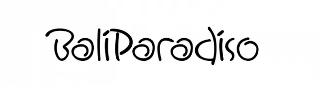
( Daddi Daryawan )
A playful and casual handwritten font with fluid, organic letterforms.
![BaliParadiso フリーフォントのダウンロード]() ダウンロード 65 ダウンロード数@WebFont
ダウンロード 65 ダウンロード数@WebFont


今のトップフォントは?
は、クリーンな造形と広い適用範囲で支持を集めています。 ブランディングからランディングページ、ポスターまで活躍します。
ロゴで人気のフォントは?
幾何学系の サンセリフ(例: Poppins、Gotham 系のファミリー)は、スケーラブルでクリーンな印象に最適。 親しみやすさを出すなら スクリプト や手書き系も定番です。 見出しは力強く、本文はニュートラルに──この組み合わせが認知とバランスを高めます。
人気リストはどのくらいの頻度で更新される?
ダウンロード数やエンゲージメントに基づき定期的に更新します。 こまめにチェックして、次に流行るフォントを先取りしましょう。
💡 ヒント: このページをブックマークしておくと便利です。トレンドは速く、今のトップが明日のリブランディングを導くこともあります。