人気フォント セクションへようこそ。ここでは「よくダウンロードされ、よく使われている」実績ある書体をまとめています。 ロゴ、Web、SNS のどれにも使いやすい、外さない選択肢が見つかります。
どの トップフォント も、バランス・可読性・汎用性で高評価です。 モダン・サンセリフ、エレガントなスクリプト、ヴィンテージなセリフ、ミニマルなディスプレイなどを厳選しています。
-
( Fonts by setyaisiam _type - Personal-use only. For commercial use please contact owner. )
A dynamic and elegant script font with a flowing, handwritten style.
 ダウンロード 62 ダウンロード数@WebFont
 -
( fontvir.us - xero harrison - fontvir.us )
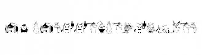
Cartoon character dingbat font with unique illustrations for each glyph.
![aqua teen hunger font フリーフォントのダウンロード]() ダウンロード 62 ダウンロード数@WebFont
ダウンロード 62 ダウンロード数@WebFont -
( weknow - Wino S Kadir - www.creativefabrica.com/designer/weknow/ )
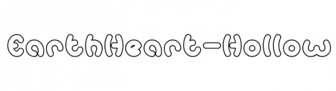
A playful, hollow, rounded font with a bubbly and friendly style.
![Earth Heart-Hollow フリーフォントのダウンロード]() ダウンロード 62 ダウンロード数@WebFont
ダウンロード 62 ダウンロード数@WebFont -
( Katz Fontz - katzfonts.50megs.com/kg.html )
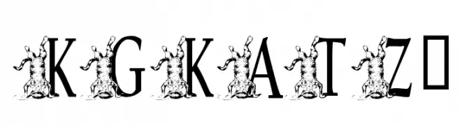
An ornate, decorative font with floral embellishments on each character.
![KGKATZ2 フリーフォントのダウンロード]() ダウンロード 62 ダウンロード数@WebFont
ダウンロード 62 ダウンロード数@WebFont -
( Fonts by Vladimir Nikolic - www.creativefabrica.com/designer/vladimirnikolic/ - Personal-use only. For commercial use please contact owner. )
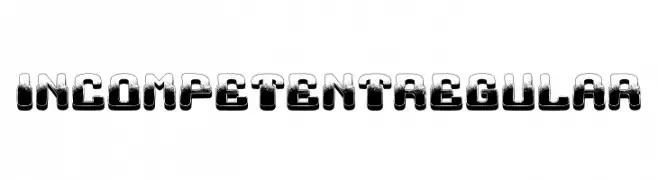
A bold, 3D font with a metallic gradient effect and rounded edges.
![Incompetent Regular フリーフォントのダウンロード]() ダウンロード 62 ダウンロード数@WebFont
ダウンロード 62 ダウンロード数@WebFont -
-
( Fonts by Amru ID - Personal-use only. For commercial use please contact owner. )
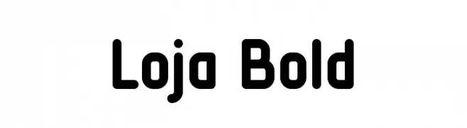
A bold, rounded font with a modern and friendly appearance.
![Loja Bold フリーフォントのダウンロード]() ダウンロード 62 ダウンロード数@WebFont
ダウンロード 62 ダウンロード数@WebFont -
( Matija Blagojevic - www.behance.net/ungrund )
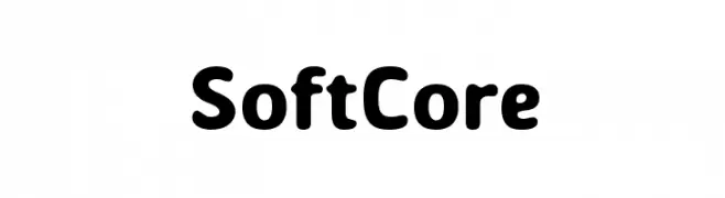
A bold, rounded font with smooth edges and uniform stroke width.
![Soft Core フリーフォントのダウンロード]() ダウンロード 62 ダウンロード数@WebFont
ダウンロード 62 ダウンロード数@WebFont -
( Murat Yegul - www.formatltd.com )
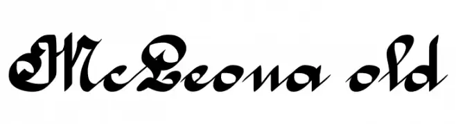
A bold, calligraphic font with ornate uppercase and flowing lowercase letters.
![McLeona Bold フリーフォントのダウンロード]() ダウンロード 62 ダウンロード数@WebFont
ダウンロード 62 ダウンロード数@WebFont -
( weknow - Wino S Kadir - www.creativefabrica.com/designer/weknow/ )
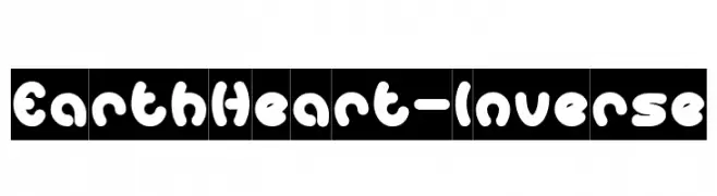
A playful, bold font with rounded, bubble-like characters perfect for creative projects.
![Earth Heart-Inverse フリーフォントのダウンロード]() ダウンロード 62 ダウンロード数@WebFont
ダウンロード 62 ダウンロード数@WebFont -
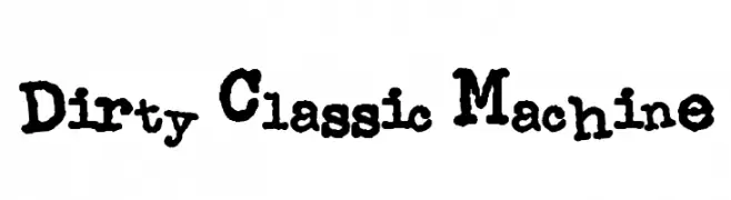
( Fonts by www.woodcutter.es - woodcutter Manero - Personal-use only. For commercial use please contact owner. )
A bold, distressed font with a vintage typewriter aesthetic.
![Dirty Classic Machine フリーフォントのダウンロード]() ダウンロード 62 ダウンロード数@WebFont
ダウンロード 62 ダウンロード数@WebFont
今のトップフォントは?
は、クリーンな造形と広い適用範囲で支持を集めています。 ブランディングからランディングページ、ポスターまで活躍します。
ロゴで人気のフォントは?
幾何学系の サンセリフ(例: Poppins、Gotham 系のファミリー)は、スケーラブルでクリーンな印象に最適。 親しみやすさを出すなら スクリプト や手書き系も定番です。 見出しは力強く、本文はニュートラルに──この組み合わせが認知とバランスを高めます。
人気リストはどのくらいの頻度で更新される?
ダウンロード数やエンゲージメントに基づき定期的に更新します。 こまめにチェックして、次に流行るフォントを先取りしましょう。
💡 ヒント: このページをブックマークしておくと便利です。トレンドは速く、今のトップが明日のリブランディングを導くこともあります。