人気フォント セクションへようこそ。ここでは「よくダウンロードされ、よく使われている」実績ある書体をまとめています。 ロゴ、Web、SNS のどれにも使いやすい、外さない選択肢が見つかります。
どの トップフォント も、バランス・可読性・汎用性で高評価です。 モダン・サンセリフ、エレガントなスクリプト、ヴィンテージなセリフ、ミニマルなディスプレイなどを厳選しています。
-
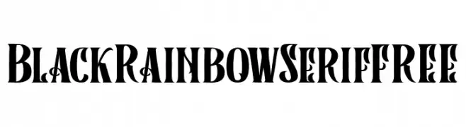
( Fonts by Vunira Design - Personal-use only. For commercial use please contact owner. )
A bold, high-contrast serif font with decorative elements and a vintage-modern aesthetic.
 ダウンロード 62 ダウンロード数@WebFont
 -
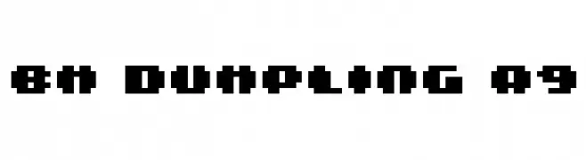
( BitmapMania - bitmapmania.m78.com/ )
A bold, pixelated font with a retro digital aesthetic.
![BM dumpling A9 フリーフォントのダウンロード]() ダウンロード 62 ダウンロード数@WebFont
ダウンロード 62 ダウンロード数@WebFont -
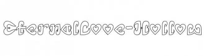
( weknow - Wino S Kadir - www.creativefabrica.com/designer/weknow/ )
A playful, heart-themed decorative font with hollow outlines.
![Eternal Love-Hollow フリーフォントのダウンロード]() ダウンロード 62 ダウンロード数@WebFont
ダウンロード 62 ダウンロード数@WebFont -
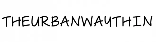
( Free for personal use - bythebutterfly.com )
A playful, handwritten font with smooth curves and a casual style.
![The Urban Way Thin フリーフォントのダウンロード]() ダウンロード 62 ダウンロード数@WebFont
ダウンロード 62 ダウンロード数@WebFont -
( Fonts by GGBotNet - Personal-use only. For commercial use please contact owner. )
A modern, elongated, and narrow font with consistent stroke width.
![Arrose フリーフォントのダウンロード]() ダウンロード 62 ダウンロード数@WebFont
ダウンロード 62 ダウンロード数@WebFont -
-
( Iconian Fonts - Daniel Zadorozny - www.iconian.com )
A bold, futuristic font with geometric and tech-inspired design.
![Quasar Pacer Laser フリーフォントのダウンロード]() ダウンロード 62 ダウンロード数@WebFont
ダウンロード 62 ダウンロード数@WebFont -
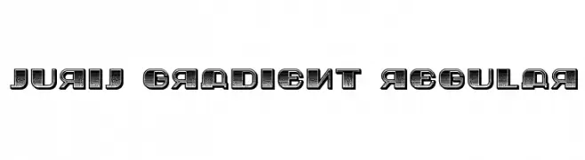
( Vladimir Nikolic - www.coroflot.com/vladimirnikolic )
A bold, gradient-effect font with a three-dimensional appearance.
![Jurij Gradient Regular フリーフォントのダウンロード]() ダウンロード 62 ダウンロード数@WebFont
ダウンロード 62 ダウンロード数@WebFont -
( Fonts by William Jeovah de Medeiros - Personal-use only. For commercial use please contact owner. )
A bold, playful font with a hand-drawn, whimsical style.
![KomixCon Bold フリーフォントのダウンロード]() ダウンロード 62 ダウンロード数@WebFont
ダウンロード 62 ダウンロード数@WebFont -
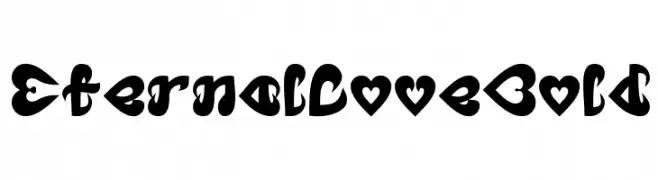
( weknow - Wino S Kadir - www.creativefabrica.com/designer/weknow/ )
A bold, heart-themed decorative font with a playful and romantic style.
![Eternal Love Bold フリーフォントのダウンロード]() ダウンロード 62 ダウンロード数@WebFont
ダウンロード 62 ダウンロード数@WebFont -
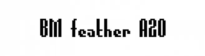
( BitmapMania - bitmapmania.m78.com/ )
A bold, pixelated font with a retro digital aesthetic.
![BM feather A20 フリーフォントのダウンロード]() ダウンロード 62 ダウンロード数@WebFont
ダウンロード 62 ダウンロード数@WebFont


今のトップフォントは?
は、クリーンな造形と広い適用範囲で支持を集めています。 ブランディングからランディングページ、ポスターまで活躍します。
ロゴで人気のフォントは?
幾何学系の サンセリフ(例: Poppins、Gotham 系のファミリー)は、スケーラブルでクリーンな印象に最適。 親しみやすさを出すなら スクリプト や手書き系も定番です。 見出しは力強く、本文はニュートラルに──この組み合わせが認知とバランスを高めます。
人気リストはどのくらいの頻度で更新される?
ダウンロード数やエンゲージメントに基づき定期的に更新します。 こまめにチェックして、次に流行るフォントを先取りしましょう。
💡 ヒント: このページをブックマークしておくと便利です。トレンドは速く、今のトップが明日のリブランディングを導くこともあります。