人気フォント セクションへようこそ。ここでは「よくダウンロードされ、よく使われている」実績ある書体をまとめています。 ロゴ、Web、SNS のどれにも使いやすい、外さない選択肢が見つかります。
どの トップフォント も、バランス・可読性・汎用性で高評価です。 モダン・サンセリフ、エレガントなスクリプト、ヴィンテージなセリフ、ミニマルなディスプレイなどを厳選しています。
-
( Fonts by Java Pep - Personal-use only. For commercial use please contact owner. )
A dynamic, italicized font with elegant, flowing characters and moderate contrast.
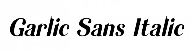 ダウンロード 62 ダウンロード数@WebFont
 -
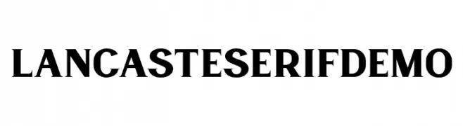
( Fonts by Runsell Studio - Personal-use only. For commercial use please contact owner. )
A bold, classic serif font with strong strokes and pronounced serifs.
![LancasteSerifDemo フリーフォントのダウンロード]() ダウンロード 62 ダウンロード数@WebFont
ダウンロード 62 ダウンロード数@WebFont -
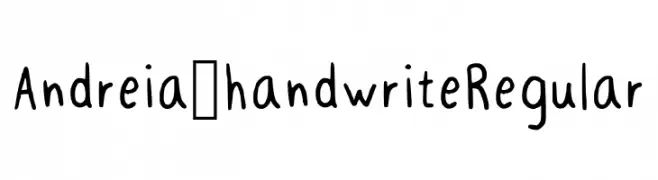
( Fonts by Andreia Coelho )
Casual handwritten font with playful style.
![Andreia_handwrite Regular フリーフォントのダウンロード]() ダウンロード 62 ダウンロード数@WebFont
ダウンロード 62 ダウンロード数@WebFont -
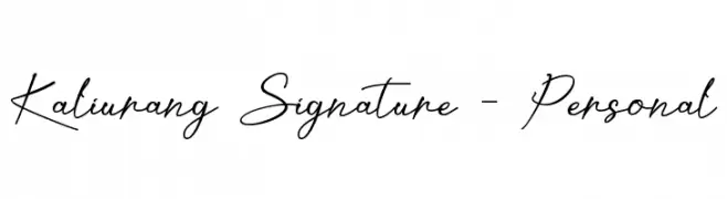
( Fonts by Letterafa Studio - Ahmad Afandi - Personal-use only. For commercial use please contact owner. )
A fluid and graceful script font with a handwritten signature style.
![Kaliurang Signature - Personal フリーフォントのダウンロード]() ダウンロード 62 ダウンロード数@WebFont
ダウンロード 62 ダウンロード数@WebFont -
( Fonts by Kong Font - fontkong.com - Personal-use only. For commercial use please contact owner. )
A playful and flowing script font with smooth, connected strokes.
![Gicery フリーフォントのダウンロード]() ダウンロード 62 ダウンロード数@WebFont
ダウンロード 62 ダウンロード数@WebFont -
-
( Fonts by Hurufraktur - Fadly Pratama - Personal-use only. For commercial use please contact owner. )
A bold, dynamic script font with fluid, energetic strokes and a handwritten feel.
![Roseshade フリーフォントのダウンロード]() ダウンロード 62 ダウンロード数@WebFont
ダウンロード 62 ダウンロード数@WebFont -
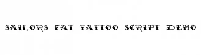
( Out Of Step Font Company - outofstepfontco.com )
A bold, decorative font with a vintage tattoo style.
![Sailor's Fat Tattoo Script Demo フリーフォントのダウンロード]() ダウンロード 62 ダウンロード数@WebFont
ダウンロード 62 ダウンロード数@WebFont -
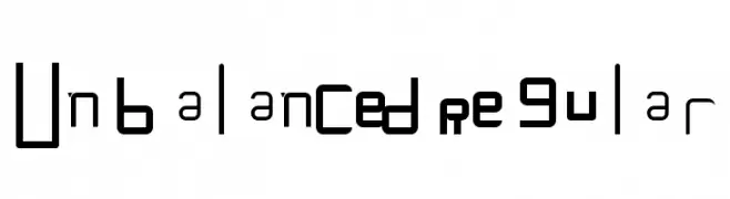
( Fonts by Birds1O6 - Personal-use only. For commercial use please contact owner. )
An eclectic and experimental font with varied, unbalanced letterforms.
![Unbalanced Regular フリーフォントのダウンロード]() ダウンロード 62 ダウンロード数@WebFont
ダウンロード 62 ダウンロード数@WebFont -
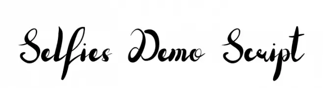
( Fonts by Edric Studio - Personal-use only. For commercial use please contact owner. )
An elegant, flowing script font with dynamic curves and expressive strokes.
![Selfies Demo Script フリーフォントのダウンロード]() ダウンロード 62 ダウンロード数@WebFont
ダウンロード 62 ダウンロード数@WebFont -
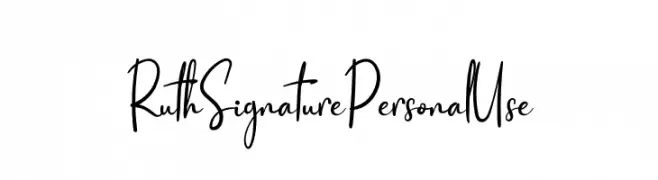
( Fonts by twinletter - Rozikan - Personal-use only. For commercial use please contact owner. )
A handwritten, cursive font with fluid strokes and a personal touch.
![Ruth Signature Personal Use フリーフォントのダウンロード]() ダウンロード 62 ダウンロード数@WebFont
ダウンロード 62 ダウンロード数@WebFont


今のトップフォントは?
は、クリーンな造形と広い適用範囲で支持を集めています。 ブランディングからランディングページ、ポスターまで活躍します。
ロゴで人気のフォントは?
幾何学系の サンセリフ(例: Poppins、Gotham 系のファミリー)は、スケーラブルでクリーンな印象に最適。 親しみやすさを出すなら スクリプト や手書き系も定番です。 見出しは力強く、本文はニュートラルに──この組み合わせが認知とバランスを高めます。
人気リストはどのくらいの頻度で更新される?
ダウンロード数やエンゲージメントに基づき定期的に更新します。 こまめにチェックして、次に流行るフォントを先取りしましょう。
💡 ヒント: このページをブックマークしておくと便利です。トレンドは速く、今のトップが明日のリブランディングを導くこともあります。