人気フォント セクションへようこそ。ここでは「よくダウンロードされ、よく使われている」実績ある書体をまとめています。 ロゴ、Web、SNS のどれにも使いやすい、外さない選択肢が見つかります。
どの トップフォント も、バランス・可読性・汎用性で高評価です。 モダン・サンセリフ、エレガントなスクリプト、ヴィンテージなセリフ、ミニマルなディスプレイなどを厳選しています。
-
( Fonts by Mans Greback - Personal-use only. For commercial use please contact owner. )
An elegant italic font with moderate contrast and a modern style.
 ダウンロード 62 ダウンロード数@WebFont
 -
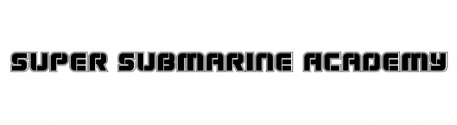
( Iconian Fonts - Daniel Zadorozny - www.iconian.com )
A bold, geometric font with an industrial, retro-futuristic style.
![Super Submarine Academy フリーフォントのダウンロード]() ダウンロード 62 ダウンロード数@WebFont
ダウンロード 62 ダウンロード数@WebFont -
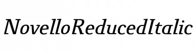
( Fonts by ingoFonts - Ingo Zimmermann - Personal-use only. For commercial use please contact owner. )
An elegant serif font with a classic italic slant and moderate stroke contrast.
![NovelloReduced-Italic フリーフォントのダウンロード]() ダウンロード 62 ダウンロード数@WebFont
ダウンロード 62 ダウンロード数@WebFont -
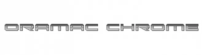
( Iconian Fonts - Daniel Zadorozny - www.iconian.com )
A futuristic, multi-line font with a three-dimensional, industrial design.
![Oramac Chrome フリーフォントのダウンロード]() ダウンロード 62 ダウンロード数@WebFont
ダウンロード 62 ダウンロード数@WebFont -
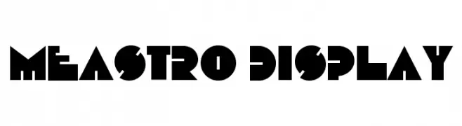
( Fonts by Ferry Ardana Putra )
A bold, geometric font with sharp angles and strong visual impact.
![Meastro Display フリーフォントのダウンロード]() ダウンロード 62 ダウンロード数@WebFont
ダウンロード 62 ダウンロード数@WebFont -
-
( Fonts by VinType )
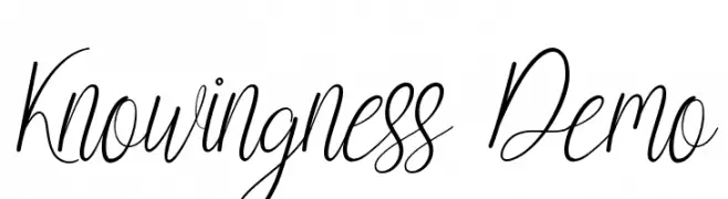
Elegant cursive script with a handwritten feel.
![Knowingness Demo フリーフォントのダウンロード]() ダウンロード 62 ダウンロード数@WebFont
ダウンロード 62 ダウンロード数@WebFont -
( Fonts by Kong Font - https://fontkong.com/ - Personal-use only. For commercial use please contact owner. )
A bold, italic script font with elegant curves and modern flair.
![Javassoul Italic フリーフォントのダウンロード]() ダウンロード 62 ダウンロード数@WebFont
ダウンロード 62 ダウンロード数@WebFont -
( Fonts by StringLabs - stringlabscreative.com - Personal-use only. For commercial use please contact owner. )
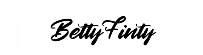
A bold, expressive script font with a handwritten, cursive style.
![Betty Finty フリーフォントのダウンロード]() ダウンロード 62 ダウンロード数@WebFont
ダウンロード 62 ダウンロード数@WebFont -
( Fonts by 38.lineart - Muhammad Ridha Agusni - Personal-use only. For commercial use please contact owner. )
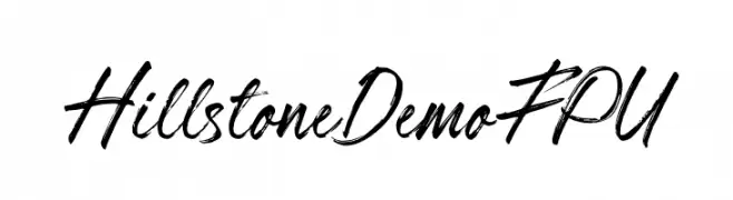
A dynamic, handwritten font with expressive and fluid strokes.
![Hillstone Demo FPU フリーフォントのダウンロード]() ダウンロード 62 ダウンロード数@WebFont
ダウンロード 62 ダウンロード数@WebFont -
( Fonts by Lemonthe - Dwi Ahidian - Personal-use only. For commercial use please contact owner. )
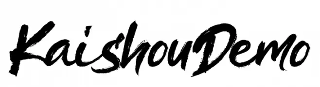
A bold, brush-style font with an expressive and dynamic appearance.
![Kaishou Demo フリーフォントのダウンロード]() ダウンロード 62 ダウンロード数@WebFont
ダウンロード 62 ダウンロード数@WebFont

今のトップフォントは?
は、クリーンな造形と広い適用範囲で支持を集めています。 ブランディングからランディングページ、ポスターまで活躍します。
ロゴで人気のフォントは?
幾何学系の サンセリフ(例: Poppins、Gotham 系のファミリー)は、スケーラブルでクリーンな印象に最適。 親しみやすさを出すなら スクリプト や手書き系も定番です。 見出しは力強く、本文はニュートラルに──この組み合わせが認知とバランスを高めます。
人気リストはどのくらいの頻度で更新される?
ダウンロード数やエンゲージメントに基づき定期的に更新します。 こまめにチェックして、次に流行るフォントを先取りしましょう。
💡 ヒント: このページをブックマークしておくと便利です。トレンドは速く、今のトップが明日のリブランディングを導くこともあります。