人気フォント セクションへようこそ。ここでは「よくダウンロードされ、よく使われている」実績ある書体をまとめています。 ロゴ、Web、SNS のどれにも使いやすい、外さない選択肢が見つかります。
どの トップフォント も、バランス・可読性・汎用性で高評価です。 モダン・サンセリフ、エレガントなスクリプト、ヴィンテージなセリフ、ミニマルなディスプレイなどを厳選しています。
-
( London's Letters - www.londonsletters.com/ )
A whimsical font with characters inside frothy beer mugs, ideal for festive designs.
 ダウンロード 61 ダウンロード数@WebFont
 -
( Fonts by Raymond Larabie - Personal-use only. For commercial use please contact owner. )
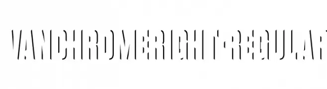
A modern, stencil-inspired font with sharp, angular cuts and dynamic negative space.
![VanchromeRight-Regular フリーフォントのダウンロード]() ダウンロード 61 ダウンロード数@WebFont
ダウンロード 61 ダウンロード数@WebFont -
( Fonts by Maswani - Personal-use only. For commercial use please contact owner. )
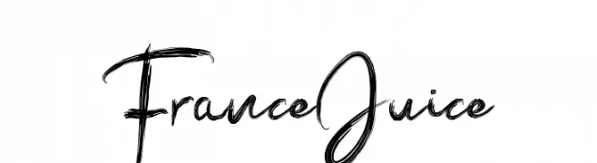
A bold, brush script font with expressive, artistic strokes.
![France Juice フリーフォントのダウンロード]() ダウンロード 61 ダウンロード数@WebFont
ダウンロード 61 ダウンロード数@WebFont -
( Fonts by Iconian Fonts )
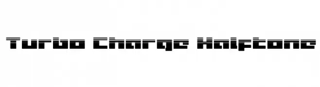
A bold, futuristic font with a halftone effect and geometric shapes.
![Turbo Charge Halftone フリーフォントのダウンロード]() ダウンロード 61 ダウンロード数@WebFont
ダウンロード 61 ダウンロード数@WebFont -
( Iconian Fonts - Daniel Zadorozny - www.iconian.com )
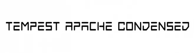
A futuristic, geometric font with a condensed and technical style.
![Tempest Apache Condensed フリーフォントのダウンロード]() ダウンロード 61 ダウンロード数@WebFont
ダウンロード 61 ダウンロード数@WebFont -
-
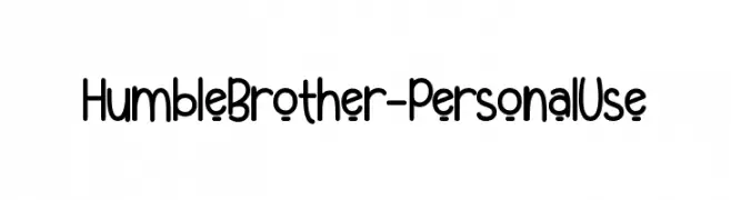
( Fonts by Endri Sulistyawan - Personal-use only. For commercial use please contact owner. )
A playful, rounded font with a casual and friendly style.
![Humble Brother - Personal Use フリーフォントのダウンロード]() ダウンロード 61 ダウンロード数@WebFont
ダウンロード 61 ダウンロード数@WebFont -
( Noto is a trademark of Google Inc. Noto fonts are open source. All Noto fonts are published under the SIL Open Font License, Version 1.1 )
A clean, modern, and extra-light semi-condensed font.
![Noto Sans Arabic UI SemiCondensed ExtraLight フリーフォントのダウンロード]() ダウンロード 61 ダウンロード数@WebFont
ダウンロード 61 ダウンロード数@WebFont -
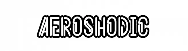
( Fonts by Kotak Kuning Studio - kotakkuning.com - Personal-use only. For commercial use please contact owner. )
A bold, outlined font with a modern and playful aesthetic.
![Aeroshodic フリーフォントのダウンロード]() ダウンロード 61 ダウンロード数@WebFont
ダウンロード 61 ダウンロード数@WebFont -
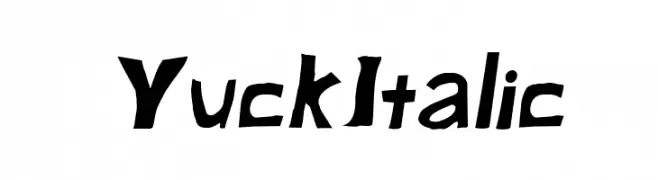
( Fonts by CannotIntoSpaceFonts - KineticPlasma Fonts - Personal-use only. For commercial use please contact owner. )
A playful, hand-drawn font with a quirky and dynamic style.
![Yuck Italic フリーフォントのダウンロード]() ダウンロード 61 ダウンロード数@WebFont
ダウンロード 61 ダウンロード数@WebFont -
( Fonts by CannotIntoSpaceFonts - KineticPlasma Fonts - Personal-use only. For commercial use please contact owner. )
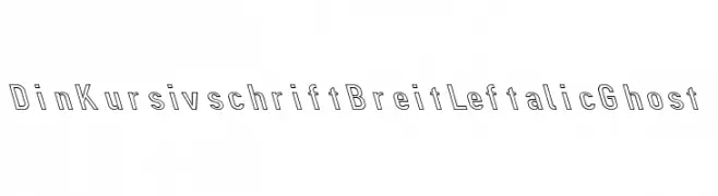
A modern, outlined italic font with a leftward slant and geometric structure.
![Din Kursivschrift Breit Leftalic Ghost フリーフォントのダウンロード]() ダウンロード 61 ダウンロード数@WebFont
ダウンロード 61 ダウンロード数@WebFont
今のトップフォントは?
は、クリーンな造形と広い適用範囲で支持を集めています。 ブランディングからランディングページ、ポスターまで活躍します。
ロゴで人気のフォントは?
幾何学系の サンセリフ(例: Poppins、Gotham 系のファミリー)は、スケーラブルでクリーンな印象に最適。 親しみやすさを出すなら スクリプト や手書き系も定番です。 見出しは力強く、本文はニュートラルに──この組み合わせが認知とバランスを高めます。
人気リストはどのくらいの頻度で更新される?
ダウンロード数やエンゲージメントに基づき定期的に更新します。 こまめにチェックして、次に流行るフォントを先取りしましょう。
💡 ヒント: このページをブックマークしておくと便利です。トレンドは速く、今のトップが明日のリブランディングを導くこともあります。