人気フォント セクションへようこそ。ここでは「よくダウンロードされ、よく使われている」実績ある書体をまとめています。 ロゴ、Web、SNS のどれにも使いやすい、外さない選択肢が見つかります。
どの トップフォント も、バランス・可読性・汎用性で高評価です。 モダン・サンセリフ、エレガントなスクリプト、ヴィンテージなセリフ、ミニマルなディスプレイなどを厳選しています。
-
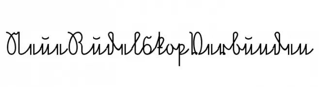
( Fonts by www.peter-wiegel.de. Personal-use only. For commercial use please contact owner. )
An elegant and artistic script font with flowing, connected characters.
 ダウンロード 60 ダウンロード数@WebFont
 -
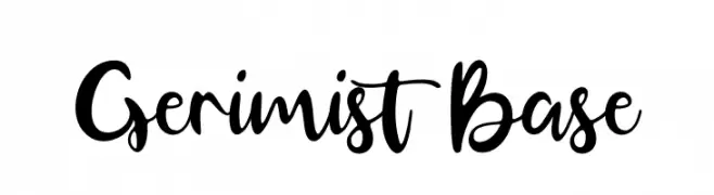
( Fonts by Four Lines - zain Fahroni - Personal-use only. For commercial use please contact owner. )
A bold, expressive handwritten font with a playful, cursive style.
![Gerimist Base フリーフォントのダウンロード]() ダウンロード 60 ダウンロード数@WebFont
ダウンロード 60 ダウンロード数@WebFont -
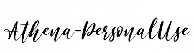
( Fonts by Haksen Studio - Sarwo Edhi Prayitno - Personal-use only. For commercial use please contact owner. )
A cursive, handwritten-style font with elegant, flowing strokes.
![Athena - Personal Use フリーフォントのダウンロード]() ダウンロード 60 ダウンロード数@WebFont
ダウンロード 60 ダウンロード数@WebFont -
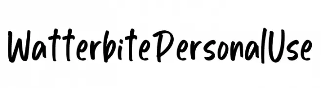
( Fonts by Ditatype - Personal-use only. For commercial use please contact owner. )
A bold, handwritten font with a playful and energetic style.
![Watterbite Personal Use フリーフォントのダウンロード]() ダウンロード 60 ダウンロード数@WebFont
ダウンロード 60 ダウンロード数@WebFont -
( Fonts by Digi Temply )
A modern dashed inline font with a geometric structure.
![LesPaul-DashedInline フリーフォントのダウンロード]() ダウンロード 60 ダウンロード数@WebFont
ダウンロード 60 ダウンロード数@WebFont -
-
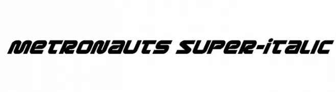
( Fonts by Daniel Zadorozny - www.iconian.com - Personal-use only. For commercial use please contact owner. )
A bold, italicized font with a futuristic and dynamic style.
![Metronauts Super-Italic フリーフォントのダウンロード]() ダウンロード 60 ダウンロード数@WebFont
ダウンロード 60 ダウンロード数@WebFont -
( Fonts by Mans Greback - Personal-use only. For commercial use please contact owner. )
A bold, italicized font with a dynamic and modern style.
![Jumper PERSONAL USE ONLY Bold Italic フリーフォントのダウンロード]() ダウンロード 60 ダウンロード数@WebFont
ダウンロード 60 ダウンロード数@WebFont -
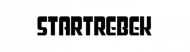
( Fonts by Chequered Ink - chequered.ink - Personal-use only. For commercial use please contact owner. )
A bold, futuristic font with geometric shapes and sharp angles.
![Star Trebek フリーフォントのダウンロード]() ダウンロード 60 ダウンロード数@WebFont
ダウンロード 60 ダウンロード数@WebFont -
( Fonts by HighUpNorth LLC - Personal-use only. For commercial use please contact owner. )
A bold, geometric font with a strong, industrial aesthetic.
![Blocker フリーフォントのダウンロード]() ダウンロード 60 ダウンロード数@WebFont
ダウンロード 60 ダウンロード数@WebFont -
( Fonts by Billy Argel - www.billyargel.com - Personal-use only. For commercial use please contact owner. )
A hand-drawn, textured font with a rugged and artistic style.
![PEIXEFRITO フリーフォントのダウンロード]() ダウンロード 60 ダウンロード数@WebFont
ダウンロード 60 ダウンロード数@WebFont


今のトップフォントは?
は、クリーンな造形と広い適用範囲で支持を集めています。 ブランディングからランディングページ、ポスターまで活躍します。
ロゴで人気のフォントは?
幾何学系の サンセリフ(例: Poppins、Gotham 系のファミリー)は、スケーラブルでクリーンな印象に最適。 親しみやすさを出すなら スクリプト や手書き系も定番です。 見出しは力強く、本文はニュートラルに──この組み合わせが認知とバランスを高めます。
人気リストはどのくらいの頻度で更新される?
ダウンロード数やエンゲージメントに基づき定期的に更新します。 こまめにチェックして、次に流行るフォントを先取りしましょう。
💡 ヒント: このページをブックマークしておくと便利です。トレンドは速く、今のトップが明日のリブランディングを導くこともあります。