人気フォント セクションへようこそ。ここでは「よくダウンロードされ、よく使われている」実績ある書体をまとめています。 ロゴ、Web、SNS のどれにも使いやすい、外さない選択肢が見つかります。
どの トップフォント も、バランス・可読性・汎用性で高評価です。 モダン・サンセリフ、エレガントなスクリプト、ヴィンテージなセリフ、ミニマルなディスプレイなどを厳選しています。
-
( Fonts by Fikryal studio - Fikry Alif - Personal-use only. For commercial use please contact owner. )
A bold, expressive brush script font with dynamic, fluid strokes.
 ダウンロード 60 ダウンロード数@WebFont
 -
( Fonts by Pen Culture - Revo Farisky - Personal-use only. For commercial use please contact owner. )
A bold, classic serif font with elegant curves and strong presence.
![Waldorf Astoria フリーフォントのダウンロード]() ダウンロード 60 ダウンロード数@WebFont
ダウンロード 60 ダウンロード数@WebFont -
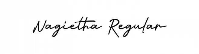
( Fonts by Arterfak Project - Ahmad Ramzi Fahruddin - Personal-use only. For commercial use please contact owner. )
A casual, elegant handwritten font with fluid, connected letterforms.
![Nagietha Regular フリーフォントのダウンロード]() ダウンロード 60 ダウンロード数@WebFont
ダウンロード 60 ダウンロード数@WebFont -
( Fonts by Fadlilah Studio - Personal-use only. For commercial use please contact owner. )
A playful, handwritten font with tall, narrow characters and rounded edges.
![Popsicle フリーフォントのダウンロード]() ダウンロード 60 ダウンロード数@WebFont
ダウンロード 60 ダウンロード数@WebFont -
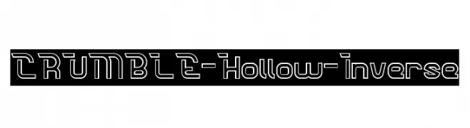
( weknow - Wino S Kadir - www.creativefabrica.com/designer/weknow/ )
A modern, hollow, inverse font with geometric shapes and sharp angles.
![CRUMBLE-Hollow-Inverse フリーフォントのダウンロード]() ダウンロード 60 ダウンロード数@WebFont
ダウンロード 60 ダウンロード数@WebFont -
-
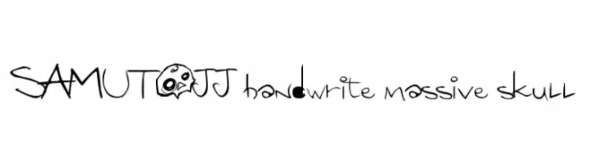
( SAMUTOJJ - www.samutojj.com )
A playful, edgy font with hand-drawn strokes and whimsical skull motifs.
![SAMUTOJJ handwrite massive skull フリーフォントのダウンロード]() ダウンロード 60 ダウンロード数@WebFont
ダウンロード 60 ダウンロード数@WebFont -
( Fonts by Creatype Studio )
A delicate, cursive handwritten font with flowing lines and elegant strokes.
![Anastasya Regular フリーフォントのダウンロード]() ダウンロード 60 ダウンロード数@WebFont
ダウンロード 60 ダウンロード数@WebFont -
( Fonts by AEN Creative Studio - Agung Eko Nugroho - Personal-use only. For commercial use please contact owner. )
A graceful script font with flowing, interconnected characters.
![Monallesia Script フリーフォントのダウンロード]() ダウンロード 60 ダウンロード数@WebFont
ダウンロード 60 ダウンロード数@WebFont -
( Fonts by Letterhend Studio - Hendry Juanda - Personal-use only. For commercial use please contact owner. )
An elegant script font with thin, flowing strokes and graceful connections.
![FlumberyWhiteDEMO フリーフォントのダウンロード]() ダウンロード 60 ダウンロード数@WebFont
ダウンロード 60 ダウンロード数@WebFont -
( Fonts by Khurasan )
A playful, hand-drawn font with a sketch-like, whimsical style.
![Scratchy Lemon フリーフォントのダウンロード]() ダウンロード 60 ダウンロード数@WebFont
ダウンロード 60 ダウンロード数@WebFont


今のトップフォントは?
は、クリーンな造形と広い適用範囲で支持を集めています。 ブランディングからランディングページ、ポスターまで活躍します。
ロゴで人気のフォントは?
幾何学系の サンセリフ(例: Poppins、Gotham 系のファミリー)は、スケーラブルでクリーンな印象に最適。 親しみやすさを出すなら スクリプト や手書き系も定番です。 見出しは力強く、本文はニュートラルに──この組み合わせが認知とバランスを高めます。
人気リストはどのくらいの頻度で更新される?
ダウンロード数やエンゲージメントに基づき定期的に更新します。 こまめにチェックして、次に流行るフォントを先取りしましょう。
💡 ヒント: このページをブックマークしておくと便利です。トレンドは速く、今のトップが明日のリブランディングを導くこともあります。