人気フォント セクションへようこそ。ここでは「よくダウンロードされ、よく使われている」実績ある書体をまとめています。 ロゴ、Web、SNS のどれにも使いやすい、外さない選択肢が見つかります。
どの トップフォント も、バランス・可読性・汎用性で高評価です。 モダン・サンセリフ、エレガントなスクリプト、ヴィンテージなセリフ、ミニマルなディスプレイなどを厳選しています。
-
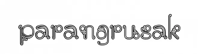
( Imam Zakaria )
A playful, double-outline font with looping, swirling characters.
 ダウンロード 57 ダウンロード数@WebFont
 -
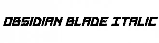
( Fonts by Daniel Zadorozny - www.iconian.com - Personal-use only. For commercial use please contact owner. )
A bold, angular italic font with sharp, jagged edges for a dynamic look.
![Obsidian Blade Italic フリーフォントのダウンロード]() ダウンロード 57 ダウンロード数@WebFont
ダウンロード 57 ダウンロード数@WebFont -
( Fonts by Vigilante Typeface Corporation Larry Yerkes. Personal-use only. For commercial use please contact owner. )
A bold, italicized, comic-inspired font with thick, rounded strokes.
![VTCKomixationSCBoldItalic フリーフォントのダウンロード]() ダウンロード 57 ダウンロード数@WebFont
ダウンロード 57 ダウンロード数@WebFont -
( Fonts by Doehantz Studio - Abduhan Fikhri - Personal-use only. For commercial use please contact owner. )
A bold, cursive font with interconnected, flowing characters.
![de hafla フリーフォントのダウンロード]() ダウンロード 57 ダウンロード数@WebFont
ダウンロード 57 ダウンロード数@WebFont -
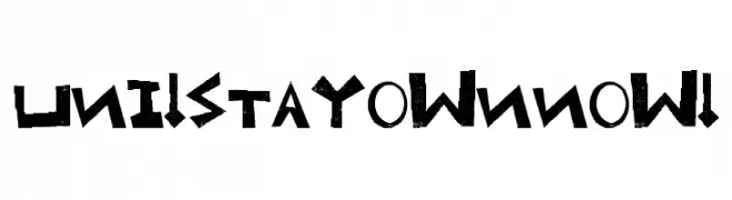
( Font Bureau - beinghairless.com )
A bold, angular font with geometric shapes and sharp edges.
![Uni! Stay own now! フリーフォントのダウンロード]() ダウンロード 57 ダウンロード数@WebFont
ダウンロード 57 ダウンロード数@WebFont -
-
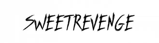
( Fonts by The Docallisme - Amry Al Mursalaat - Personal-use only. For commercial use please contact owner. )
A bold, brush-style font with dynamic, hand-drawn strokes.
![SWEETREVENGE フリーフォントのダウンロード]() ダウンロード 57 ダウンロード数@WebFont
ダウンロード 57 ダウンロード数@WebFont -
( Freddiemerqwerty - freddiemerqwerty.weebly.com/ )
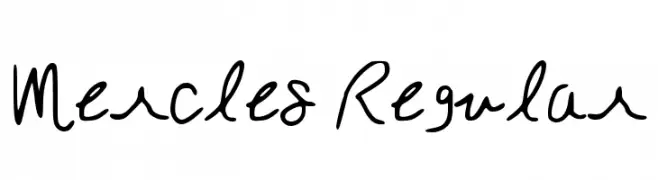
A playful and casual handwritten font with fluid, expressive strokes.
![Mercles Regular フリーフォントのダウンロード]() ダウンロード 57 ダウンロード数@WebFont
ダウンロード 57 ダウンロード数@WebFont -
( Fonts by Peter Wiegel - www.peter-wiegel.de - Personal-use only. For commercial use please contact owner. )
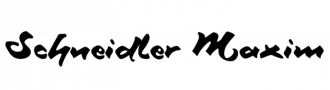
A bold, calligraphic script font with dynamic, flowing characters.
![Schneidler Maxim フリーフォントのダウンロード]() ダウンロード 57 ダウンロード数@WebFont
ダウンロード 57 ダウンロード数@WebFont -
( Fonts by Kat`s Fun Fonts - Personal-use only. For commercial use please contact owner. )
A decorative font with farm-themed illustrations for each character.
![KR On The Farm フリーフォントのダウンロード]() ダウンロード 57 ダウンロード数@WebFont
ダウンロード 57 ダウンロード数@WebFont -
( Fonts by www.chequered.ink - Chequered Ink - Personal-use only. For commercial use please contact owner. )
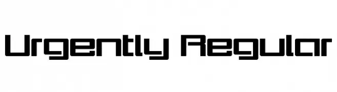
A bold, geometric font with a modern and futuristic style.
![Urgently Regular フリーフォントのダウンロード]() ダウンロード 57 ダウンロード数@WebFont
ダウンロード 57 ダウンロード数@WebFont


今のトップフォントは?
は、クリーンな造形と広い適用範囲で支持を集めています。 ブランディングからランディングページ、ポスターまで活躍します。
ロゴで人気のフォントは?
幾何学系の サンセリフ(例: Poppins、Gotham 系のファミリー)は、スケーラブルでクリーンな印象に最適。 親しみやすさを出すなら スクリプト や手書き系も定番です。 見出しは力強く、本文はニュートラルに──この組み合わせが認知とバランスを高めます。
人気リストはどのくらいの頻度で更新される?
ダウンロード数やエンゲージメントに基づき定期的に更新します。 こまめにチェックして、次に流行るフォントを先取りしましょう。
💡 ヒント: このページをブックマークしておくと便利です。トレンドは速く、今のトップが明日のリブランディングを導くこともあります。