人気フォント セクションへようこそ。ここでは「よくダウンロードされ、よく使われている」実績ある書体をまとめています。 ロゴ、Web、SNS のどれにも使いやすい、外さない選択肢が見つかります。
どの トップフォント も、バランス・可読性・汎用性で高評価です。 モダン・サンセリフ、エレガントなスクリプト、ヴィンテージなセリフ、ミニマルなディスプレイなどを厳選しています。
-
( Noto is a trademark of Google Inc. Noto fonts are open source. All Noto fonts are published under the SIL Open Font License, Version 1.1 )
A modern, extra bold, and highly condensed sans-serif font with tight spacing.
 ダウンロード 59 ダウンロード数@WebFont
 -
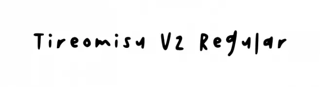
( Fonts by tireomisu - Personal-use only. For commercial use please contact owner. )
A playful, casual handwritten font with irregular strokes and a lively appearance.
![Tireomisu V2 Regular フリーフォントのダウンロード]() ダウンロード 59 ダウンロード数@WebFont
ダウンロード 59 ダウンロード数@WebFont -
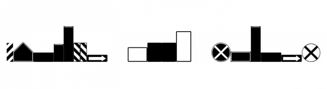
( Michael D. Adams - www.triskele.com/roadgeek-fonts/ )
A bold, geometric dingbat font featuring road sign shapes.
![Roadgeek 2005 SignBacks フリーフォントのダウンロード]() ダウンロード 59 ダウンロード数@WebFont
ダウンロード 59 ダウンロード数@WebFont -
( Fonts by Haksen Studio - Sarwo Edhi Prayitno - Personal-use only. For commercial use please contact owner. )
A jagged, distressed font ideal for horror themes.
![SCARY NIGHT - Personal Use フリーフォントのダウンロード]() ダウンロード 59 ダウンロード数@WebFont
ダウンロード 59 ダウンロード数@WebFont -
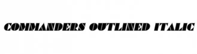
( Vladimir Nikolic - www.coroflot.com/vladimirnikolic )
A bold, italicized outlined font with a modern and dynamic style.
![Commanders Outlined Italic フリーフォントのダウンロード]() ダウンロード 59 ダウンロード数@WebFont
ダウンロード 59 ダウンロード数@WebFont -
-
( Fonts by www.chequered.ink - Chequered Ink - Personal-use only. For commercial use please contact owner. )
A bold, geometric font with a modern and assertive style.
![Pinch My Ride フリーフォントのダウンロード]() ダウンロード 59 ダウンロード数@WebFont
ダウンロード 59 ダウンロード数@WebFont -
( Fonts by Wahyu Rahmawan - Personal-use only. For commercial use please contact owner. )
A modern, geometric font with semi-rounded edges and consistent weight.
![Leo SemiRounded Light フリーフォントのダウンロード]() ダウンロード 59 ダウンロード数@WebFont
ダウンロード 59 ダウンロード数@WebFont -
( Iconian Fonts - Daniel Zadorozny - www.iconian.com )
A bold, futuristic font with a striped, chrome-like appearance and italic slant.
![Echo Station Chrome Italic フリーフォントのダウンロード]() ダウンロード 59 ダウンロード数@WebFont
ダウンロード 59 ダウンロード数@WebFont -
( Martin Sørensen )
A playful, bold handwritten font with expressive strokes and a casual style.
![Svampens Handwriting フリーフォントのダウンロード]() ダウンロード 59 ダウンロード数@WebFont
ダウンロード 59 ダウンロード数@WebFont -
( Fonts by Riccardo Mecheri - Personal-use only. For commercial use please contact owner. )
A modern, curvilinear font with smooth, flowing lines and elegant style.
![Curvy フリーフォントのダウンロード]() ダウンロード 59 ダウンロード数@WebFont
ダウンロード 59 ダウンロード数@WebFont


今のトップフォントは?
は、クリーンな造形と広い適用範囲で支持を集めています。 ブランディングからランディングページ、ポスターまで活躍します。
ロゴで人気のフォントは?
幾何学系の サンセリフ(例: Poppins、Gotham 系のファミリー)は、スケーラブルでクリーンな印象に最適。 親しみやすさを出すなら スクリプト や手書き系も定番です。 見出しは力強く、本文はニュートラルに──この組み合わせが認知とバランスを高めます。
人気リストはどのくらいの頻度で更新される?
ダウンロード数やエンゲージメントに基づき定期的に更新します。 こまめにチェックして、次に流行るフォントを先取りしましょう。
💡 ヒント: このページをブックマークしておくと便利です。トレンドは速く、今のトップが明日のリブランディングを導くこともあります。