人気フォント セクションへようこそ。ここでは「よくダウンロードされ、よく使われている」実績ある書体をまとめています。 ロゴ、Web、SNS のどれにも使いやすい、外さない選択肢が見つかります。
どの トップフォント も、バランス・可読性・汎用性で高評価です。 モダン・サンセリフ、エレガントなスクリプト、ヴィンテージなセリフ、ミニマルなディスプレイなどを厳選しています。
-
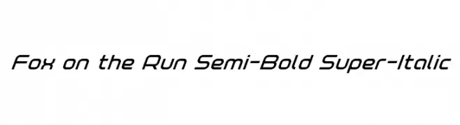
( Iconian Fonts - Daniel Zadorozny - www.iconian.com )
A sleek, modern semi-bold italic font with a compact and uniform design.
 ダウンロード 56 ダウンロード数@WebFont
 -
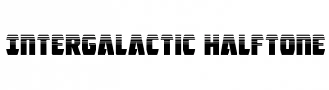
( Iconian Fonts - Daniel Zadorozny - www.iconian.com )
A bold, futuristic font with a halftone effect and geometric design.
![Intergalactic Halftone フリーフォントのダウンロード]() ダウンロード 56 ダウンロード数@WebFont
ダウンロード 56 ダウンロード数@WebFont -
( Noto is a trademark of Google Inc. Noto fonts are open source. All Noto fonts are published under the SIL Open Font License, Version 1.1 )
No valid font glyphs are visible.
![Noto Sans Lao Condensed SemiBold フリーフォントのダウンロード]() ダウンロード 56 ダウンロード数@WebFont
ダウンロード 56 ダウンロード数@WebFont -
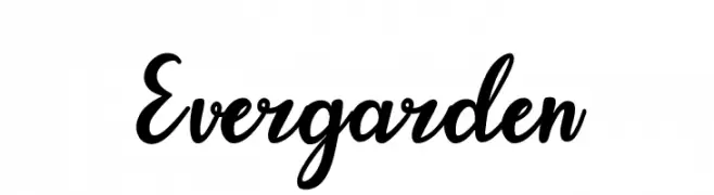
( Fonts by Lettertype Studio - Diki Pradipta Tri Atmojo - Personal-use only. For commercial use please contact owner. )
A flowing, cursive font with elegant loops and flourishes.
![Evergarden フリーフォントのダウンロード]() ダウンロード 56 ダウンロード数@WebFont
ダウンロード 56 ダウンロード数@WebFont -
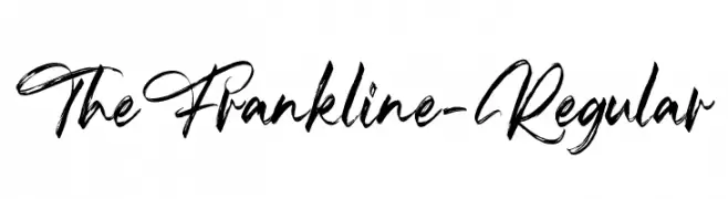
( Fonts by Vz Type - Personal-use only. For commercial use please contact owner. )
A dynamic and fluid script font with elegant cursive letters.
![TheFrankline-Regular フリーフォントのダウンロード]() ダウンロード 56 ダウンロード数@WebFont
ダウンロード 56 ダウンロード数@WebFont -
-
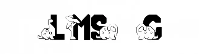
( London's Letters - www.londonsletters.com/ )
A playful, dinosaur-themed decorative font with bold, blocky letters.
![LMS Conradasaur フリーフォントのダウンロード]() ダウンロード 56 ダウンロード数@WebFont
ダウンロード 56 ダウンロード数@WebFont -
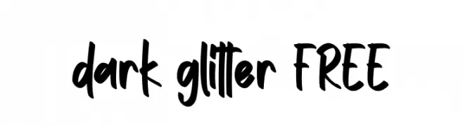
( Fonts by Vunira Design - Personal-use only. For commercial use please contact owner. )
A bold, handwritten font with a playful and casual style.
![dark glitter FREE フリーフォントのダウンロード]() ダウンロード 56 ダウンロード数@WebFont
ダウンロード 56 ダウンロード数@WebFont -
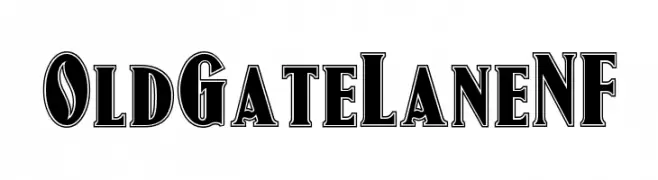
( Fonts by Nick Curtis - Personal-use only. For commercial use please contact owner. )
A bold, decorative serif font with a shadow effect for impactful designs.
![OldGateLaneNF フリーフォントのダウンロード]() ダウンロード 56 ダウンロード数@WebFont
ダウンロード 56 ダウンロード数@WebFont -
( Fonts by Jozef Herrebrugh )
A traditional blackletter font with bold, intricate letterforms and a historic aesthetic.
![Textura Belgica フリーフォントのダウンロード]() ダウンロード 56 ダウンロード数@WebFont
ダウンロード 56 ダウンロード数@WebFont -
( Fonts by StringLabs - stringlabscreative.com - Personal-use only. For commercial use please contact owner. )
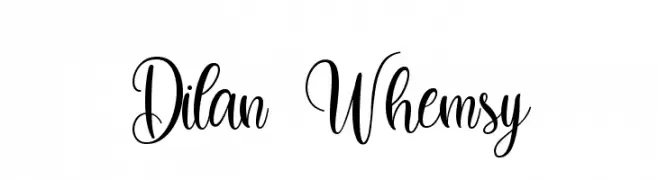
A whimsical, cursive font with elegant loops and swirls.
![Dilan Whemsy フリーフォントのダウンロード]() ダウンロード 56 ダウンロード数@WebFont
ダウンロード 56 ダウンロード数@WebFont

今のトップフォントは?
は、クリーンな造形と広い適用範囲で支持を集めています。 ブランディングからランディングページ、ポスターまで活躍します。
ロゴで人気のフォントは?
幾何学系の サンセリフ(例: Poppins、Gotham 系のファミリー)は、スケーラブルでクリーンな印象に最適。 親しみやすさを出すなら スクリプト や手書き系も定番です。 見出しは力強く、本文はニュートラルに──この組み合わせが認知とバランスを高めます。
人気リストはどのくらいの頻度で更新される?
ダウンロード数やエンゲージメントに基づき定期的に更新します。 こまめにチェックして、次に流行るフォントを先取りしましょう。
💡 ヒント: このページをブックマークしておくと便利です。トレンドは速く、今のトップが明日のリブランディングを導くこともあります。