人気フォント セクションへようこそ。ここでは「よくダウンロードされ、よく使われている」実績ある書体をまとめています。 ロゴ、Web、SNS のどれにも使いやすい、外さない選択肢が見つかります。
どの トップフォント も、バランス・可読性・汎用性で高評価です。 モダン・サンセリフ、エレガントなスクリプト、ヴィンテージなセリフ、ミニマルなディスプレイなどを厳選しています。
-
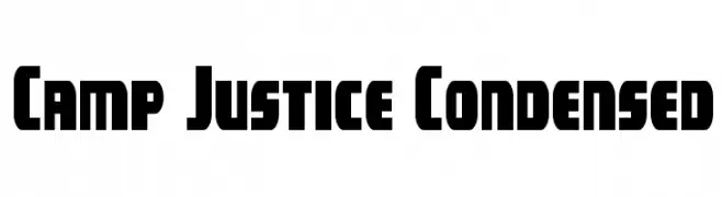
( Iconian Fonts - Daniel Zadorozny - www.iconian.com )
A bold, condensed font with a modern, geometric style.
 ダウンロード 56 ダウンロード数@WebFont
 -
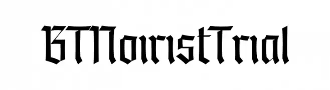
( Fonts by BeauType Studio - beautique.vn - Personal-use only. For commercial use please contact owner. )
A bold, angular blackletter-inspired font with high contrast and modern flair.
![BT Noirist Trial フリーフォントのダウンロード]() ダウンロード 56 ダウンロード数@WebFont
ダウンロード 56 ダウンロード数@WebFont -
( Fonts by Mans Greback - www.mansgreback.com - Personal-use only. For commercial use please contact owner. )
An elegant script font with ornate flourishes and a luxurious feel.
![World Discovery Three PERSONAL Regular フリーフォントのダウンロード]() ダウンロード 56 ダウンロード数@WebFont
ダウンロード 56 ダウンロード数@WebFont -
( Noto is a trademark of Google Inc. Noto fonts are open source. All Noto fonts are published under the SIL Open Font License, Version 1.1 )
A modern, semi-condensed sans-serif font with medium weight and excellent readability.
![Noto Sans Devanagari UI SemiCondensed Medium フリーフォントのダウンロード]() ダウンロード 56 ダウンロード数@WebFont
ダウンロード 56 ダウンロード数@WebFont -
( Fonts by Bories Bechker - Personal-use only. For commercial use please contact owner. )
A dynamic and expressive script font with fluid, flowing letterforms and high contrast.
![Mood Booster Demo フリーフォントのダウンロード]() ダウンロード 56 ダウンロード数@WebFont
ダウンロード 56 ダウンロード数@WebFont -
-
( Fonts by Libscript - Personal-use only. For commercial use please contact owner. )
A lively handwritten font with fluid, connected letterforms and a modern aesthetic.
![Octobre Regular フリーフォントのダウンロード]() ダウンロード 56 ダウンロード数@WebFont
ダウンロード 56 ダウンロード数@WebFont -
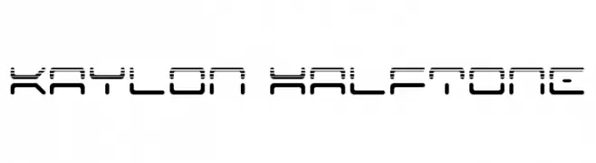
![Kaylon Halftone フリーフォントのダウンロード]() ダウンロード 56 ダウンロード数@WebFont
ダウンロード 56 ダウンロード数@WebFont -
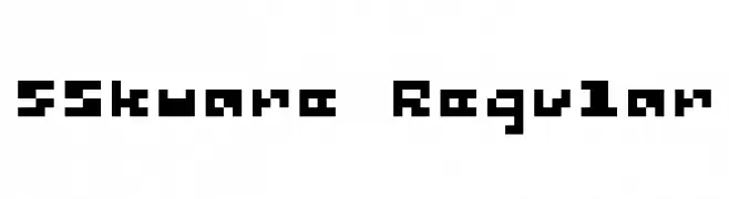
( Fonts by Winter Design Studio - winty5.wixsite.com/noahtheawesome/ - Personal-use only. For commercial use please contact owner. )
A bold, pixelated font with a geometric, digital aesthetic.
![5Skware Regular フリーフォントのダウンロード]() ダウンロード 56 ダウンロード数@WebFont
ダウンロード 56 ダウンロード数@WebFont -
( Fonts by Smart Designs - Personal-use only. For commercial use please contact owner. )
A lively handwritten font with fluid, expressive strokes.
![Hilton フリーフォントのダウンロード]() ダウンロード 56 ダウンロード数@WebFont
ダウンロード 56 ダウンロード数@WebFont -
( Fonts by Tribby )
A modern, italic sans-serif font with clean lines and balanced proportions.
![Barlow Medium Italic フリーフォントのダウンロード]() ダウンロード 56 ダウンロード数@WebFont
ダウンロード 56 ダウンロード数@WebFont


今のトップフォントは?
は、クリーンな造形と広い適用範囲で支持を集めています。 ブランディングからランディングページ、ポスターまで活躍します。
ロゴで人気のフォントは?
幾何学系の サンセリフ(例: Poppins、Gotham 系のファミリー)は、スケーラブルでクリーンな印象に最適。 親しみやすさを出すなら スクリプト や手書き系も定番です。 見出しは力強く、本文はニュートラルに──この組み合わせが認知とバランスを高めます。
人気リストはどのくらいの頻度で更新される?
ダウンロード数やエンゲージメントに基づき定期的に更新します。 こまめにチェックして、次に流行るフォントを先取りしましょう。
💡 ヒント: このページをブックマークしておくと便利です。トレンドは速く、今のトップが明日のリブランディングを導くこともあります。