人気フォント セクションへようこそ。ここでは「よくダウンロードされ、よく使われている」実績ある書体をまとめています。 ロゴ、Web、SNS のどれにも使いやすい、外さない選択肢が見つかります。
どの トップフォント も、バランス・可読性・汎用性で高評価です。 モダン・サンセリフ、エレガントなスクリプト、ヴィンテージなセリフ、ミニマルなディスプレイなどを厳選しています。
-
( Fonts by Haksen Studio - Sarwo Edhi Prayitno - Personal-use only. For commercial use please contact owner. )
A playful and whimsical script font with a lively, cursive style.
 ダウンロード 56 ダウンロード数@WebFont
 -
( Fonts by Typehill Studio - Personal-use only. For commercial use please contact owner. )
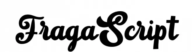
A bold, flowing script font with elegant, cursive letterforms and high contrast.
![FragaScript フリーフォントのダウンロード]() ダウンロード 56 ダウンロード数@WebFont
ダウンロード 56 ダウンロード数@WebFont -
( Iconian Fonts - Daniel Zadorozny - www.iconian.com )
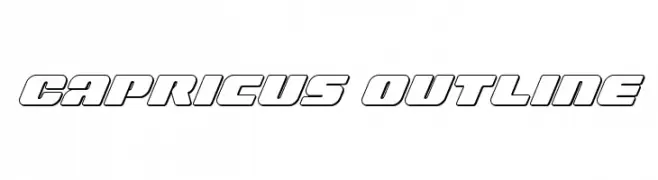
A bold, futuristic outline font with geometric shapes and clean lines.
![Capricus Outline フリーフォントのダウンロード]() ダウンロード 56 ダウンロード数@WebFont
ダウンロード 56 ダウンロード数@WebFont -
( Fonts by Vladimir Nikolic - www.creativefabrica.com/designer/vladimirnikolic/ - Personal-use only. For commercial use please contact owner. )
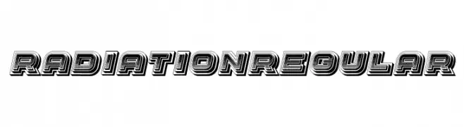
A bold, layered font with a retro 3D effect and geometric structure.
![Radiation Regular フリーフォントのダウンロード]() ダウンロード 56 ダウンロード数@WebFont
ダウンロード 56 ダウンロード数@WebFont -
( Fonts by Iconian Fonts )
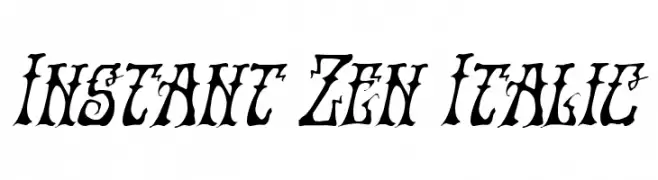
A bold, italic font with dramatic flourishes and high contrast strokes.
![Instant Zen Italic フリーフォントのダウンロード]() ダウンロード 56 ダウンロード数@WebFont
ダウンロード 56 ダウンロード数@WebFont -
-
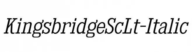
( Fonts by Typodermic Fonts )
An elegant serif font with an italic slant, featuring moderate contrast and a classic style.
![KingsbridgeScLt-Italic フリーフォントのダウンロード]() ダウンロード 56 ダウンロード数@WebFont
ダウンロード 56 ダウンロード数@WebFont -
( Fonts by twinletter - Rozikan - Personal-use only. For commercial use please contact owner. )
A bold, playful handwritten font with rounded strokes and dynamic letterforms.
![GrabahpersonaluseRegular フリーフォントのダウンロード]() ダウンロード 56 ダウンロード数@WebFont
ダウンロード 56 ダウンロード数@WebFont -
( LJ Design Studios - www.ljdesignstudios.com )
A bold, brush-style font with a hand-drawn, artistic appearance.
![My Brush フリーフォントのダウンロード]() ダウンロード 56 ダウンロード数@WebFont
ダウンロード 56 ダウンロード数@WebFont -
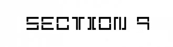
( Mechanismatic - whitespirals.com )
A geometric, blocky font with a futuristic and digital aesthetic.
![Section 9 フリーフォントのダウンロード]() ダウンロード 56 ダウンロード数@WebFont
ダウンロード 56 ダウンロード数@WebFont -
( Fonts by Haksen Studio - Sarwo Edhi Prayitno - Personal-use only. For commercial use please contact owner. )
A bold, expressive script font with flowing, cursive letterforms.
![Biscuit フリーフォントのダウンロード]() ダウンロード 56 ダウンロード数@WebFont
ダウンロード 56 ダウンロード数@WebFont


今のトップフォントは?
は、クリーンな造形と広い適用範囲で支持を集めています。 ブランディングからランディングページ、ポスターまで活躍します。
ロゴで人気のフォントは?
幾何学系の サンセリフ(例: Poppins、Gotham 系のファミリー)は、スケーラブルでクリーンな印象に最適。 親しみやすさを出すなら スクリプト や手書き系も定番です。 見出しは力強く、本文はニュートラルに──この組み合わせが認知とバランスを高めます。
人気リストはどのくらいの頻度で更新される?
ダウンロード数やエンゲージメントに基づき定期的に更新します。 こまめにチェックして、次に流行るフォントを先取りしましょう。
💡 ヒント: このページをブックマークしておくと便利です。トレンドは速く、今のトップが明日のリブランディングを導くこともあります。