人気フォント セクションへようこそ。ここでは「よくダウンロードされ、よく使われている」実績ある書体をまとめています。 ロゴ、Web、SNS のどれにも使いやすい、外さない選択肢が見つかります。
どの トップフォント も、バランス・可読性・汎用性で高評価です。 モダン・サンセリフ、エレガントなスクリプト、ヴィンテージなセリフ、ミニマルなディスプレイなどを厳選しています。
-
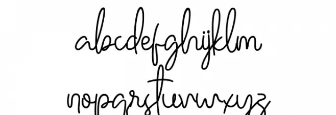
( Fonts by StringLabs - stringlabscreative.com - Personal-use only. For commercial use please contact owner. )
An elegant, cursive handwritten font with fluid, interconnected strokes.
 ダウンロード 55 ダウンロード数@WebFont
 -
( Fonts by benoitsjoholm.blogspot.com - Benoit Sjoholm - Personal-use only. For commercial use please contact owner. )
A modern, rounded font with a playful and bold aesthetic.
![Judit フリーフォントのダウンロード]() ダウンロード 55 ダウンロード数@WebFont
ダウンロード 55 ダウンロード数@WebFont -
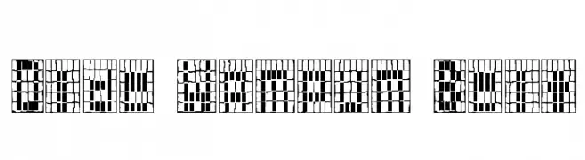
( JMRBooks Fonts )
A decorative font with a mosaic-like, grid-based design inspired by traditional beadwork.
![Olde Wampum Belt フリーフォントのダウンロード]() ダウンロード 55 ダウンロード数@WebFont
ダウンロード 55 ダウンロード数@WebFont -
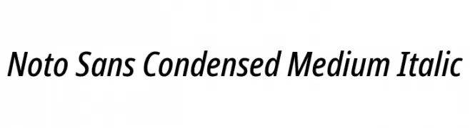
( Fonts by Google - Personal-use only. For commercial use please contact owner. )
A modern, condensed sans-serif font with italic styling and medium weight.
![Noto Sans Condensed Medium Italic フリーフォントのダウンロード]() ダウンロード 55 ダウンロード数@WebFont
ダウンロード 55 ダウンロード数@WebFont -
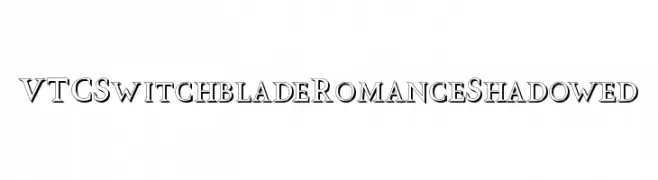
( Fonts by Vigilante Typeface Corporation Larry Yerkes. Personal-use only. For commercial use please contact owner. )
A bold, shadowed font with sharp serifs and a dramatic, modern aesthetic.
![VTCSwitchbladeRomanceShadowed フリーフォントのダウンロード]() ダウンロード 55 ダウンロード数@WebFont
ダウンロード 55 ダウンロード数@WebFont -
-
( Fonts by vroz studio - Personal-use only. For commercial use please contact owner. )
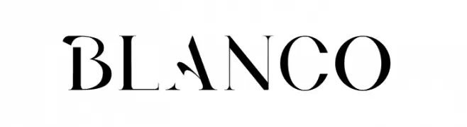
A high-contrast, geometric serif font with a modern yet classic appeal.
![BLANCO フリーフォントのダウンロード]() ダウンロード 55 ダウンロード数@WebFont
ダウンロード 55 ダウンロード数@WebFont -
( Hazel Abbiati - diamondidiocy.tumblr.com )
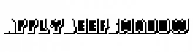
A bold, blocky font with a pixelated, shadowed style for a retro digital look.
![ApplyBeefShadow フリーフォントのダウンロード]() ダウンロード 55 ダウンロード数@WebFont
ダウンロード 55 ダウンロード数@WebFont -
( Iconian Fonts - Daniel Zadorozny - www.iconian.com )
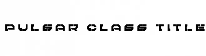
A bold, geometric font with a futuristic, industrial style.
![Pulsar Class Title フリーフォントのダウンロード]() ダウンロード 55 ダウンロード数@WebFont
ダウンロード 55 ダウンロード数@WebFont -
( Iconian Fonts - Daniel Zadorozny - www.iconian.com )
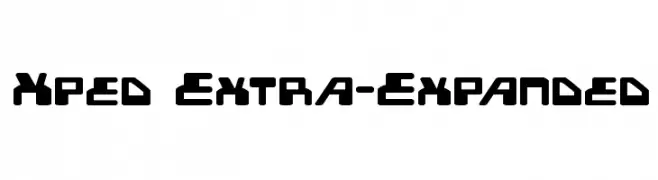
A bold, geometric font with a futuristic and modern design.
![Xped Extra-Expanded フリーフォントのダウンロード]() ダウンロード 55 ダウンロード数@WebFont
ダウンロード 55 ダウンロード数@WebFont -
( Fonts by Rometheme Studio - Yahdi Kumala - Personal-use only. For commercial use please contact owner. )
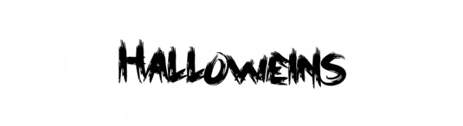
A bold, jagged font with a spooky, distressed style perfect for Halloween themes.
![Halloweins フリーフォントのダウンロード]() ダウンロード 55 ダウンロード数@WebFont
ダウンロード 55 ダウンロード数@WebFont

今のトップフォントは?
は、クリーンな造形と広い適用範囲で支持を集めています。 ブランディングからランディングページ、ポスターまで活躍します。
ロゴで人気のフォントは?
幾何学系の サンセリフ(例: Poppins、Gotham 系のファミリー)は、スケーラブルでクリーンな印象に最適。 親しみやすさを出すなら スクリプト や手書き系も定番です。 見出しは力強く、本文はニュートラルに──この組み合わせが認知とバランスを高めます。
人気リストはどのくらいの頻度で更新される?
ダウンロード数やエンゲージメントに基づき定期的に更新します。 こまめにチェックして、次に流行るフォントを先取りしましょう。
💡 ヒント: このページをブックマークしておくと便利です。トレンドは速く、今のトップが明日のリブランディングを導くこともあります。