人気フォント セクションへようこそ。ここでは「よくダウンロードされ、よく使われている」実績ある書体をまとめています。 ロゴ、Web、SNS のどれにも使いやすい、外さない選択肢が見つかります。
どの トップフォント も、バランス・可読性・汎用性で高評価です。 モダン・サンセリフ、エレガントなスクリプト、ヴィンテージなセリフ、ミニマルなディスプレイなどを厳選しています。
-
( Florin Florea - florin.reel.ro )
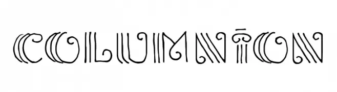
A decorative font with intricate line work and geometric patterns.
 ダウンロード 55 ダウンロード数@WebFont
 -
( Fonts by Pixilate )
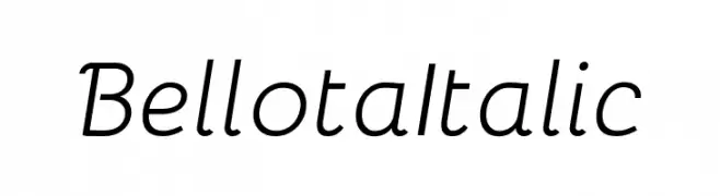
A playful, elegant italic font with smooth curves and a friendly appearance.
![Bellota Italic フリーフォントのダウンロード]() ダウンロード 55 ダウンロード数@WebFont
ダウンロード 55 ダウンロード数@WebFont -
( imagex - www.imagex-fonts.com )
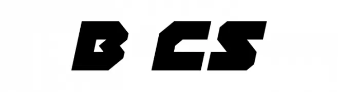
A bold, geometric font with a futuristic and modern aesthetic.
![Bot CraftShop フリーフォントのダウンロード]() ダウンロード 55 ダウンロード数@WebFont
ダウンロード 55 ダウンロード数@WebFont -
( Fonts by Almarkhatype - Abdul Malik Wisnu - Personal-use only. For commercial use please contact owner. )
A whimsical, cursive font with flowing, elegant strokes.
![Mathelline フリーフォントのダウンロード]() ダウンロード 55 ダウンロード数@WebFont
ダウンロード 55 ダウンロード数@WebFont -
( London's Letters - www.londonsletters.com/ )
A whimsical, decorative font with intricate patterns and playful illustrations.
![LMS Dancing Rag Dolls フリーフォントのダウンロード]() ダウンロード 55 ダウンロード数@WebFont
ダウンロード 55 ダウンロード数@WebFont -
-
( Fonts by Jayvee Enaguas - Personal-use only. For commercial use please contact owner. )
A pixelated, monospaced font with a retro digital aesthetic.
![European Teletext Nuevo フリーフォントのダウンロード]() ダウンロード 55 ダウンロード数@WebFont
ダウンロード 55 ダウンロード数@WebFont -
( Fonts by Manjali Studio - Personal-use only. For commercial use please contact owner. )
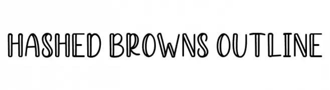
A playful, bold outline font with a hand-drawn, whimsical style.
![Hashed Browns Outline フリーフォントのダウンロード]() ダウンロード 55 ダウンロード数@WebFont
ダウンロード 55 ダウンロード数@WebFont -
( Fonts by Jonathan S. Harris - Personal-use only. For commercial use please contact owner. )
A bold, brush-stroke style font with an expressive and artistic appearance.
![Magic Brush フリーフォントのダウンロード]() ダウンロード 55 ダウンロード数@WebFont
ダウンロード 55 ダウンロード数@WebFont -
( Fonts by Zetafonts - Personal-use only. For commercial use please contact owner. )
A modern, wide sans-serif font with clean lines and balanced spacing.
![Stinger Wide Trial Light フリーフォントのダウンロード]() ダウンロード 55 ダウンロード数@WebFont
ダウンロード 55 ダウンロード数@WebFont -
( 7NTypes - Situjuh Nazara - 7ntypes.com )
A fluid and elegant script font with smooth, flowing lines.
![Goday フリーフォントのダウンロード]() ダウンロード 55 ダウンロード数@WebFont
ダウンロード 55 ダウンロード数@WebFont


今のトップフォントは?
は、クリーンな造形と広い適用範囲で支持を集めています。 ブランディングからランディングページ、ポスターまで活躍します。
ロゴで人気のフォントは?
幾何学系の サンセリフ(例: Poppins、Gotham 系のファミリー)は、スケーラブルでクリーンな印象に最適。 親しみやすさを出すなら スクリプト や手書き系も定番です。 見出しは力強く、本文はニュートラルに──この組み合わせが認知とバランスを高めます。
人気リストはどのくらいの頻度で更新される?
ダウンロード数やエンゲージメントに基づき定期的に更新します。 こまめにチェックして、次に流行るフォントを先取りしましょう。
💡 ヒント: このページをブックマークしておくと便利です。トレンドは速く、今のトップが明日のリブランディングを導くこともあります。