人気フォント セクションへようこそ。ここでは「よくダウンロードされ、よく使われている」実績ある書体をまとめています。 ロゴ、Web、SNS のどれにも使いやすい、外さない選択肢が見つかります。
どの トップフォント も、バランス・可読性・汎用性で高評価です。 モダン・サンセリフ、エレガントなスクリプト、ヴィンテージなセリフ、ミニマルなディスプレイなどを厳選しています。
-
( Fonts by Ardana Creative - Personal-use only. For commercial use please contact owner. )
A dynamic and expressive handwritten font with fluid cursive letterforms.
 ダウンロード 55 ダウンロード数@WebFont
 -
( Fonts by Kurnia Setyadi - Personal-use only. For commercial use please contact owner. )
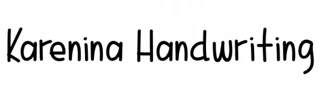
A playful, casual handwritten font with smooth, rounded edges and consistent strokes.
![Karenina Handwriting フリーフォントのダウンロード]() ダウンロード 55 ダウンロード数@WebFont
ダウンロード 55 ダウンロード数@WebFont -
( Fonts by www.woodcutter.es - woodcutter Manero - Personal-use only. For commercial use please contact owner. )
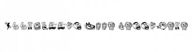
A whimsical collection of bold, hand-drawn illustrations with playful and surreal elements.
![Woodcutter Olla Barrejada フリーフォントのダウンロード]() ダウンロード 55 ダウンロード数@WebFont
ダウンロード 55 ダウンロード数@WebFont -
( Fonts by YonType Studio - Muhammad Yoni - Personal-use only. For commercial use please contact owner. )
A bold, decorative serif font with intricate swirls and embellishments.
![Bughia フリーフォントのダウンロード]() ダウンロード 55 ダウンロード数@WebFont
ダウンロード 55 ダウンロード数@WebFont -
( Iconian Fonts - Daniel Zadorozny - www.iconian.com )
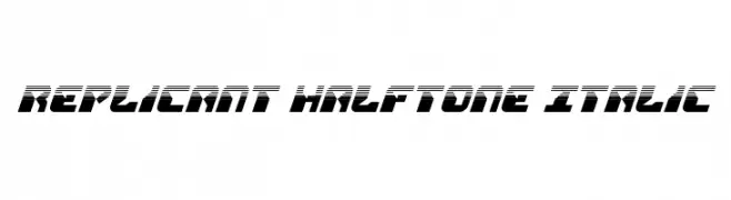
A bold, futuristic italic font with a halftone effect and dynamic design.
![Replicant Halftone Italic フリーフォントのダウンロード]() ダウンロード 55 ダウンロード数@WebFont
ダウンロード 55 ダウンロード数@WebFont -
-
( Fonts by Pustudio )
Expressive handwritten script with a signature style.
![SwagSignature フリーフォントのダウンロード]() ダウンロード 55 ダウンロード数@WebFont
ダウンロード 55 ダウンロード数@WebFont -
( Fonts by Pawel Burgiel - Personal-use only. For commercial use please contact owner. )
A modern serif font with clean lines and elegant curves.
![Uranos DEMO フリーフォントのダウンロード]() ダウンロード 55 ダウンロード数@WebFont
ダウンロード 55 ダウンロード数@WebFont -
( Fortress Tech - www.youtube.com/channel/UCLyHUw5NcyVCILijN5vebwg )
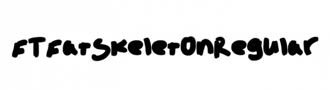
A bold, playful font with thick, rounded strokes and a whimsical, hand-drawn style.
![FT Fat Skeleton Regular フリーフォントのダウンロード]() ダウンロード 55 ダウンロード数@WebFont
ダウンロード 55 ダウンロード数@WebFont -
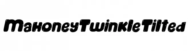
( Fonts by Kong Font )
A bold, playful font with star accents and a tilted design.
![Mahoney Twinkle Tilted フリーフォントのダウンロード]() ダウンロード 55 ダウンロード数@WebFont
ダウンロード 55 ダウンロード数@WebFont -
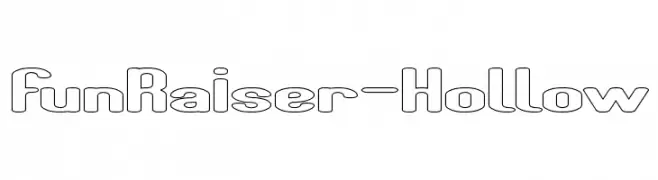
( weknow - Wino S Kadir - www.creativefabrica.com/designer/weknow/ )
A playful, modern hollow font with rounded edges and consistent proportions.
![Fun Raiser-Hollow フリーフォントのダウンロード]() ダウンロード 55 ダウンロード数@WebFont
ダウンロード 55 ダウンロード数@WebFont


今のトップフォントは?
は、クリーンな造形と広い適用範囲で支持を集めています。 ブランディングからランディングページ、ポスターまで活躍します。
ロゴで人気のフォントは?
幾何学系の サンセリフ(例: Poppins、Gotham 系のファミリー)は、スケーラブルでクリーンな印象に最適。 親しみやすさを出すなら スクリプト や手書き系も定番です。 見出しは力強く、本文はニュートラルに──この組み合わせが認知とバランスを高めます。
人気リストはどのくらいの頻度で更新される?
ダウンロード数やエンゲージメントに基づき定期的に更新します。 こまめにチェックして、次に流行るフォントを先取りしましょう。
💡 ヒント: このページをブックマークしておくと便利です。トレンドは速く、今のトップが明日のリブランディングを導くこともあります。